Fox Residence // Horton Harper Architects
Text description provided by the architects.
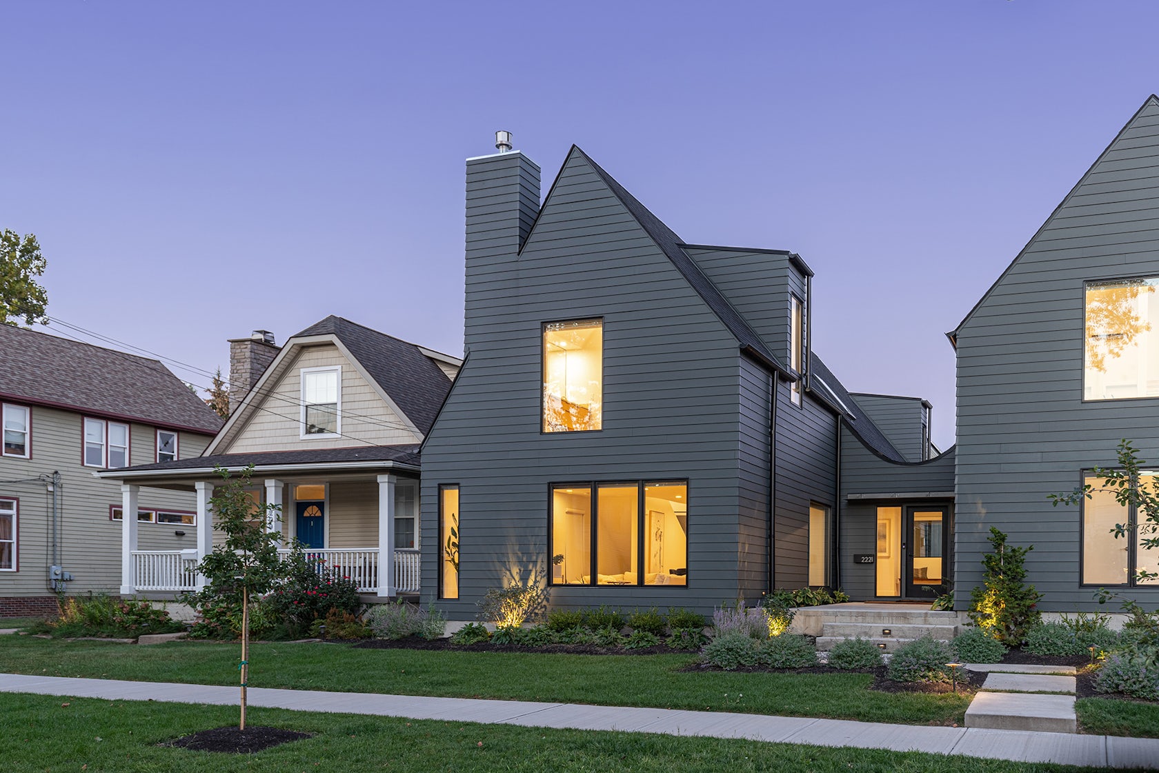
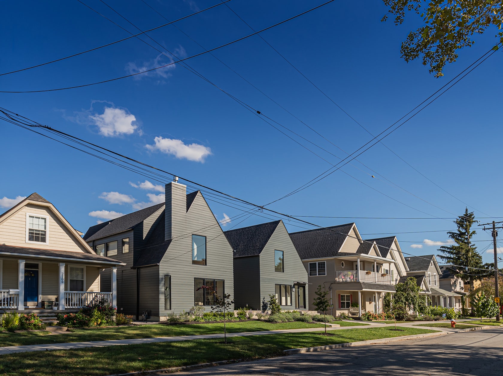
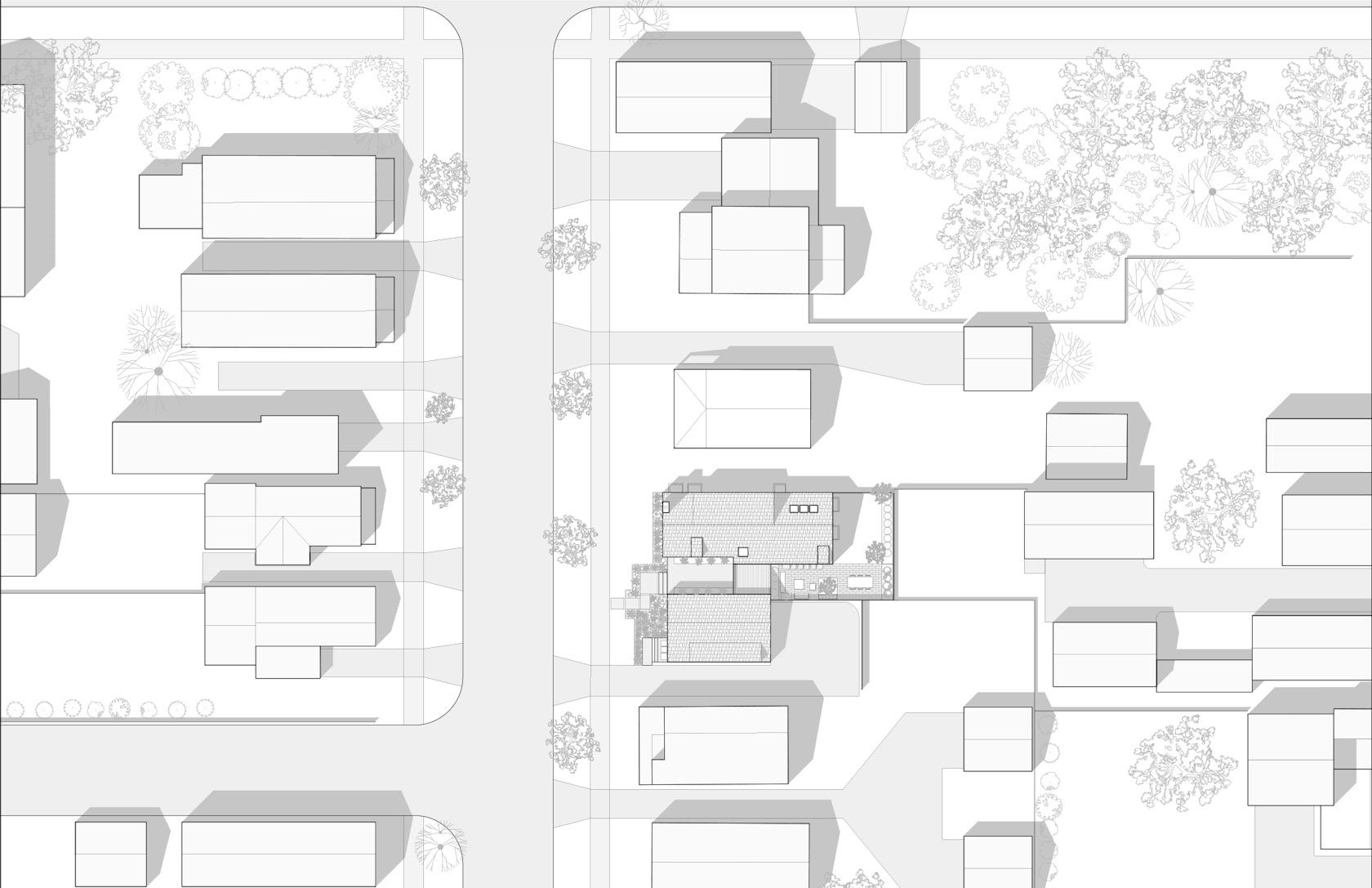
Located in Duck Island, an unpretentious neighborhood overlooking the Cuyahoga River and Cleveland’s low-lying industrial areas, the home sits amongst dozens of late nineteenth-century worker cottages. Historically, the site consisted of two, separate parcels, both previously occupied by a single-family home. The homes were demolished by previous owners after decades of neglect and disrepair.
© Horton Harper Architects
© Horton Harper Architects
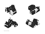
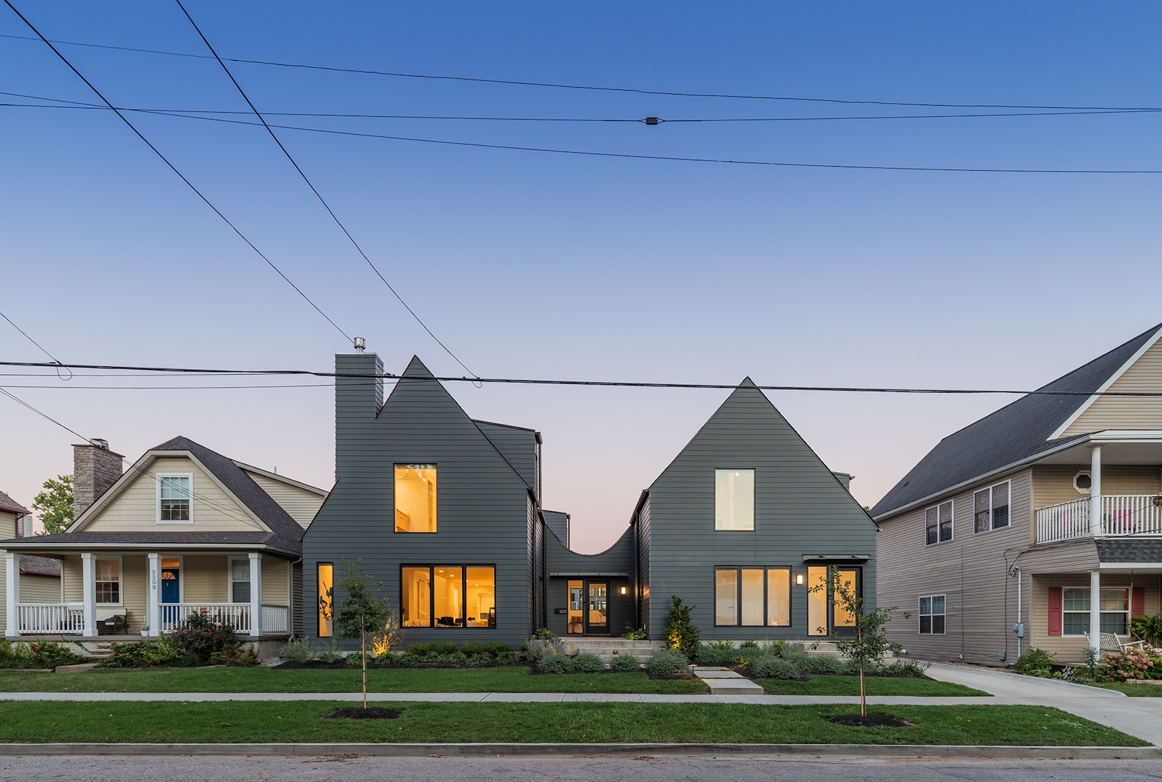
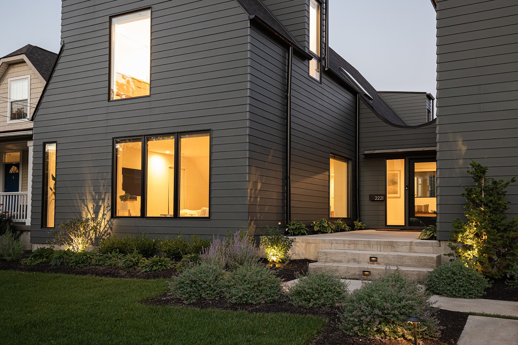
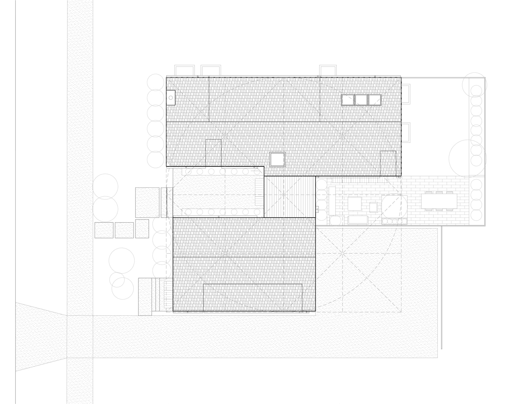
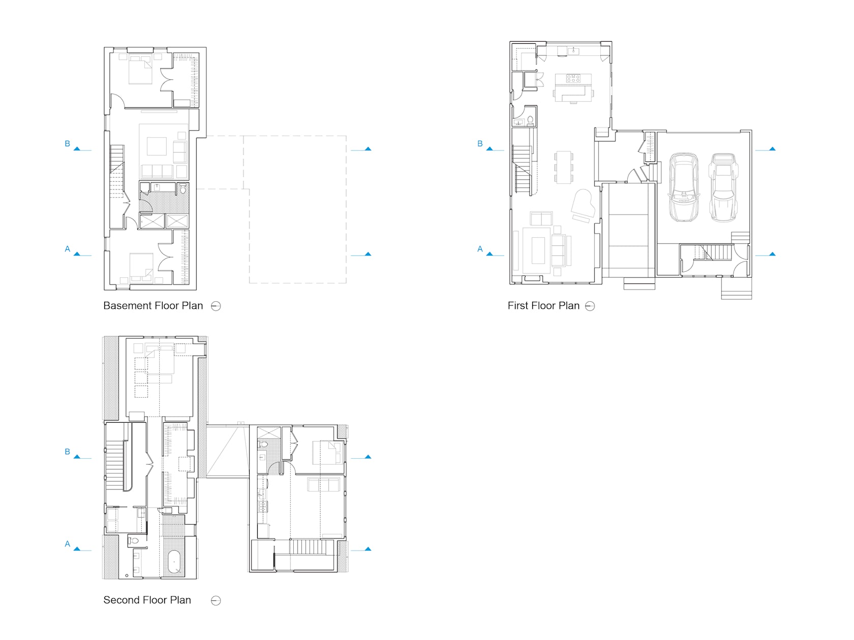
The client, a mother with three daughters, wanted a home that could accommodate their growing family throughout all stages of their lives. Thus, the home is conceived as two buildings, a main house and carriage house. Each building sits on its respective parcel and is connected to the other via a single-story room within the center of the plan, which serves as the entrance into the main house.
© Horton Harper Architects
© Horton Harper Architects
This physical separation repairs the disjointed sequence of houses along the street, while affording its inhabitants the privacy desired in multigenerational homes. The living quarters for each “generation” are located on the upper and lower floors while the ground floor of the main house acts as the shared space for all.
© Peter Larson
© Christian Phillips
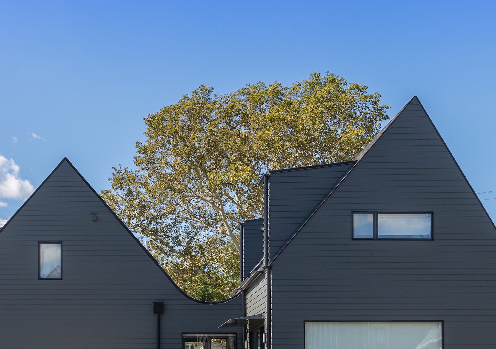
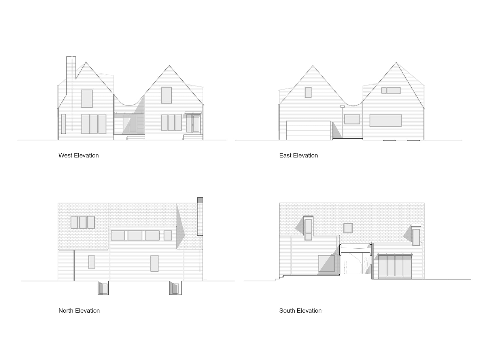
Each living quarter imbues its own unique tripartite division of space specific to the needs of the user. On the exterior, the home retains the appearance of two separate gabled-roof structures. Like fraternal twins, each structure shares similar external characteristics, but are unique from one another upon closer inspection. Their profiles are irregular and playful, akin to a child’s graphic depiction of a house.
© Christian Phillips
© Christian Phillips
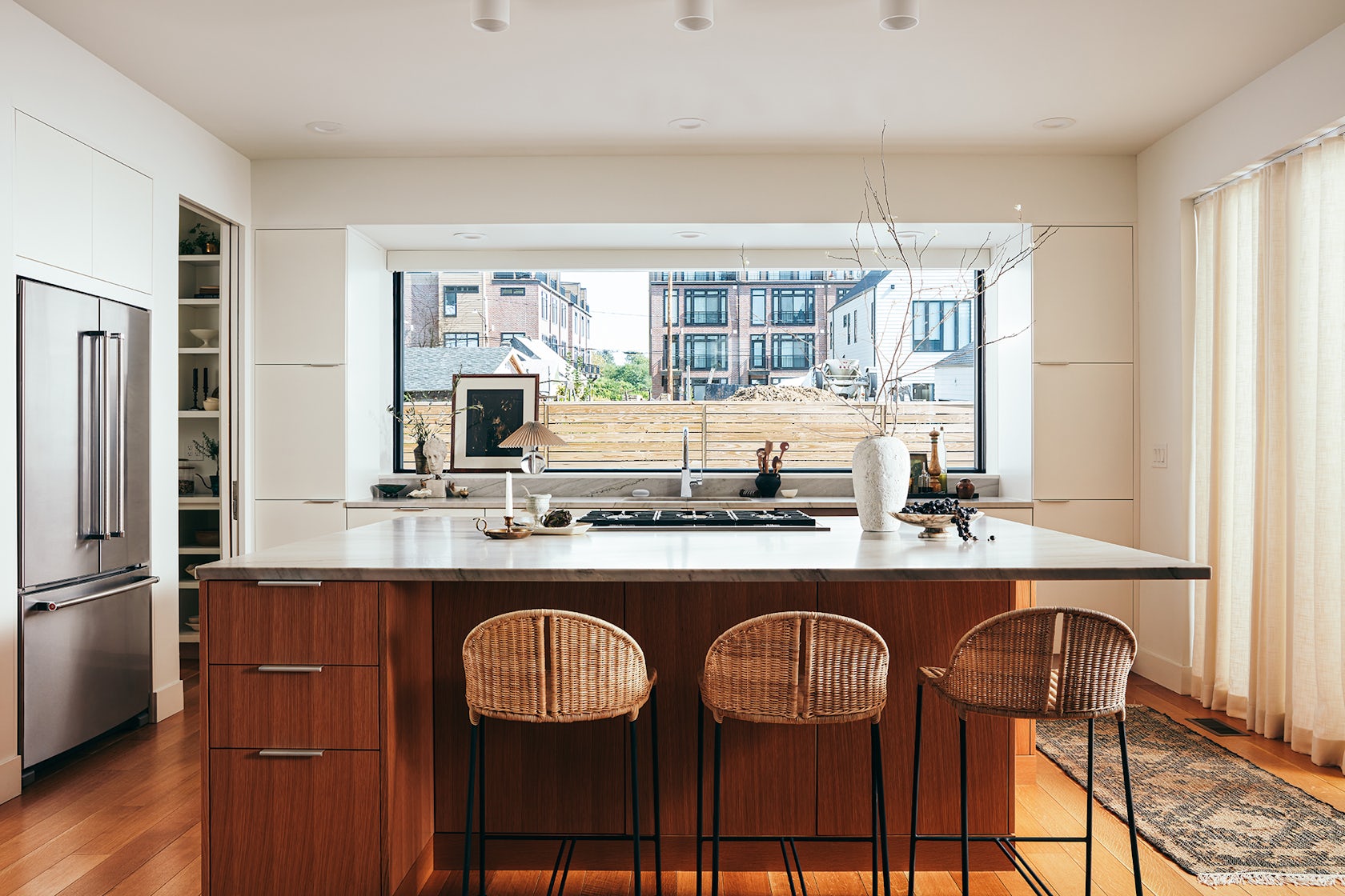
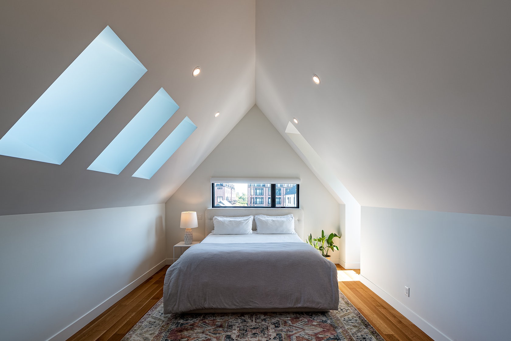
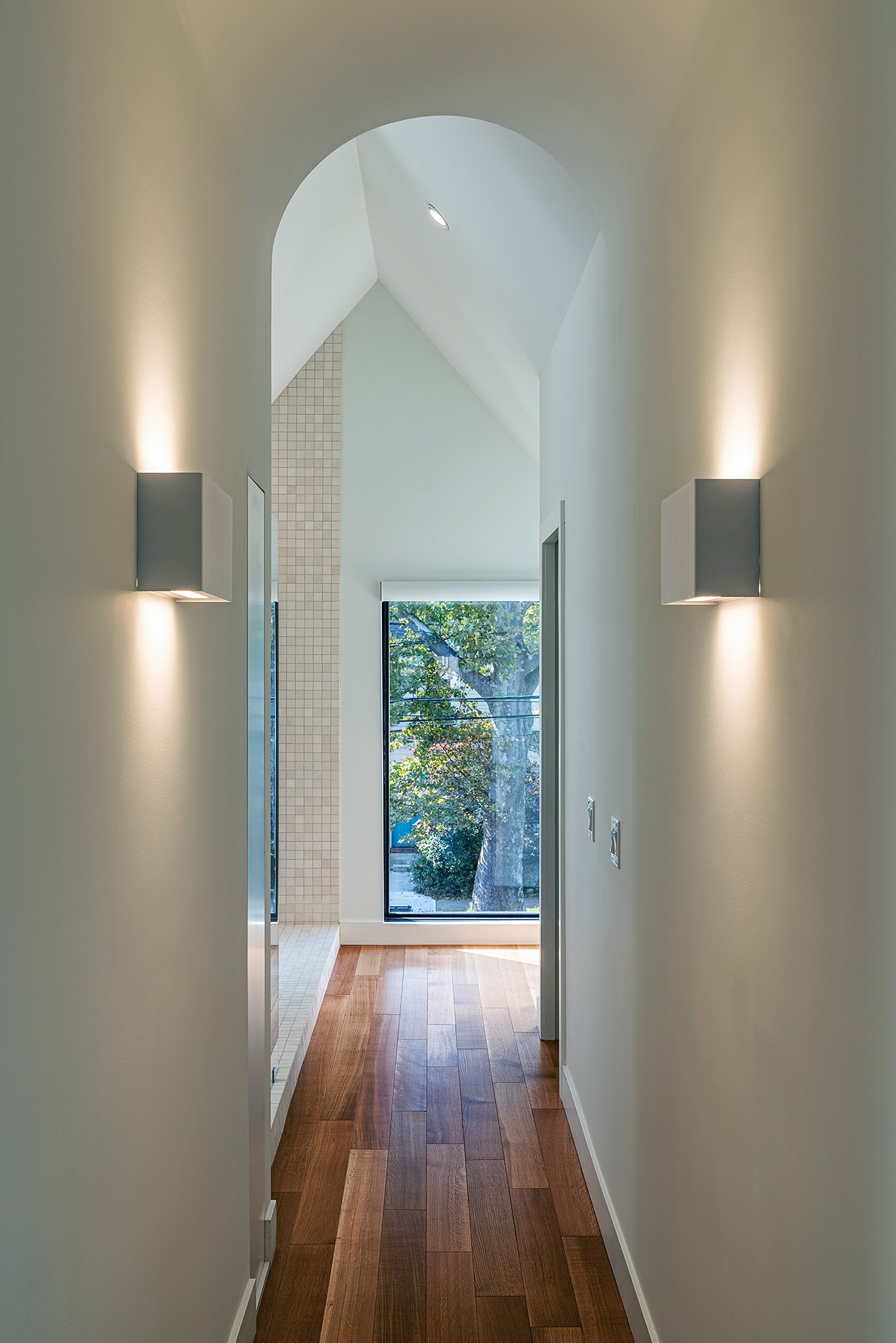
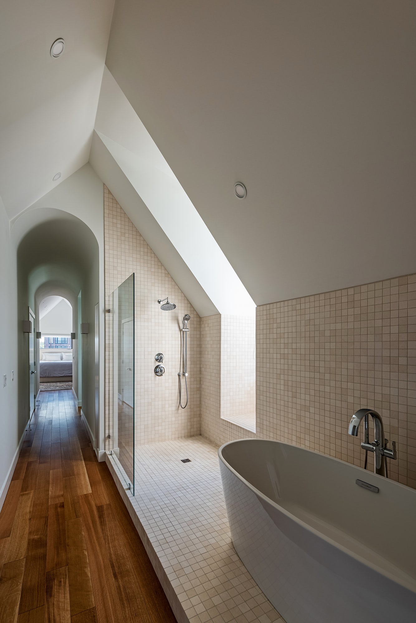
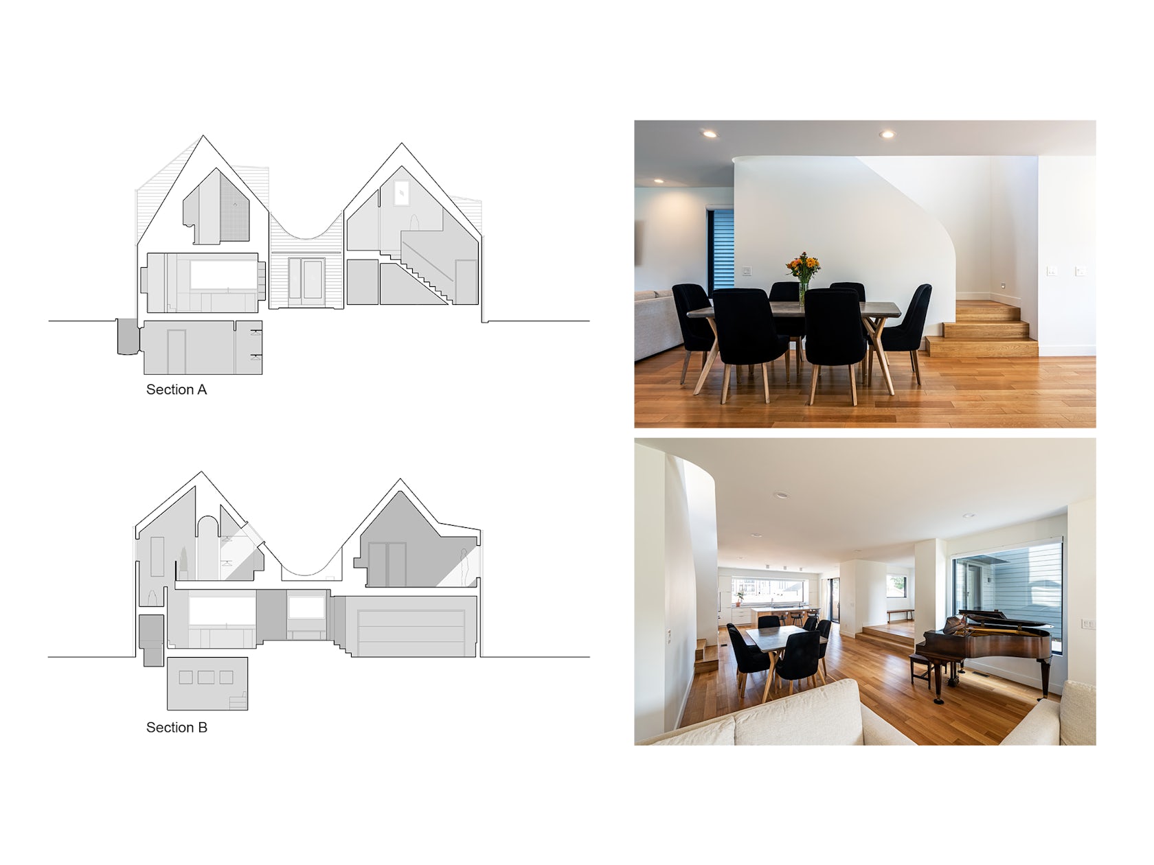
On the interior, a more formal ordering system governs the plan and section in an effort to reorient the user inside of each room and reframe their view to the outside. Thickened, double framed ceilings create symmetrical, vaulted rooms on the upper floors, while niches and ancillary rooms along the perimeter establish axial relationships on the main floor.
© Horton Harper Architects
© Horton Harper Architects
As a result, the interior volume of the home reflects a much different proportion than its exterior volume. Selected corners are softened radially to enhance the home’s visual and spatial continuity (this effect occurs only once in plan, once in elevation, and once in section).
The home was constructed on a modest budget relative to its size, and like its late nineteen-century counterparts, uses humble, readily available materials such as painted clapboard siding and asphalt shingles.
© Horton Harper Architects
© Horton Harper Architects
The dark charcoal hue of the siding unifies the two structures to form a cohesive whole, while the contrasting white interior walls and ceilings provide a neutral foreground to view the everchanging seasons from within. .
© Horton Harper Architects
© Christian Phillips

