Everything Old is New: Revisiting the Iconic Grid of Italy’s Superstudio
Architects: Want to have your project featured? Showcase your work through Architizer and sign up for our inspirational newsletter.
Superstudio is one of the few iconic architectural practices that made waves without actually creating any physical buildings. And their revolutionary ideologies continue to influence designers today. Started by Adolfo Natalini and Cristiano Toraldo di Francia in 1966, the firm was part of the radical architecture movements — Archizoom, Archigram, etc — that emerged in Italy and other European countries throughout the 1960s. The founders were later joined by Gian Piero Frassinelli, Alessandro Poli and Alessandro and Roberto Magris. Superstudio’s ideas did not simply imagine buildings; they sought to reimagine what the future of the architectural profession and the built environment could look like. Fanciful collages, abstract ideas and gridded visuals represented their design principles and somehow, their hope for the future.
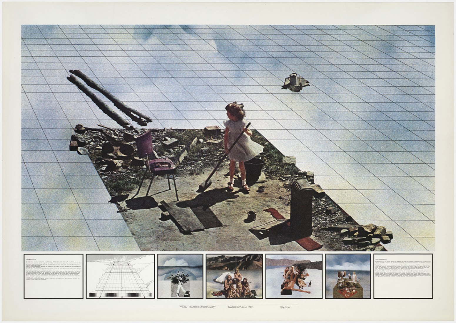
Image via metalocus.es
The team was constantly reevaluating the role of an architect and how they could solve what ailed society. They also proposed ideas like anti-architecture and anti-design that were a commentary on the political and social dynamics of the era, the want for novelty in design and the consumerist mindset. They countered the need for unique objects by proposing a simplistic black and white grid system that formed the foundation of some of their most iconic work. The grid was, in some ways, a symbol of freedom.
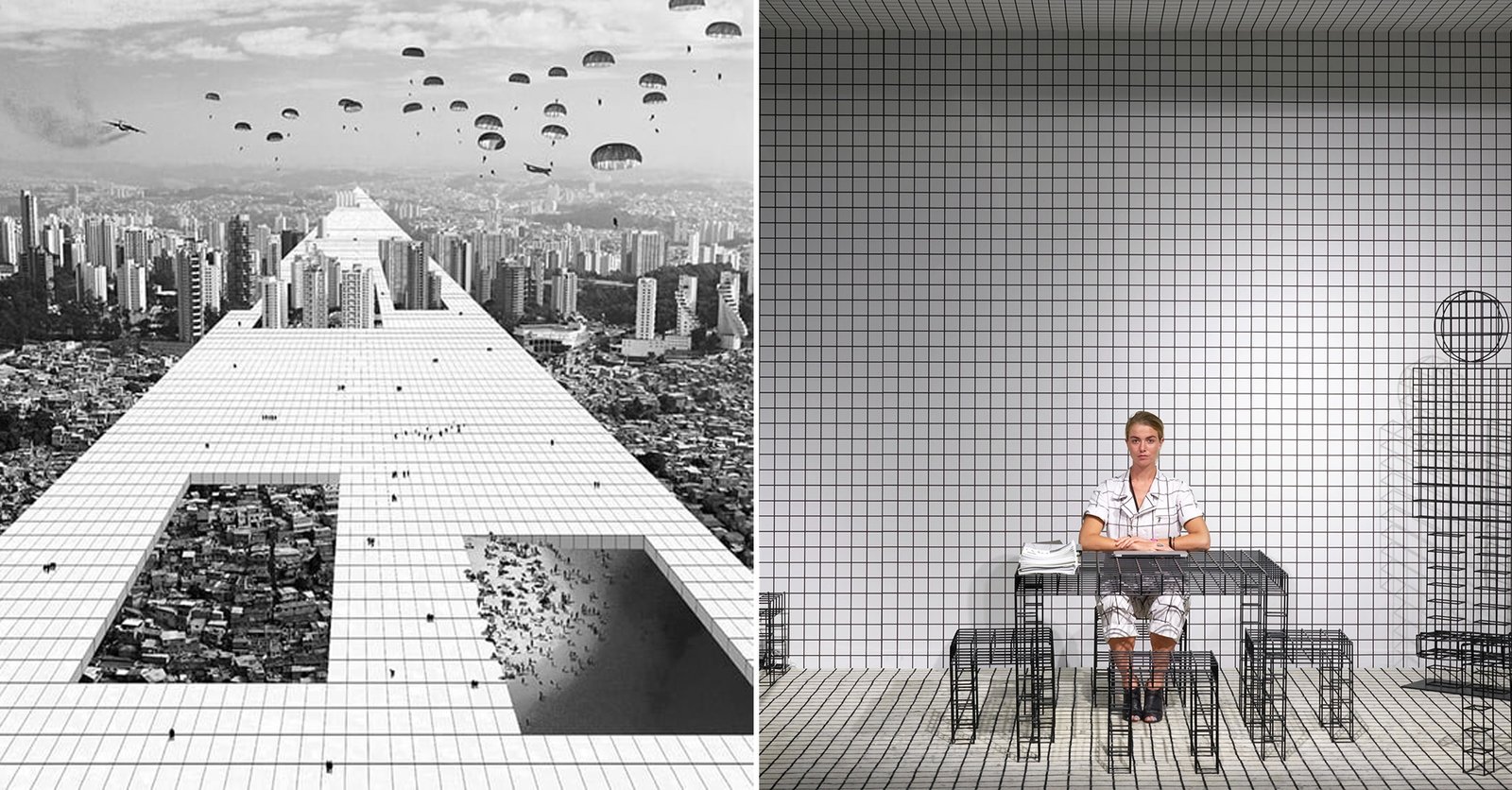
Natalini and di Francia believed that architects needed to focus on meeting the basic needs of individuals across the world. More and more, architectural design was servicing a culture of consumption. Instead, they thought, it should diminish social inequality instead of fueling it. This lead the group to develop the Continuous Monument: a utopian gridded structure encompassed the whole earth, taking over iconic structures and natural forms to create a uniform base that would serve all.
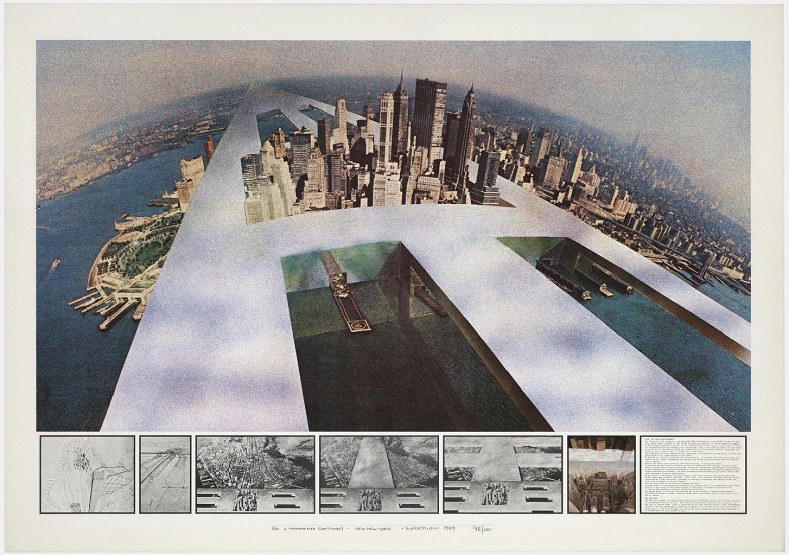
Image via metalocus.es
This Florentine’s group’s idea for the Continuous Monument was later accompanied by the Supersurface. This concept was essentially an infinite flat grid that, devoid of architectural diversity, would even the playing field when it came to social strata and regimented lifestyles. The gridded design represented equal access to essential resources and technology. They imagined it as a continuous network that anyone could plug into and use when needed. In a way, it was also a prescient conceptual image of a world beset by homogenous culture and lifestyles thanks to globalization.
And, while the designers never intended for the Supersurface to be implemented — never mind the fact that it would have been impossible to superimpose a grid across the surface of the entire world — they found a way to channel their ideas into furniture design. Superstudio created tables, benches and storage units that featured their signature grid. Their most popular design was the Quaderna table. Today, it is still being produced by the Italian furniture company Zanotta.
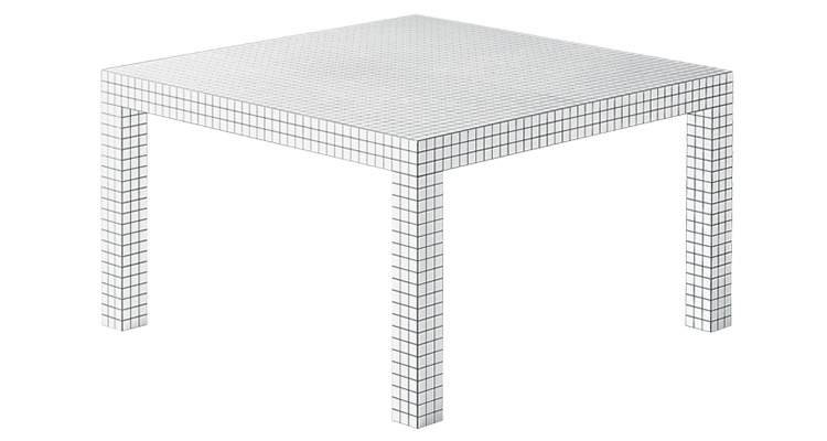
Image via Zanotta.it
Now, this style of furniture has resurfaced again, albeit with a very different meaning. Gridded accents are becoming even more popular with the emergence of TikTok and YouTubers creating DIY projects. The simplicity and versatility of this pattern is prompting millennials to customize it and use it in different ways for their homes.
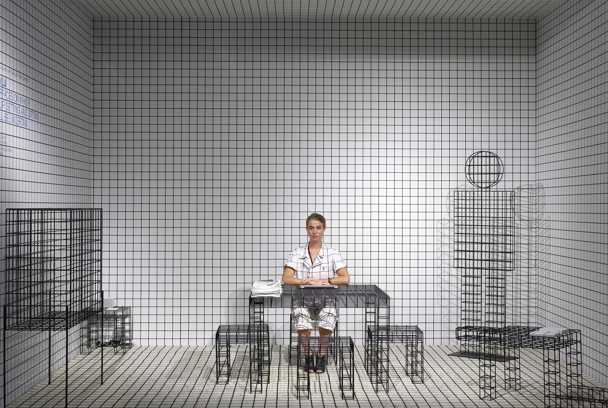
Surfaces On Which Your Setting and Sitting Will Be Uncertain by Various Projects, Miami, Florida
Meanwhile, for similar and different reasons, architects in recent years have also adopted a Superstudio-like grid in their works. For example, Various Projects designed a pop-up booth in Miami that showcased Superstudio-inspired furniture and objects by RO/LU. The studio wanted to equalize every element present in the booth and also connect with its participants. The project, titled Surfaces On Which Your Setting and Sitting Will Be Uncertain, features a gridded backdrop and accompanying mesh tables, cabinets and stools. In addition to this, models wearing clothes with the same print help reinforce the concept.
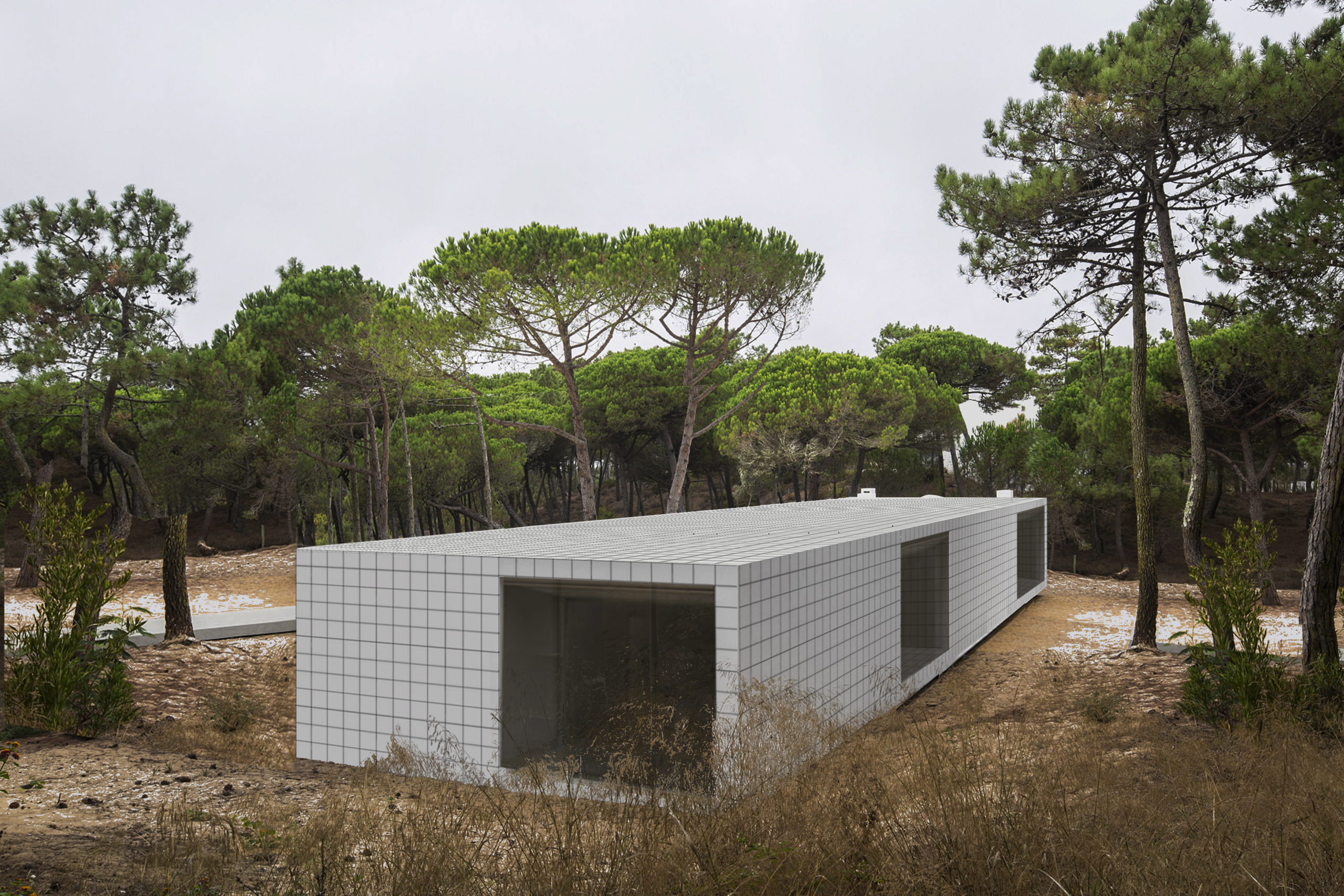
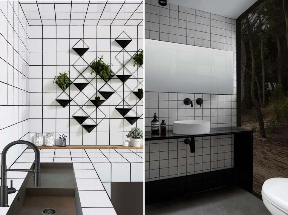
Check House by altro_studio, Italy
Likewise, the Check House by altro_studio is also reminiscent of the Superstructure. Large windows puncture through the continuous grid and break up the pattern. The spaces inside are also divided into square-shaped plans that follow a larger grid. Surfaces throughout the home are also covered with a similar black and white pattern. Minimal black furniture and fixtures help the pattern stand out. According to the architects, the grid was embraced as a strategy for “induces reflection in the passage between one space and another, between one environment and another” so that “nothing is taken for granted and everything is marked by an incessant and repetitive rhythm.”
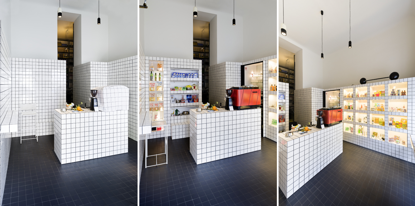
Super Mari’ by Madame Mohr, Vienna, Austria
Much like the Check House, Super Mari’ by Madame Mohr also uses the grid throughout the surfaces of its interiors. The pattern continues from the walls and furniture to the fabric coverings used within, conveniently hiding the storage shelves when their doors are closed. The color scheme also highlights the products displayed.
Hints of their designs can also be found reflected in the works of Rem Koolhaas, Steven Holl and Bjarke Ingels as well. Their version of an architectural utopia still remains a topic of discussion. Additionally, conceptual architecture is making a comeback in a big way. Aided by significant advances in rendering software, architects are used reality-bending visuals to express feelings of loss and isolation, celebrate diversity in gender identity, comment on political instability or imagine a different utopia.
These new visuals many be a far cry from the collage-style imaginaries and mind-bending illustrations of the 1960s radical architecture movement, Superstudio’s legacy lives on in these bold reimaginings of the profession. While the Florentine studio might not have created architecture in its physical manifestation, its members have definitely played a role in shaping it through others.
Architects: Want to have your project featured? Showcase your work through Architizer and sign up for our inspirational newsletter.
