Dō-maru House / Materiadarchitettura
Dō-maru House / Materiadarchitettura


Text description provided by the architects. The project consists of a reconstruction that reinterprets the main characteristics of the original building, which had an asymmetrical two-pitch roof, bringing them back to their essentiality, their pure form.

A large space collects the main functions, from the entrance to the living room, from the dining room to the kitchen; the environment is unique, not fragmented, and fluid. At the same time, the dedicated areas are perceivable while remaining secluded. The entrance on the northeast front has its own reserved area, characterized by a compressed height made possible by the projecting volume above. The living room, negative, is identified by the different levels of the floor and a small glass patio that floods a deep space with light, which defines the space dedicated to dining. Finally, the kitchen, on a slightly higher level, is filtered, perceptually, by the steel and glass staircase that intrudes into this space and leads to the upper floor.

The night area breaks out into the double-height living area: both bedrooms stretch out into the void and become elements suspended in the space below. Relations are generated between opposing masses and suspended volumes at half-height that contribute to characterizing the different areas of the free space below: compressing the entrance, dilating the living room, mediating the dining area, controlling the technical area of the kitchen. Visual relationships are also generated between the bottom and the top: for example, the master bedroom opens through a large overlook on the living space below; it becomes an element of attraction, perception, and relationship. On the whole, the fluid space unwinds in plan and in height, making the act of living in the house an experience that is renewed from ambit to ambit, rich in perceptions that chase each other in the progress of domestic events.


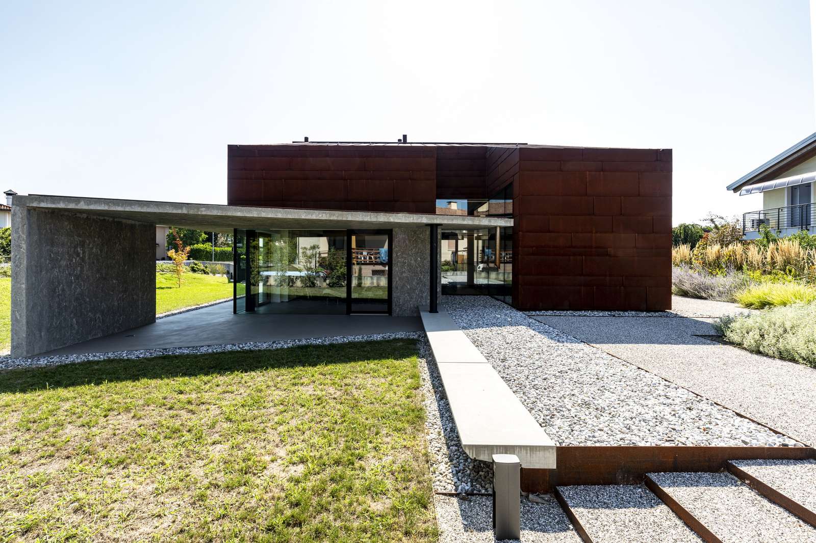
The internal relations expand towards the outside by means of the portico, an element of mediation, an entrance canopy that protects from the weather, deep and compressed in height, till it becomes one with the exterior by extending the living room and formally uniting it with the garden; a place of rest, a place to play, in the bright days of mid-season or in the summer evenings, protected from the humidity of the night.

The building, in its new interpretation, does not deny the original one. Actually, it takes up its substantial volumetric and spatial concepts. The volume is essential by form; every emerging element is removed. The porch is a counterpoint to the essentiality, even the material of the facade contributes to this purpose: dark red cor-ten steel plates, arranged in a banded geometry that reflects the envelope alignments, with an irregular design that emphasizes the clear lines.


The openings are cut out in the geometric design of the ventilated facade, protected by vertical folding shutters. When they close, they become coplanar, completing the envelope, making the surface unitary, the front continuous; while those that aren’t obscured, dig the volume in depth.


