Deus Videt Te House and Ceramic Studio / Objekt Architecten
Deus Videt Te House and Ceramic Studio / Objekt Architecten


Text description provided by the architects. In the middle of the Flemish fields, our clients bought an old house with an adjacent, dilapidated barn. Both buildings were in urgent need of some tender love and care, but there was one big asset: the location.


Urban planning regulations forced us to rebuild the barn. Therefore, this ruin was renovated and partly incorporated into the living area. Another part was converted into a double garage. The original front façade of the house was restored to its former glory, and the view of the barn was not changed either, again because of the local planning regulations. The rear façade, however, was fitted with large windows that offer a magnificent view of the surrounding fields and nature. They also connect the two volumes in one movement by means of a prominent concrete portico structure that also gives shape to the roof gutter and the crown molding.


The entrance to the house was moved to the barn. Through a patio right next to the original house, residents and visitors enter a beautiful open entrance hall that connects to the storage room, living room, and kitchen. The exposed high ceilings in the barn – of which the roof was completely renewed – provide a spacious feeling. The large windows in turn ensure an abundance of daylight. Old and new go hand in hand. The plastered walls of the newly installed volumes and the steel supporting structure contrast beautifully with the original brick wall. The champagne-colored exterior joinery provides soft lines and, depending on the incidence of light, a warm glow.


The same material was chosen as the floor covering but in a different form. The barn area is covered with concrete strips (or pavement strips). It a not an obvious choice, partly forced by budgetary considerations. A polished concrete floor was placed in the old house. In this way, both spaces remain visually connected, but the different pattern provides a clear separation between old and new.

In the original house, authentic elements and contemporary features alternate. The wooden staircase, for example, was given a facelift and was complemented with a deep red, twisted steel handrail. The original door to the cellar and a charming little cupboard was retained. Together with the old fireplace mantel, they remind us of the rich history of the house. The walls of the former bedroom, accessible via a step, have partially disappeared. As a result, the differences in level on the ground floor give the whole a playful character and, together with the preserved walls, they separate the different zones in the otherwise rather open space.

On the first floor and in the attic we find the sleeping quarters of the house. A void on the garden side ensures permanent contact between all levels. The landing provides access to a separate toilet, the bathroom, and a bedroom with a dressing room. There is also a newly installed spiral staircase that considerably facilitates access to the multi-purpose room and the extra storage room on the attic floor. The original wooden floors have been retained. Further authentic elements can be found in the bathroom, namely the recurring brick wall that was alternated with a shiny, dark green ceramic tile in the shower area and in the bathtub.


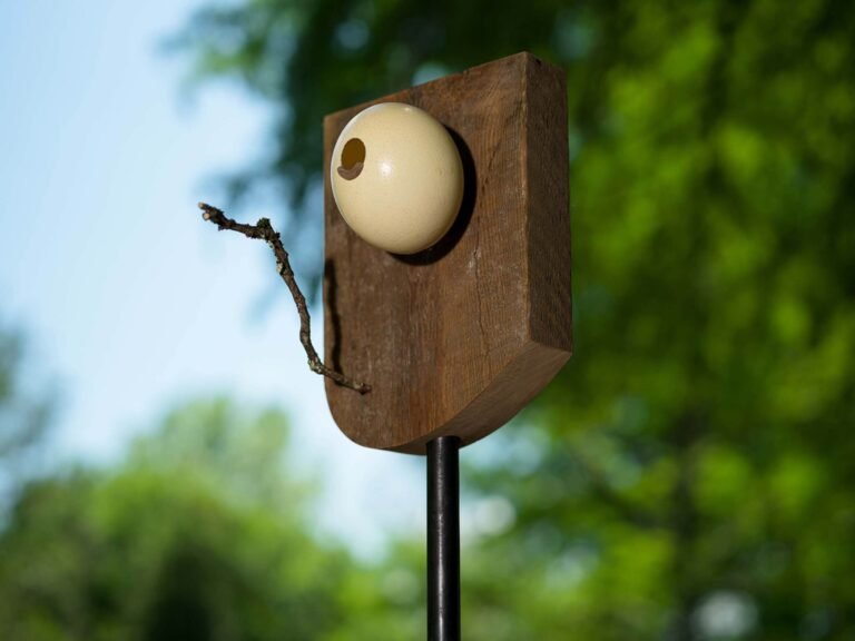
The result of this thorough renovation is a house designed according to its potential, with the necessary respect for the past. The design allows the resident to go on a voyage of discovery, with each room having its own identity. In addition, the connection with the garden, strengthened by the large width of the house, and the surrounding fields provide an absolute added value. And all this under the all-seeing, approving eye of a strategically placed holy statue. Deus videt te.


