CetraRuddy updates the art deco facade on a NoMad skyscraper
Architect: CetraRuddy
Location: New York, New York
Opening: October, 2021
Joining the ranks of luxury towers in Manhattan’s NoMad neighborhood is Rose Hill, CetraRuddy’s contemporary take on Gothic Revival skyscrapers. Like many residential projects in the city, construction continued during the pandemic, with the building at 30 East 29th Street opening last October. Rising over 600 feet, Rose Hill makes a statement with its midblock height—usually reserved for buildings along the avenues per the city’s zoning regulations. Working with the client, the Rockefeller Group, CetraRuddy sought to design a building that reflected the Rockefeller Group’s impact on New York architecture, without trying to create a facsimile of a bygone era.
The building is home to 123 condominiums, totaling approximately 230,000 square feet of interior space, including amenities. Common spaces include a lobby, underground pool, squash court, gym, and 37th floor meeting room and spacious terrace—accessible to all residents. The pool nearly imitates the feel of a bathhouse, with green-tiled walls, a curved ceiling, and tile mural, while the lobby was designed to be more akin to that of a hotel.
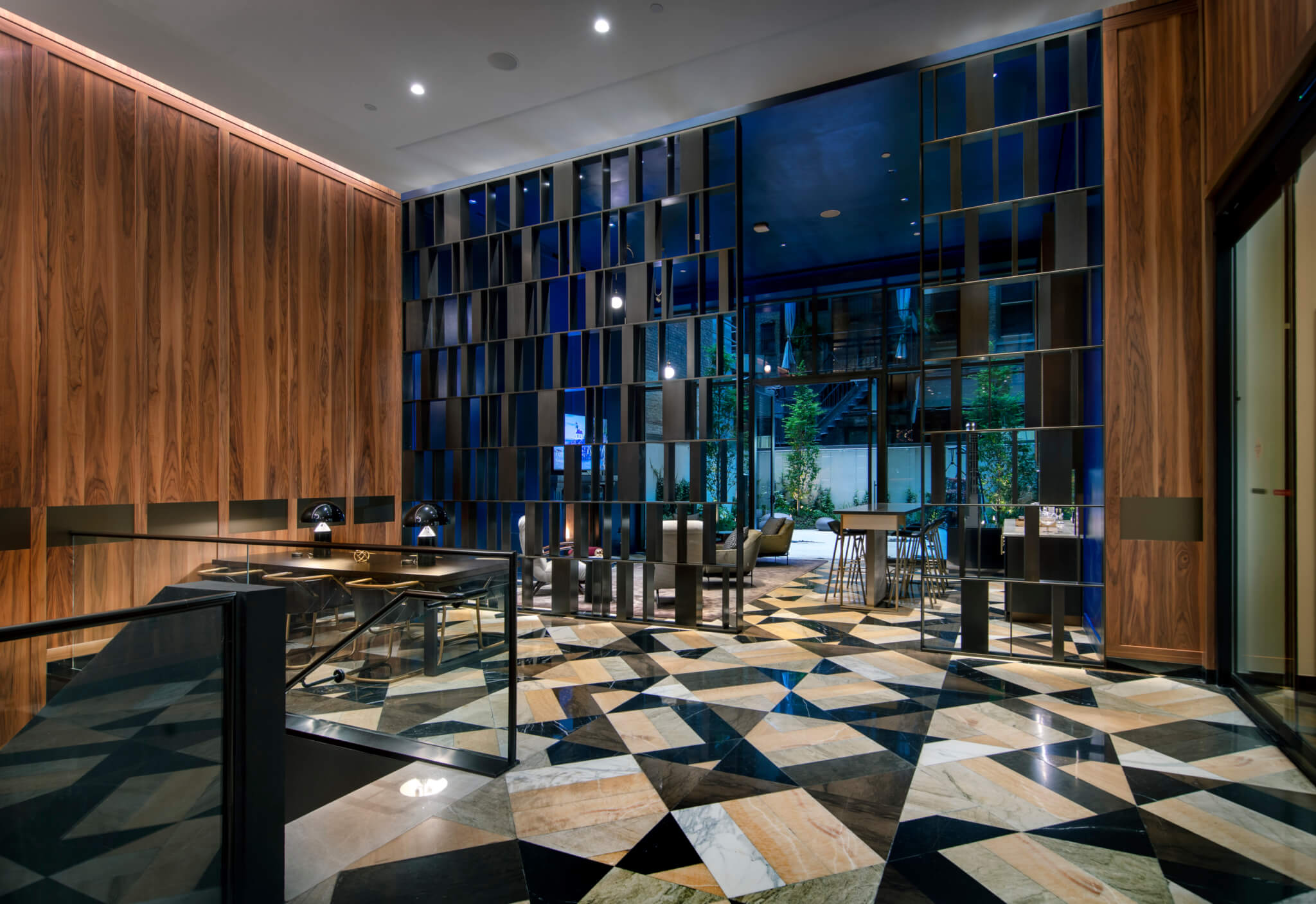
CetraRuddy founding principal John Cetra and Rockefeller Group senior managing director Meg Brod told AN that the intent behind the lobby was to create a space that would be more social. Rather than simply serving as a point of circularity, as many lobbies in New York condominium buildings do, the lobby’s wood-paneled walls and seating create a more inviting environment. The large mural in the lobby, painted by Matthew Cole, is a nod to 30 Rockefeller Plaza’s iconic lobby. A secondary space in the back of the lobby, suited for small gatherings, leads to the backyard garden, where the building’s height and facade loom large.
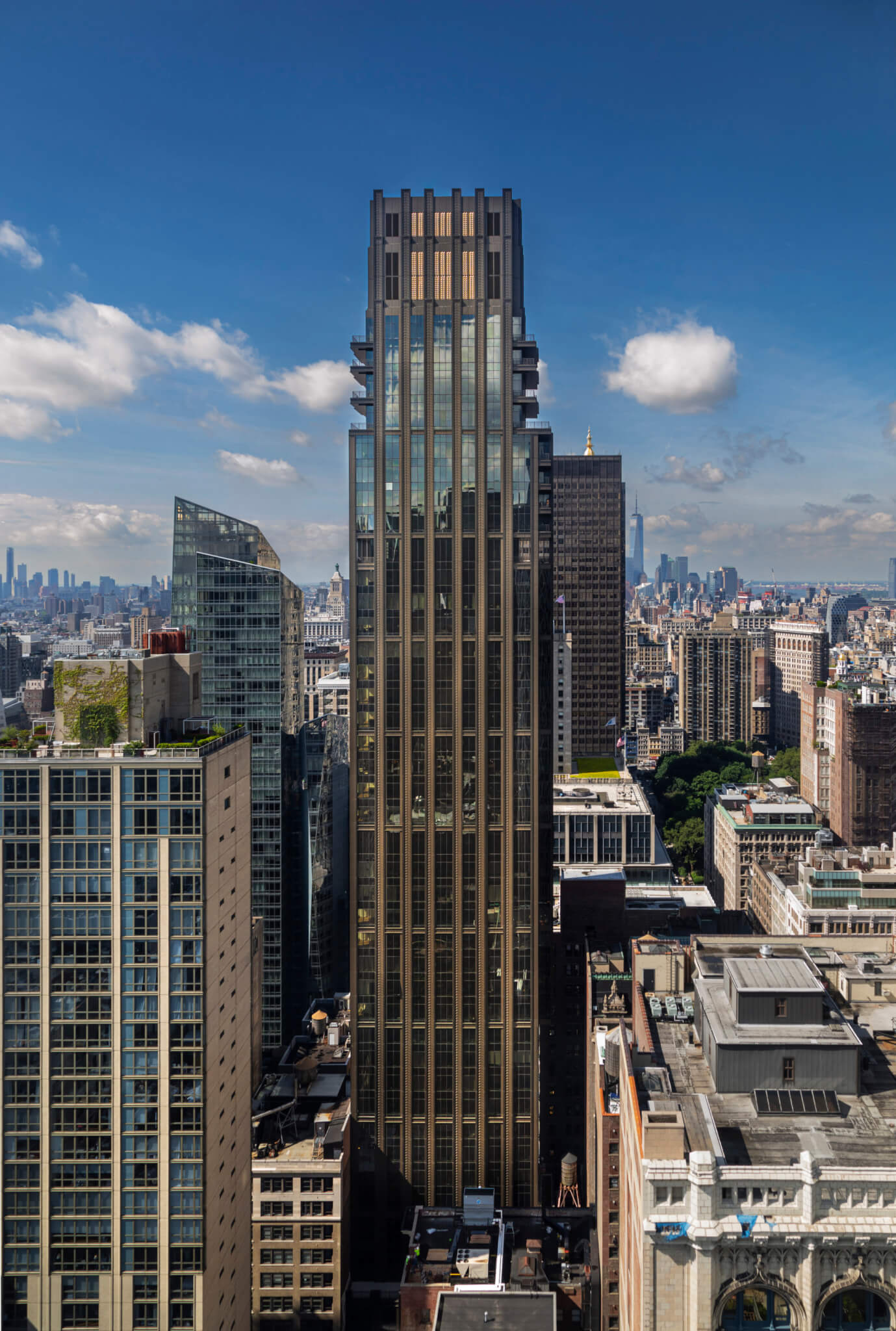
The outline of the western face of the building consistently sets back, while the outline of the eastern face is interrupted by a cantilever, permitted by the purchasing of air rights from the neighboring lot. The narrowness of the facade—due in large part to the roughly 4,500-square-foot floor plate—is cemented by the construction of sheer walls on the sides of the building, with three bays in the middle. This design and construction eliminated the need for a damper, and permits the cantilever, which adds additional interior and balcony space on a narrow lot.
The facade was constructed as a rectilinear series of bronze-colored metal panels and glazing, rising into a blockier iteration of the “wedding cake” style of setbacks that are guided by the city’s zoning regulations. The facade at the base of the building, however, is more similar to the art deco style of setback that CetraRuddy’s design is in-part inspired by. As Cetra explained, the proportionality of the building was crucial, particularly as perceived from the exterior. Moving vertically up the facade, the lobby is followed by a screen with zigzag details, covering the mechanical, electrical, and plumbing components of the building. Above is a level of balconies that connect to their adjoining apartments, marking the first level of setbacks.
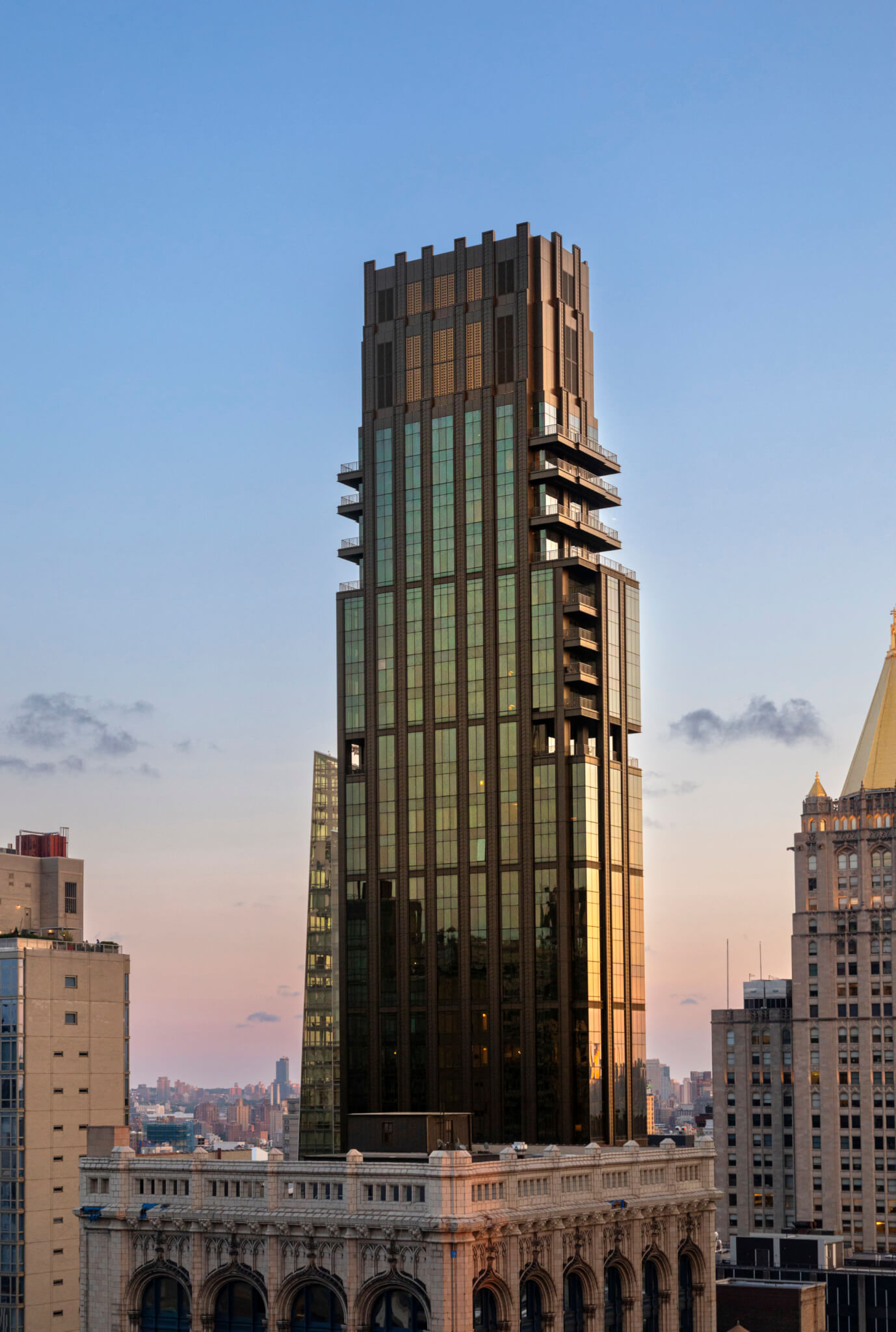
As Cetra explained, the building is not a “replica” of a century-old building, but instead responds to its context and site while being inspired by century-old Manhattan skyscraper design. The fact that the first scaling-back of the facade is easily perceptible from a pedestrian view, rather than having to look up dozens of stories as is the case on many other skyscrapers in the city, renders the facade—and the building’s height—more legible from the street. Cetra described Rose Hill as a “statement to the street.”
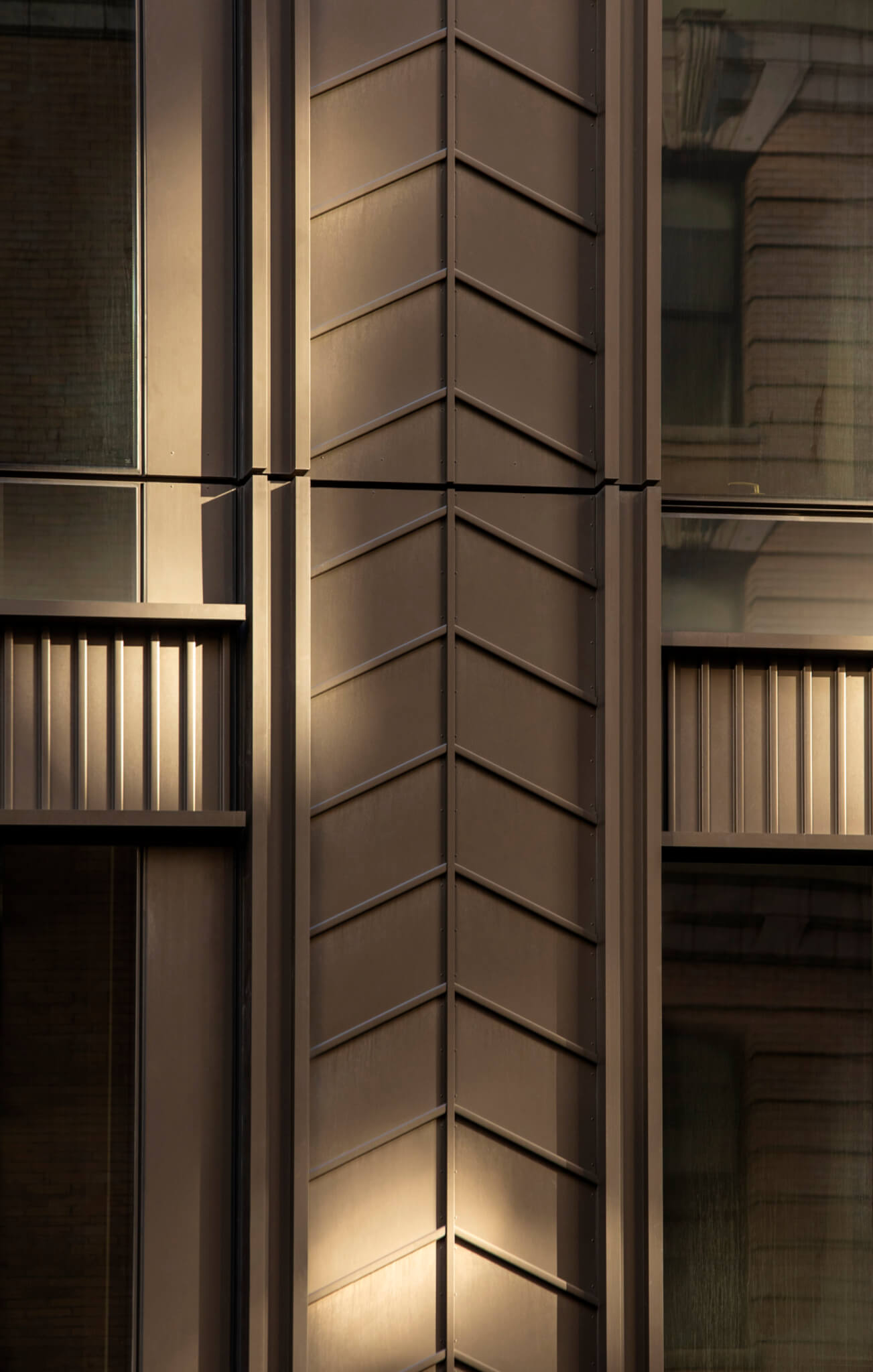
The metal panels that run the height of the building establish a consistency up the facade, with the bottom-lit chevron reliefs standing out from street level. The chevron is another nod to art deco design, and was fabricated by a metal press that bent the relief into place. Cetra told AN that while terra-cotta and other contemporary materials were considered for the facade, cost and load considerations led to the choice of metal paneling. While metal panels can otherwise given a facade an overt flatness, the raised chevrons add depth to the facade. Corrugated metal banding the facade neatly sections-off the building every four stories, creating a grid with the columns of panels. Cetra described the bands as “popping out,” contributing to variance in depth of the palette of facade materials.
The design team chose a nontempered, double-glazed window, with a clear outer pane and tinted inner pane, balancing views with energy considerations. CetraRuddy’s environmental modeling focused on factors such as heat gain, optimizing the placement of the glass on the facade. Subtle, yet visible, shade changes in the glass are the built results of the modeling. As CetraRuddy also designed the interiors, the windows could adequately account for energy requirements while still meshing with the interior design, resulting in a more holistic design process for Rose Hill. There is an 18-inch window sill extending from the floor of each unit, rather than the floor-to-ceiling glass that can be popular in higher-end residential design. Cetra described this move as establishing a “human scale” on the interior. When viewed from the exterior, the glazing contributes to the verticality of the rest of the facade design. The chevron pattern from the facade is repeated in carpets and bathroom tiling, establishing visual continuity between the facade and interior residential spaces. As Cetra told AN, the parts of the building may be straightforward, “in a way… but take advantage of the material.”
Project Specifications
