Ca N’Alegre Residential Building / Bergnes de las Casas
Ca N’Alegre Residential Building / Bergnes de las Casas


Text description provided by the architects. Ca N’Alegre is a multi-dwelling building in the neighborhood of Vila de Gràcia, Barcelona. The building occupies one hundred percent of the longitudinal plot (30x6m) completing one side of a block in Calle Ca L’Alegre de Dalt, between Balcells and Passeig D’Amunt. It offers 900m2 of floor space divided into a basement and four floors.

The elevation of the building over Ca L’Alegre has structured into a main ground floor volume plus two stories and an attic that seeks to trick the human eye and reduce the building’s physical appearance by separating it off from the main volume, thereby meeting urban development regulations on height in the area.

The floor plan is devised around a central vertical communication hub with two dwellings per landing. It comprises a total of seven dwellings that are distributed on the ground floor plus two stories in Calle Balcells and the ground floor plus three stories in Calle Amount.


Opposite the plot is Casa Gustà, a modernist property from the early 1900s that marks the boundary with a protected environment.

The building blends into its modernist environment by reinterpreting the composition of neighboring façades to establish a timeless dialogue between two pieces as the building splits into three parts. A plinth that meets the ground, the main body with groups of spaces and eaves that finish off the building.


The plinth or base of the building, formed by rows of exposed brick, seeks to connect with neighboring properties and blur the topographical difference between the two streets, as it is broken at several heights. The main body, in rough-textured beige, groups its openings into framed smooth sections that break up the weighty image of a unitary volume. Over it, the eaves form a light, timeless, classic pavilion, placed on the actual building, thereby distracting from the accentuated height of the building.


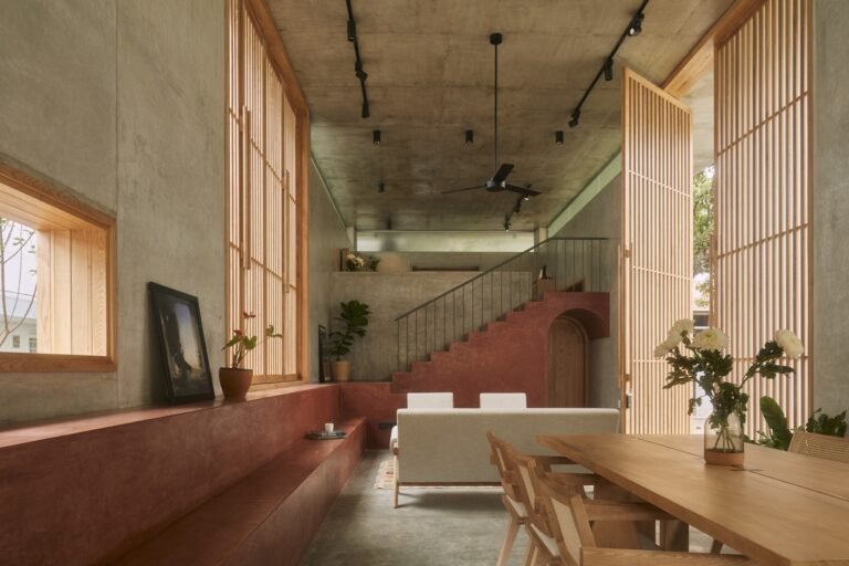
Reinterpreting folding shutters brings out the wood on the façade, providing a warm tone to the building and filtering the light inside the dwelling. In this way, each user can customize how much light and privacy they want.

The proportion of its spaces and grouping of windows into frames create a set of contrasts against the hefty aspect of the building and its apparently disorganized composition gives it certain urban continuity.

Inside, the stories are organized through a gallery parallel to the façade that narrows and widens according to the project’s needs, thereby blurring the image of the lengthened story.

Avoiding historicist language, the project favors restrained, timeless construction by means of a volume that blends into its surroundings thanks to its neutral choice of materials and its contemporary compositional language.


