BOX IN THE BOX – Big Design // ZZ Media
Text description provided by the architects.
Project name: BOX IN THE BOXDesign firm: Giant DesignChief designer: Xiaojie Li, Zhiqiang Hu Completion Time: 2021.04Model:Lingjun Luo Written by: XiaoanProject location: Foshan, ChinaProject area: 300㎡Photography: Yun Ouyang from Yinxiang Architectural PhotographyGiant Design • Xiaojie Li|Box in the Box, an Ideal OfficeSpiritual abundance does not mean material impoverishment.
© Design aesthetics
© Design aesthetics
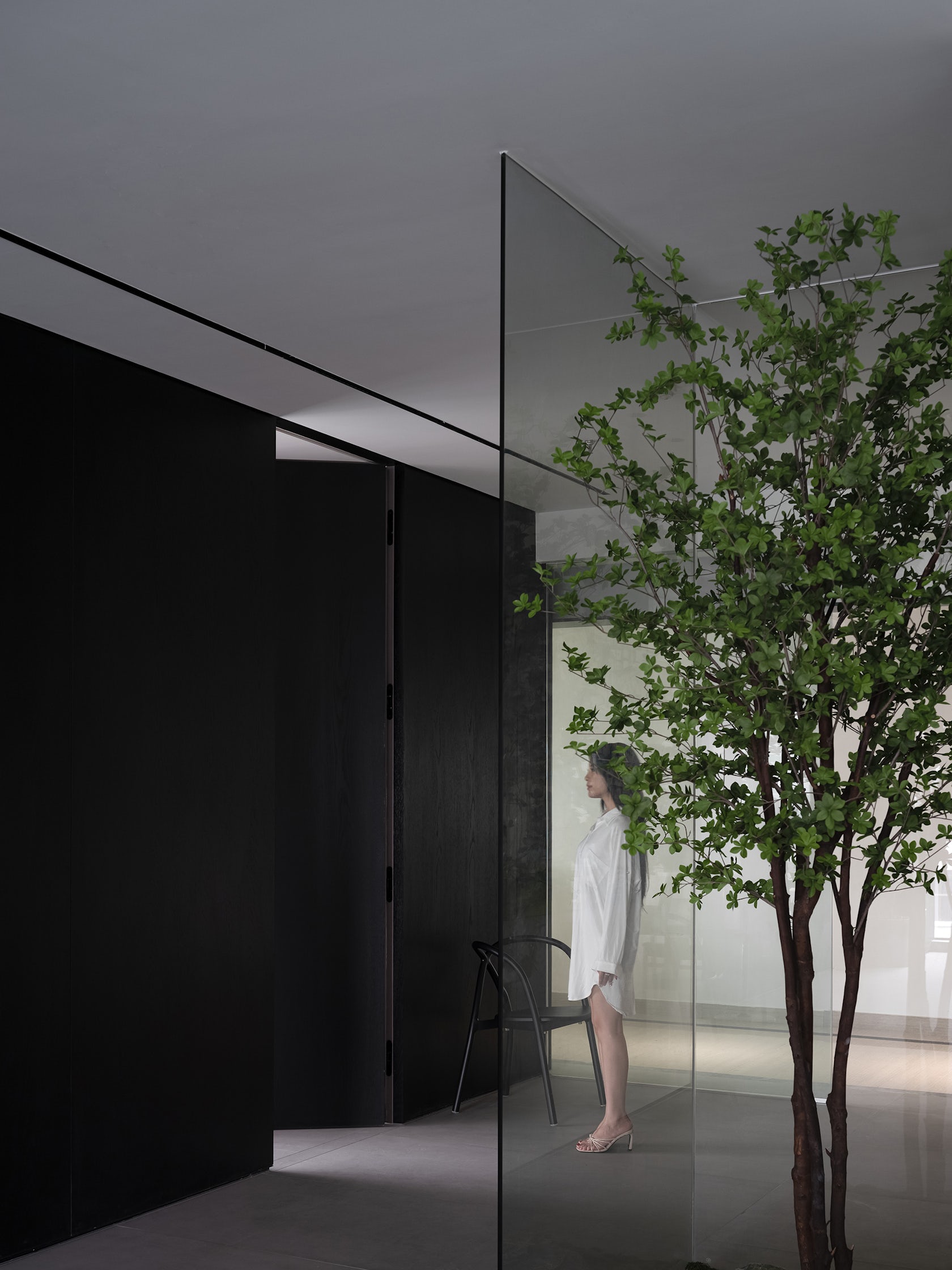
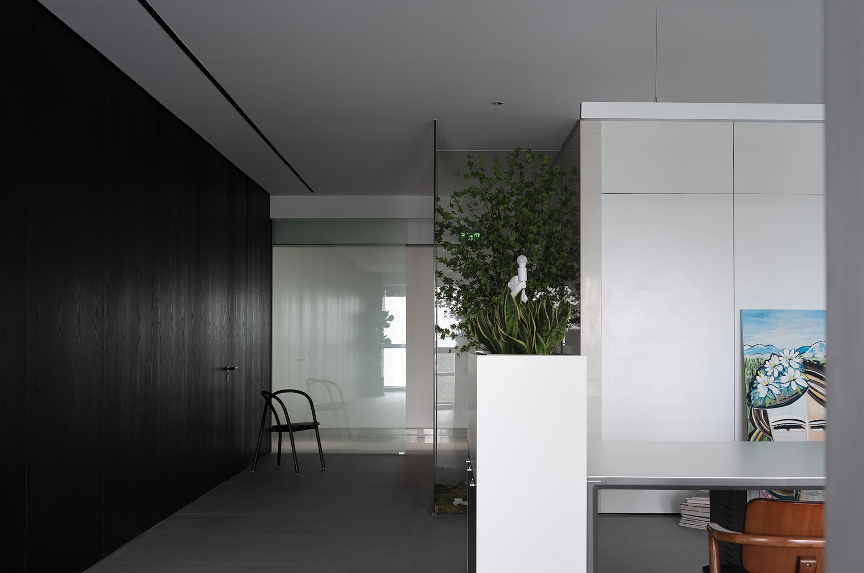
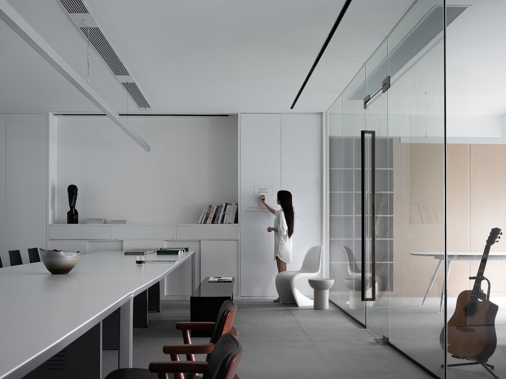
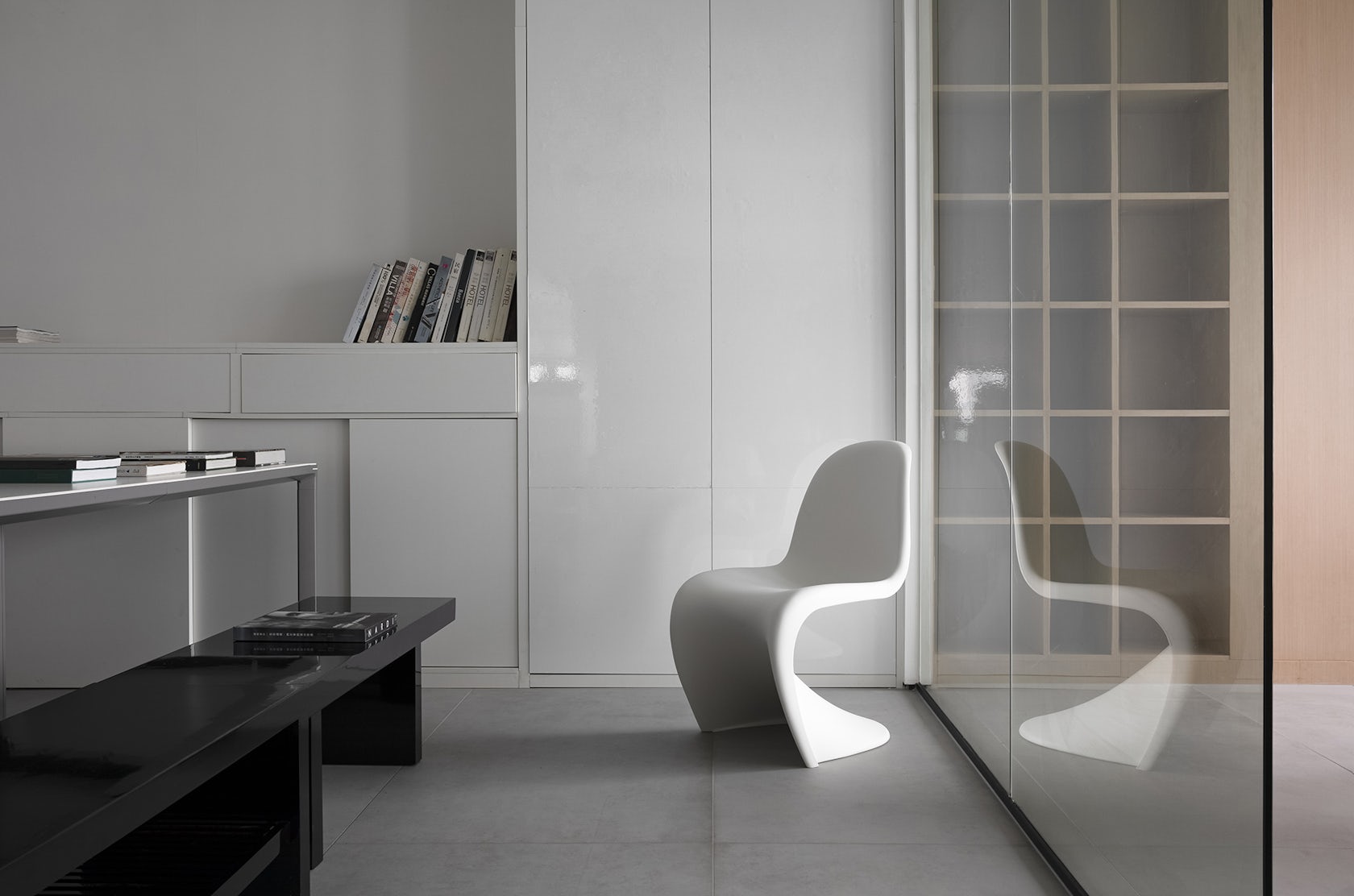
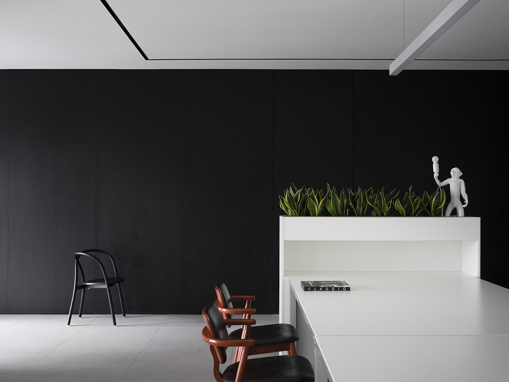
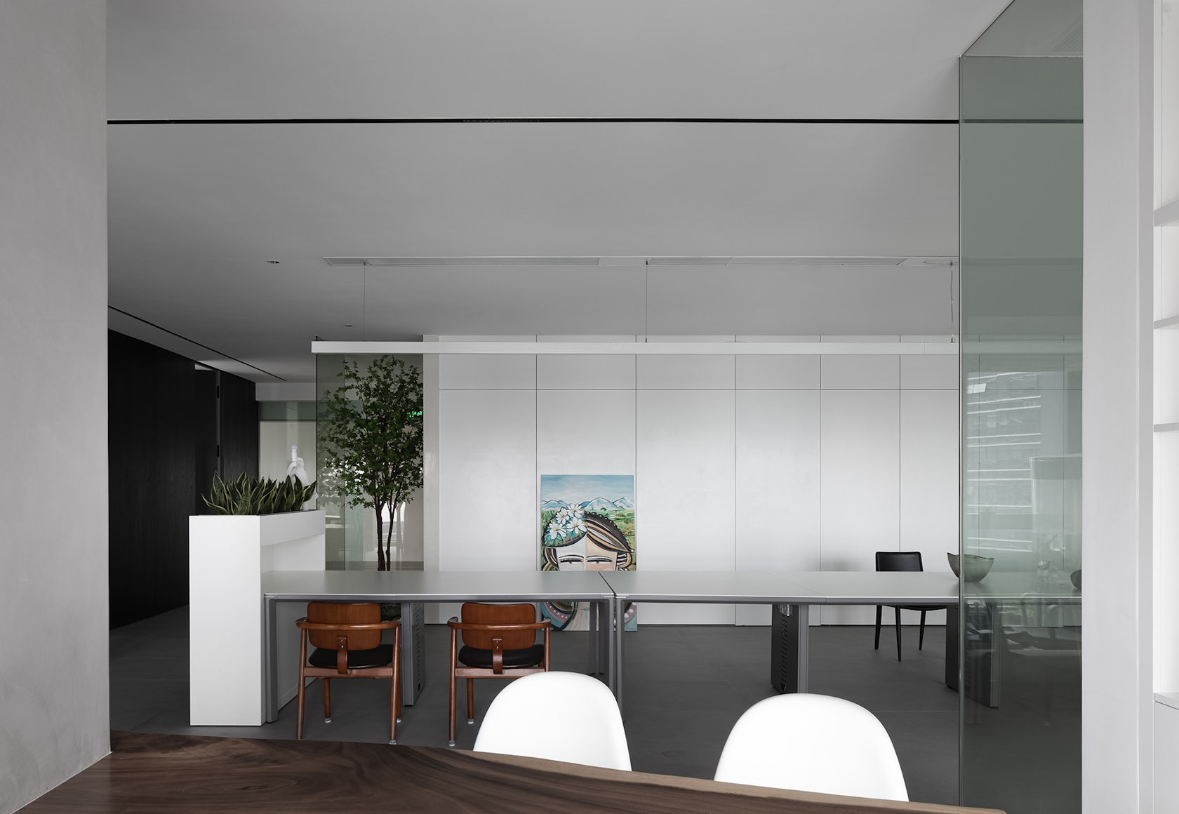
It can be an ideal working experience derived from the interaction between people and space, that is, sincerity and respect for each other.01LARGE SCALE ACTIVITY SPACERather than creating an office,the design has built a place for work, communication, and rest.The wrapped black and white walls,like an inserted box,create a mysterious feeling by the contrast of the two colors.The rearrangement of the details of light and shadowreshapes the space to add a sense of belonging.Here, beauty becomes a kind of spiritual pleasure.With the freedom of imagination and understanding,the rich sense of vision and intuition is open.Through three-dimensional and flexible space with different degrees of closure,the potential of space is fulfilled and the connections between space scenarios are established.This connection breaks the barriers between the three levels of private space.Different levels of privacy are integrated into the nested space,creating gradient multiple boundaries with increasing privacy.
© Design aesthetics
© Design aesthetics
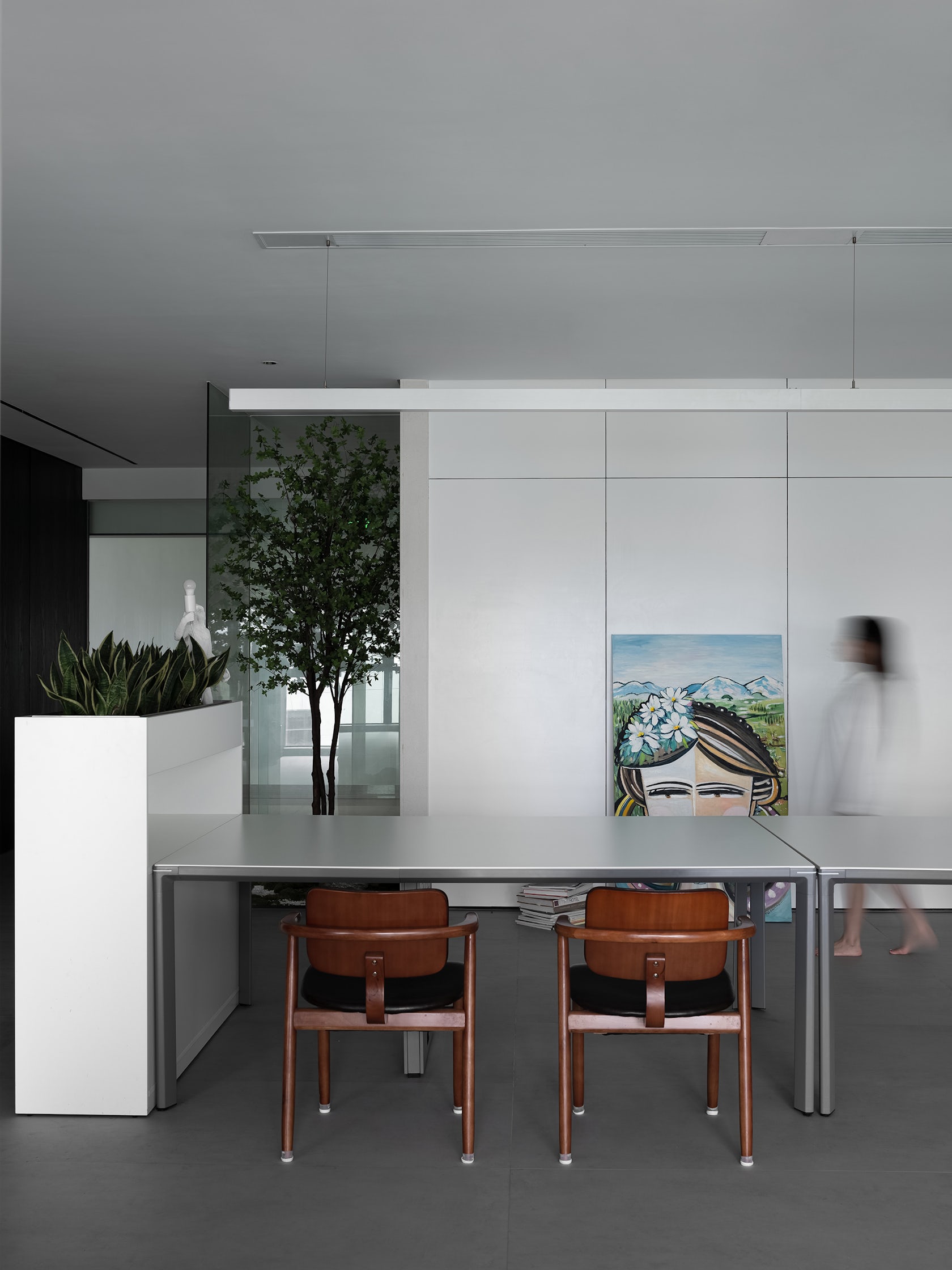
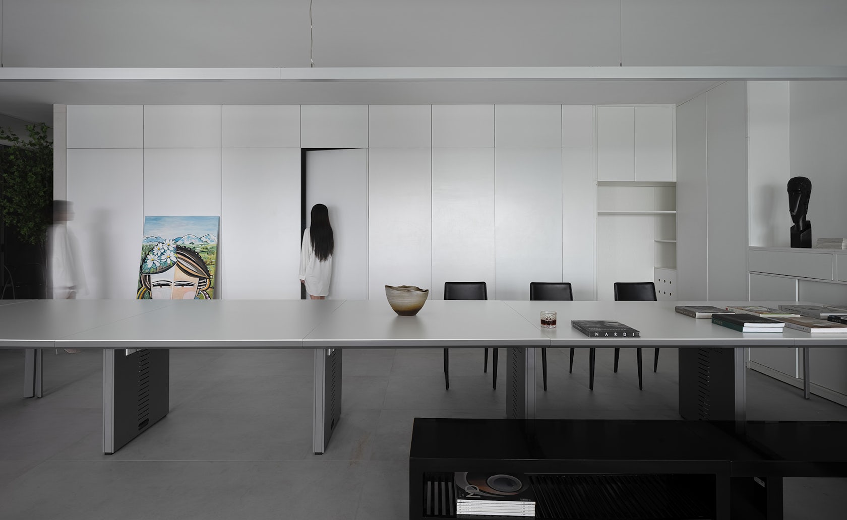
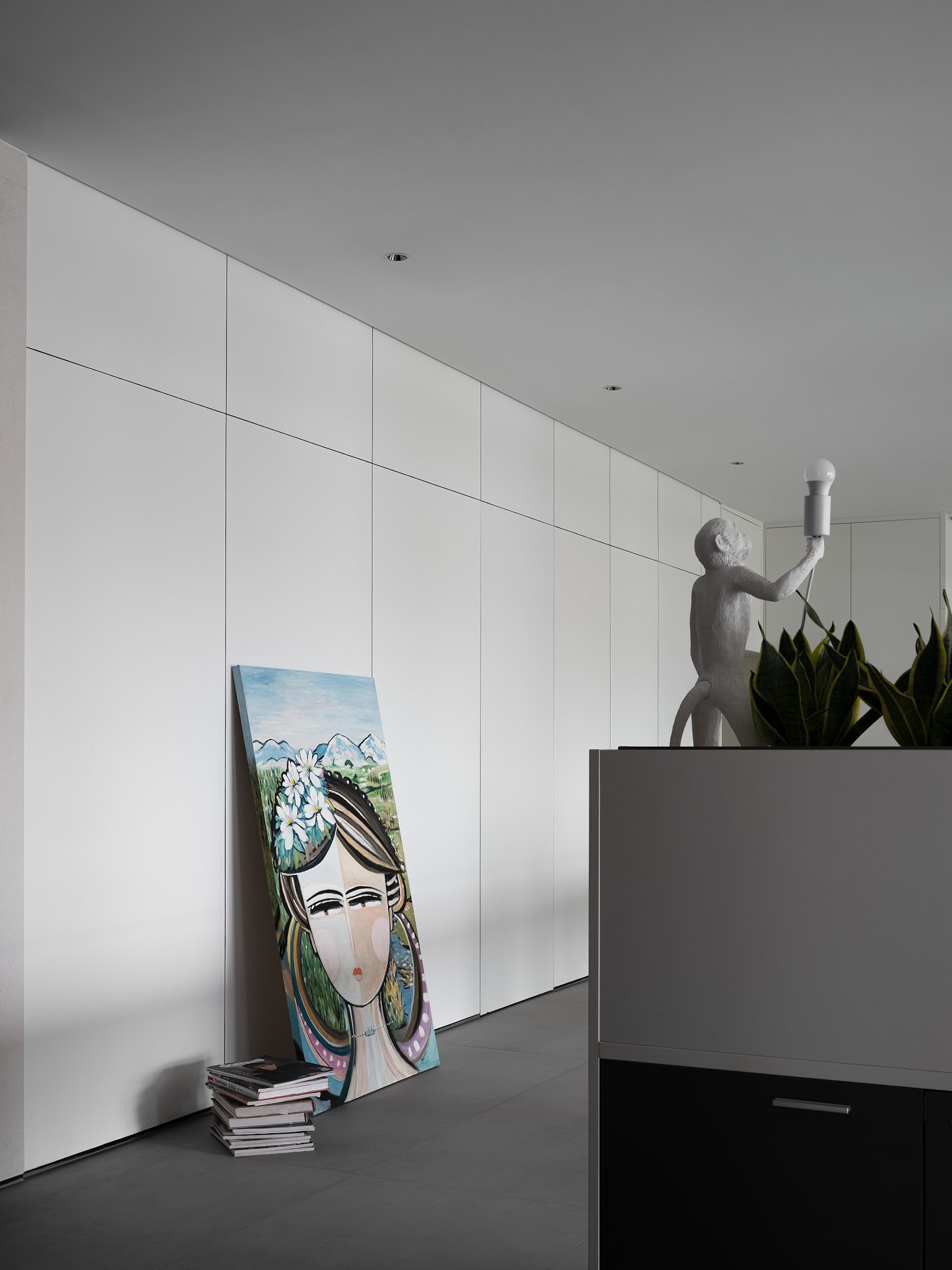
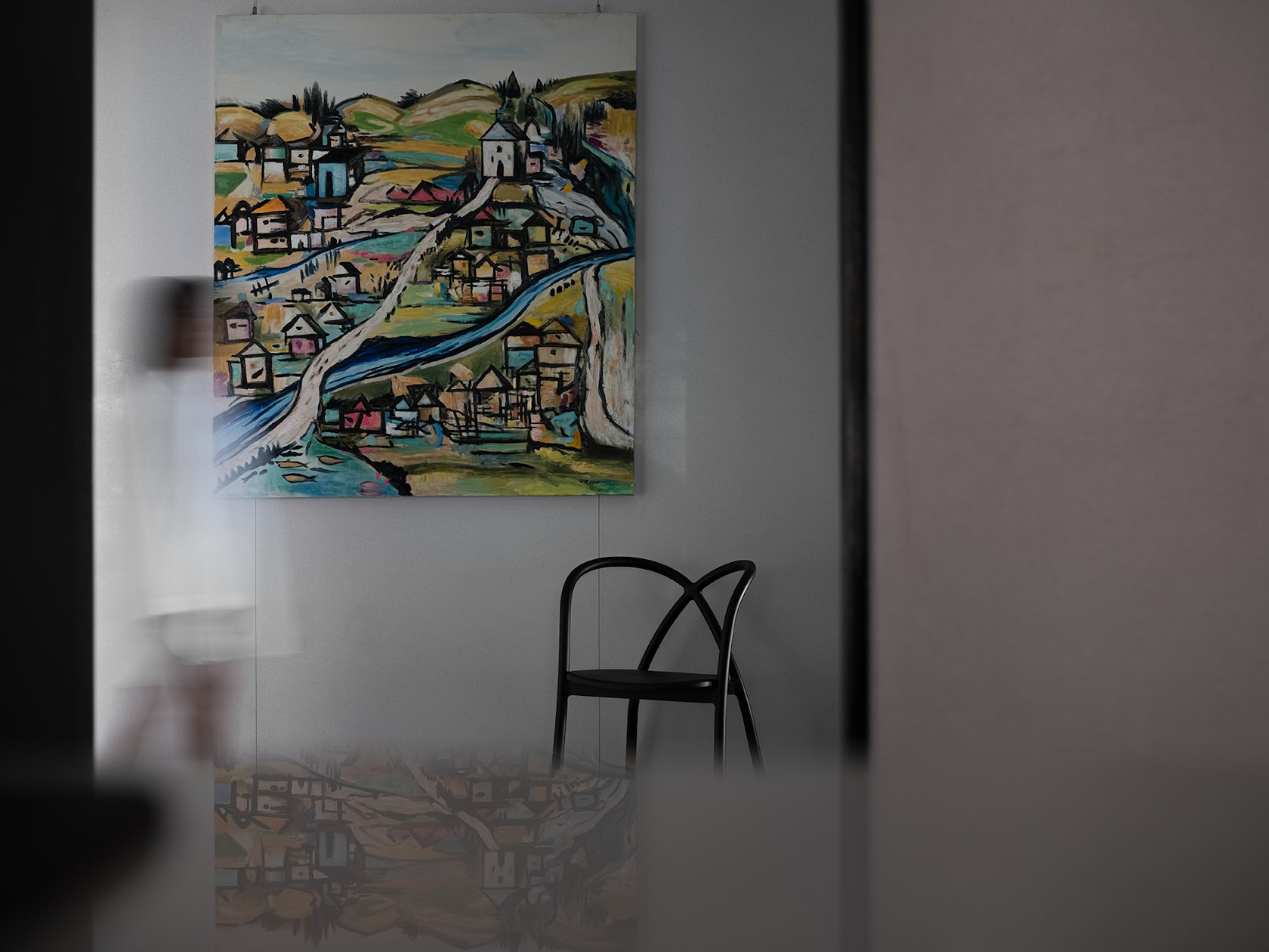
The orderly blocks, green plants, and natural lightsform a flowing spacewhere the consistent saturationmakes people more peaceful.Decorative paintings that light up the white paletteinject a warm texture into the pure space,becoming an interesting embellishment.Outer space can be used for public events,in which everyone can sit beside the long tableeither to toast or exchange ideas.It can also be used for daily design creation thinking and sharingeven dance in the open space.The designer hopes to surpass himself constantly in exploration,pursuing the essence of space,balancing the relationship between practicality and beauty,and making it a carrier for seeking inner peace.Space is a kind of state,in which all objects are moments on the timeline.Multiple states in space can exist at the same time,and different spaces connect to each other on the same timeline.The design of the aisle encourages people to experiencea state of pause and meditation,making people who are extremely stressed in the busy city lifeget relaxation and rest.It also acts as a spiritual harbor for designersto meditate and be cheerful.02IMMERSIVE INNER AREATaken space transition as the spread of emotions,the reception areais a clever combination of vision and function in an orderly manner.Visible from the layout,the black part of space features complex functionsto release a lot of volume transferred to outer space.Connecting the natural environment outside the window with the black inner space,this transitional space has a relaxed atmosphere like an outdoor courtyard.The complete interior form and the application of the black wallstrengthen the intention of blurring indoors and outdoors.Quiet and private reception spaceand spacious and open public spaceare separated by walls,but also connected to the outdoor natural landscape.The relationship of different function areas,including the contrast between big and small, white and black, sparse and dense,release and retraction, forms a unique rhythm of space.03THE STRUCTURE BOUNDARYGeometric surfaces and linesare staggered and contrasted in space,achieving the aesthetic balance of straight and curve.The designer hopes thatvisitors will be moved by the space instantly,and the staff who work here every daywill perceive the eternal peace.Once stepping into the space,one can tell at a glance this is an office;but when staying a little longer,it seems not just an office.Into the details of time,and in a disordered and unknown life,the designer is looking for something certain.With curiosity and exploration of the unknown,he uses a rich and diverse design languageto liberate clearly defined space,where the spiritual dimension is generated from the aesthetic field,so as to achieve true freedom and openness.Ordinary office cubicles can easily result in a “self-isolation” working state.
© Design aesthetics
© Design aesthetics
In this project, we try to reshape and create a more suitable “outside and inside relationship” by reversing the original space order.
The direct architectural logic of “BOX IN THE BOX”, coupled with outdoor space, naturally forms a three-layered nested structure, in which the inside is the outside, and vice versa.
© Design aesthetics
© Design aesthetics
The so-called ideal building can be an external space similar to the interior, and an internal space similar to the exterior. The building is not to build an internal space or an external space, but to build an abundant place between the inside and the outside. The project emphasizes the “selectivity” of space and abandons the “distance limitation” imposed on people by architecture to transform space attributes, allowing the temperature to penetrate and subvert the rigid and indifferent routine working atmosphere..
© Design aesthetics
© Design aesthetics
