Before & After – A 1960s Split-Level Turned Three-Story Home In Seattle
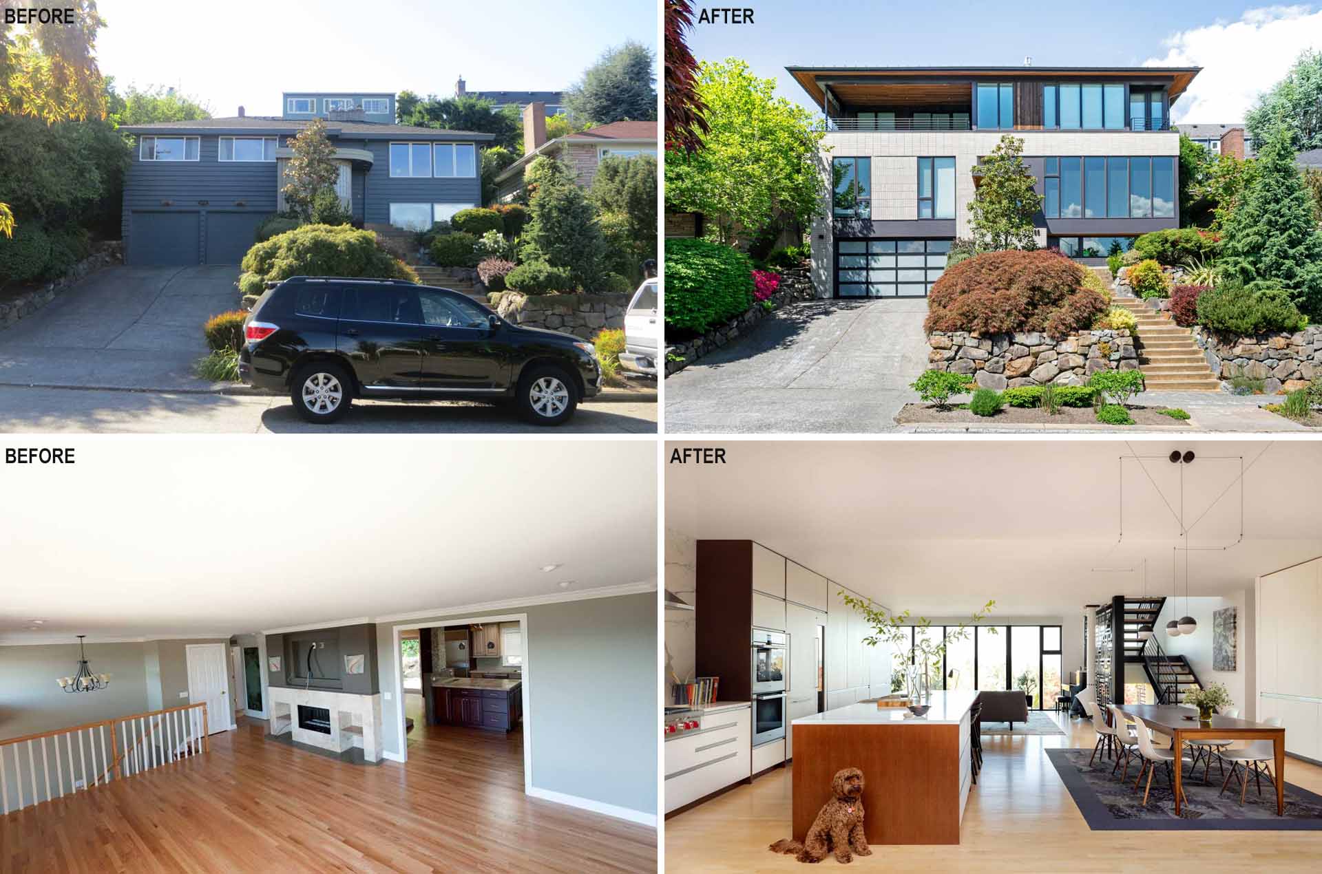
Floisand Studio Architects has sent us photos of a remodel project they completed in Seattle, Washington, that transformed a 1960s split-level home into an updated design for a family of five.
The project’s goals were to modernize the space, add a third floor, relocate the primary bedroom, and open up the main floor living space.
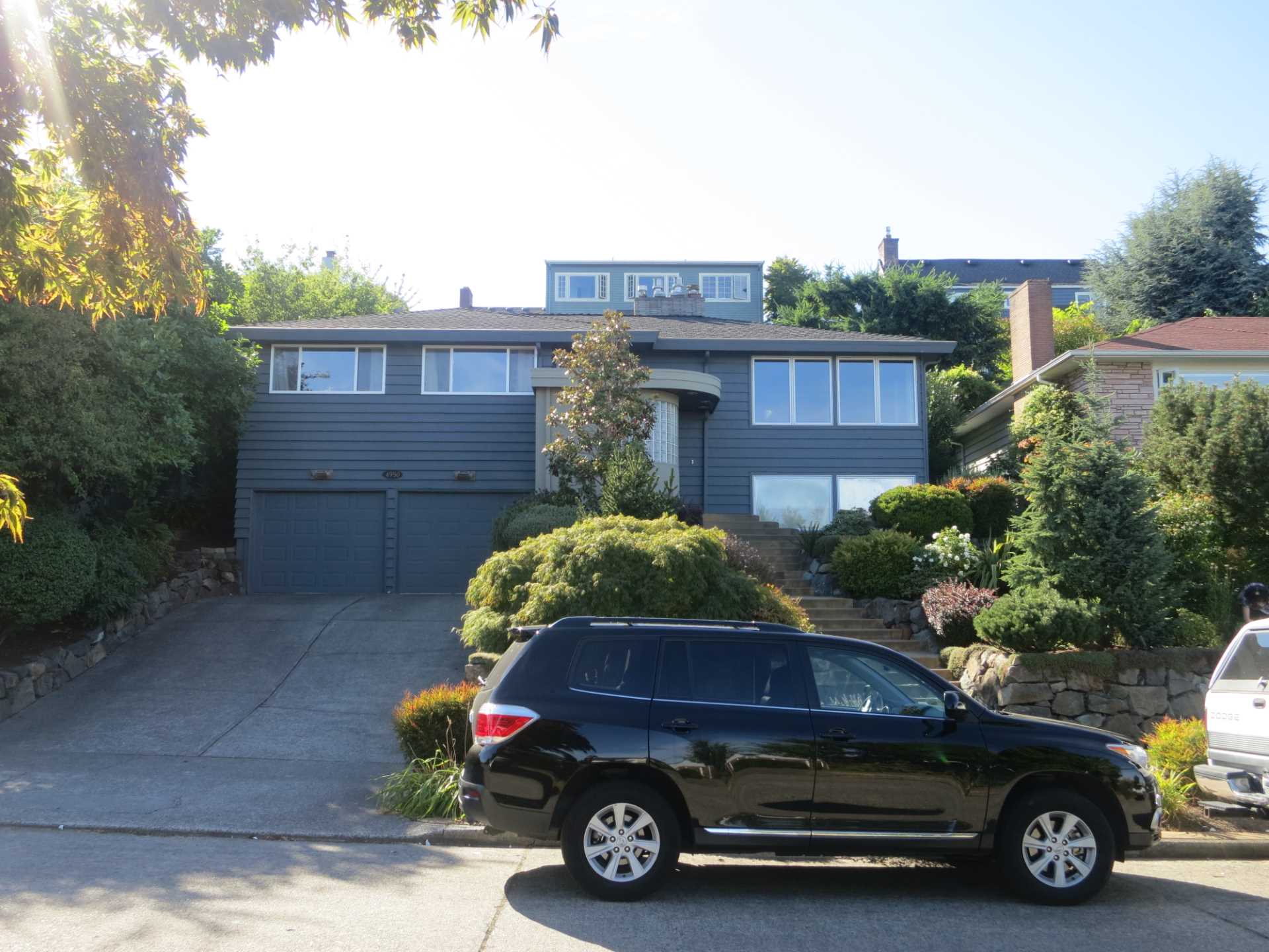
Before – The Exterior
Often referred to as a ‘bi-level’ home, the original home was two floors with a protruding entryway.
Photography provided by Floisand Studio Architects
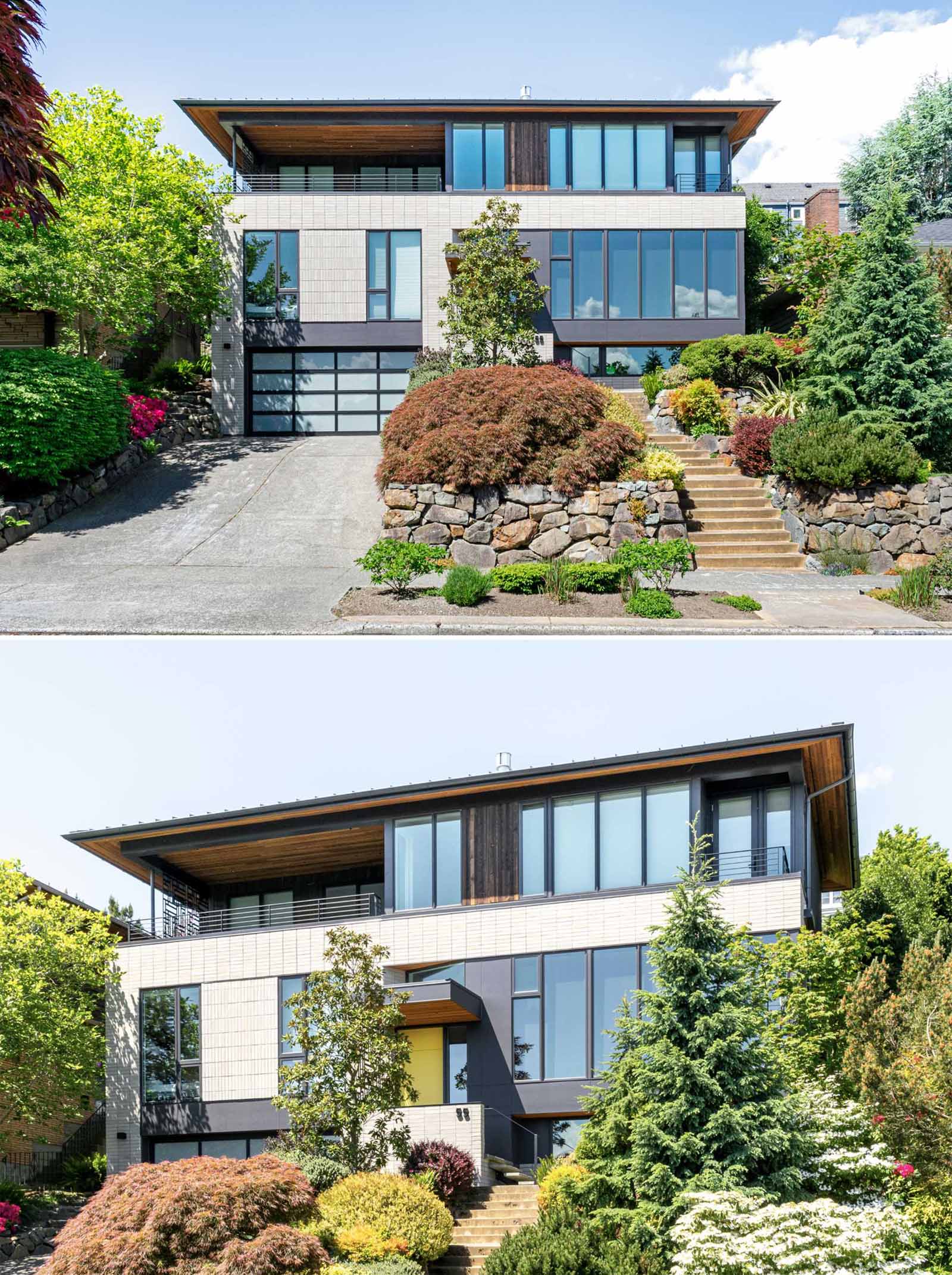
After – The Exterior
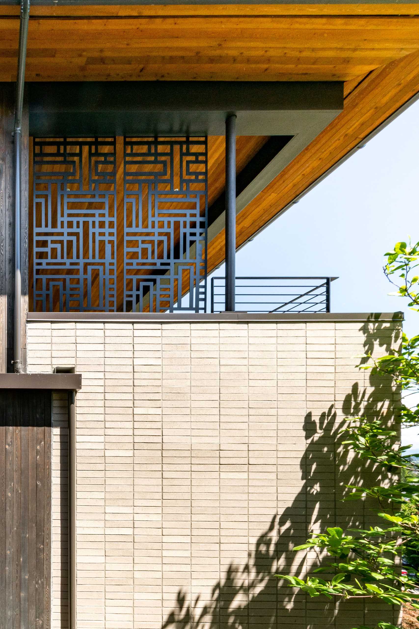
While Floisand preserved the basic structure of the original split level, everything else underwent significant changes. A ribbon of windows adorns each floor, allowing for abundant natural light and showcasing the surrounding views.
Photography by Floisand Studio Architects
Photography by Floisand Studio Architects
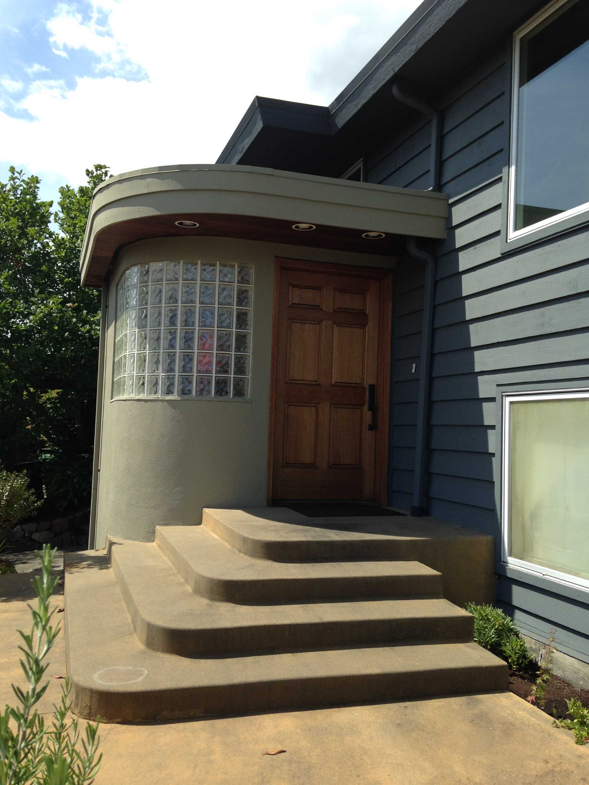
Before – The Front Door
The original front door was a solid wood wood nestled within a protruding addition with glass blocks.
Photography provided by Floisand Studio Architects
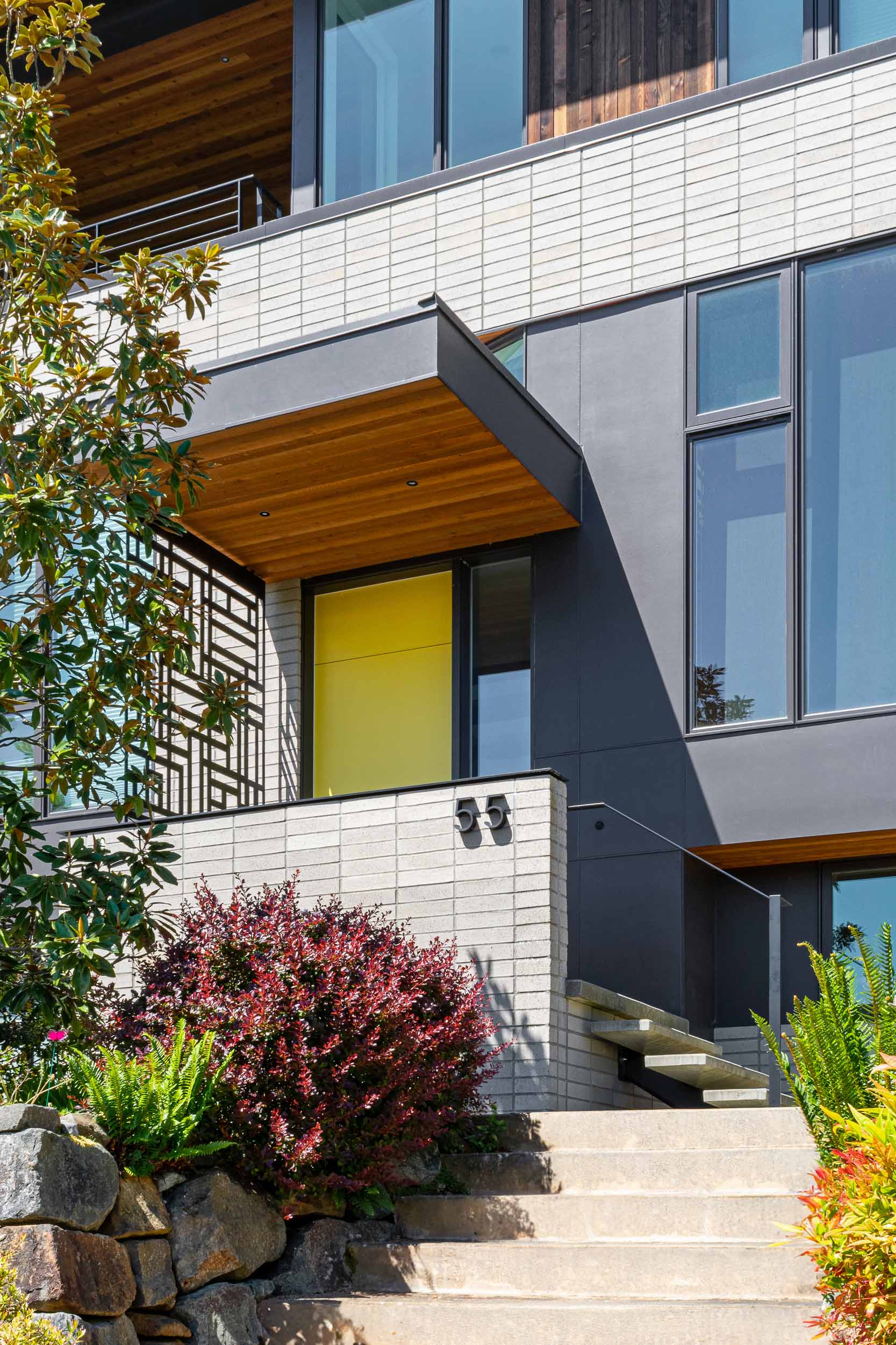
After – The Front Door
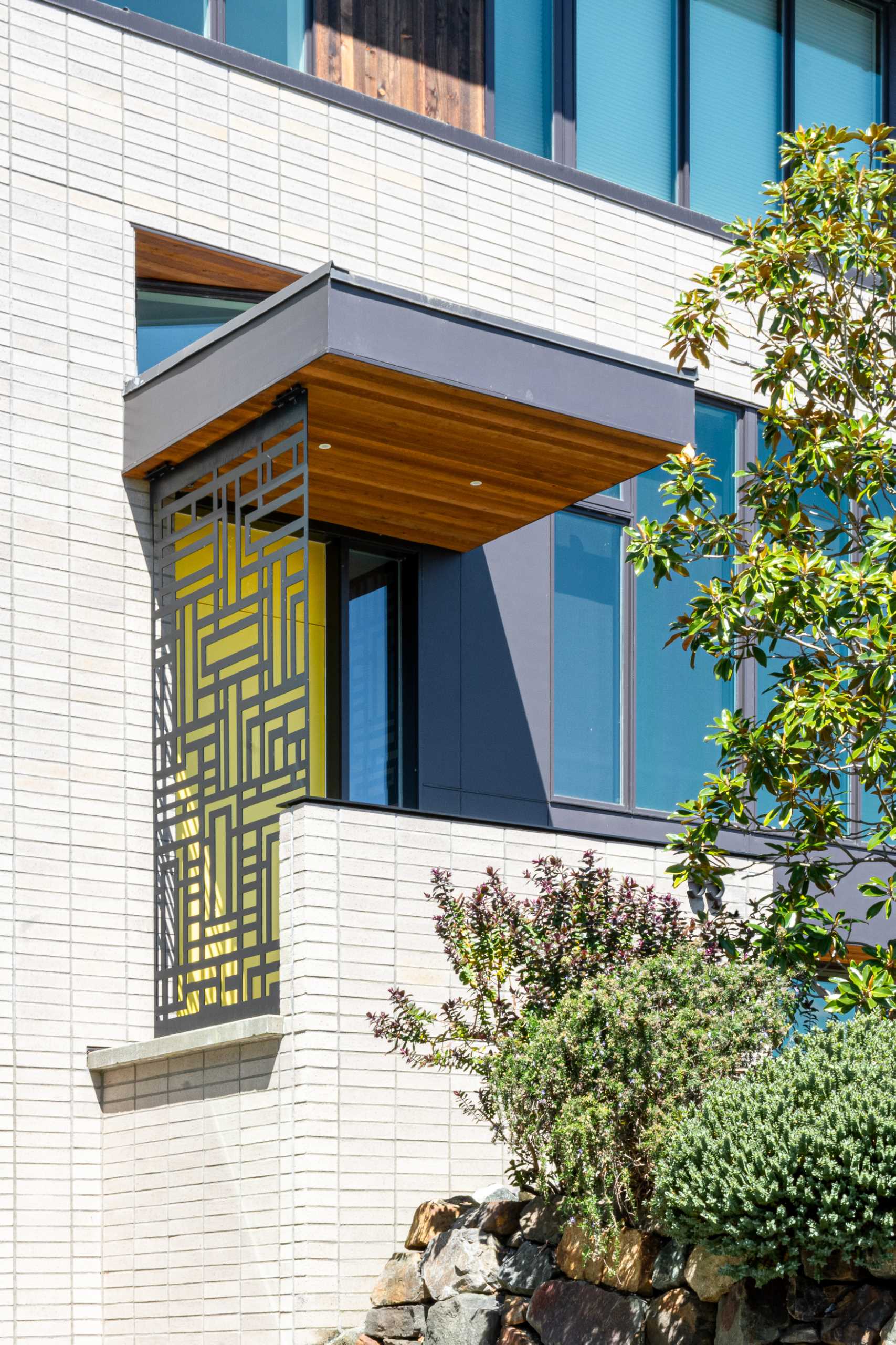
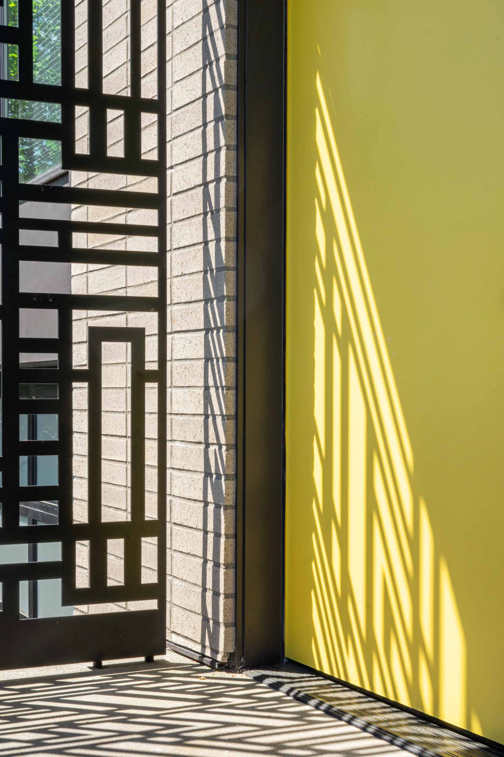
The entryway of the home was given a fresh makeover, with steps leading up to a metal screen and a bright yellow door.
Photography by Floisand Studio Architects
Photography by Floisand Studio Architects
Photography by Floisand Studio Architects
Before – Living Room
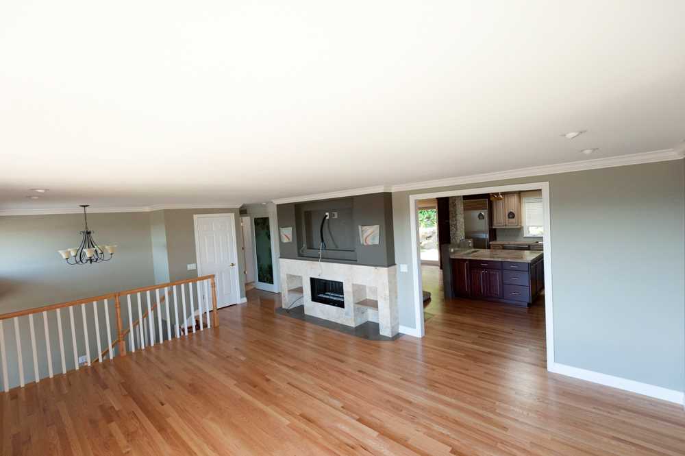
The original living room was separated from the kitchen and dining room.
Photography provided by Floisand Studio Architects
After – The Living Room + Fireplace
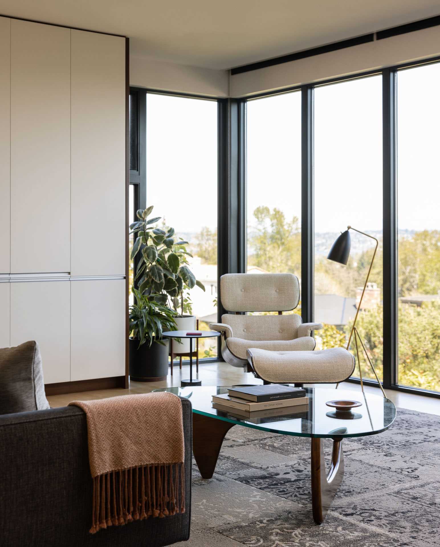
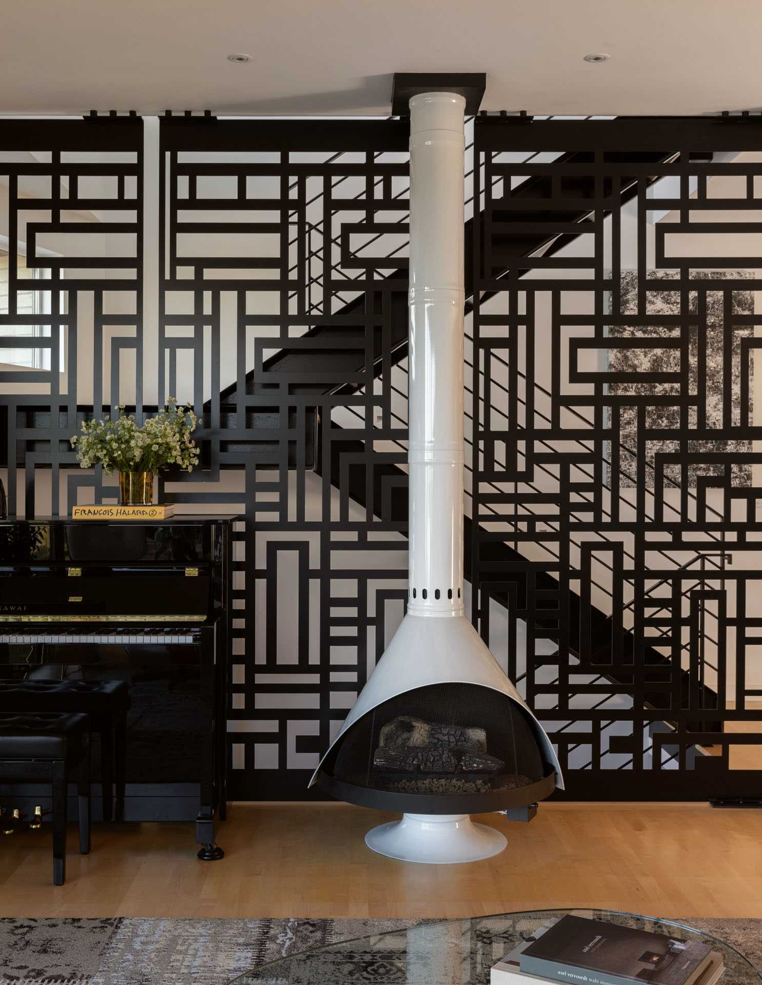
The interior walls of the living space were torn down, creating an open living, kitchen, and dining area. the living room at the front of the home was expanded. A new fireplace was also added.
Photography by Rafael Soldi
Photography by Rafael Soldi
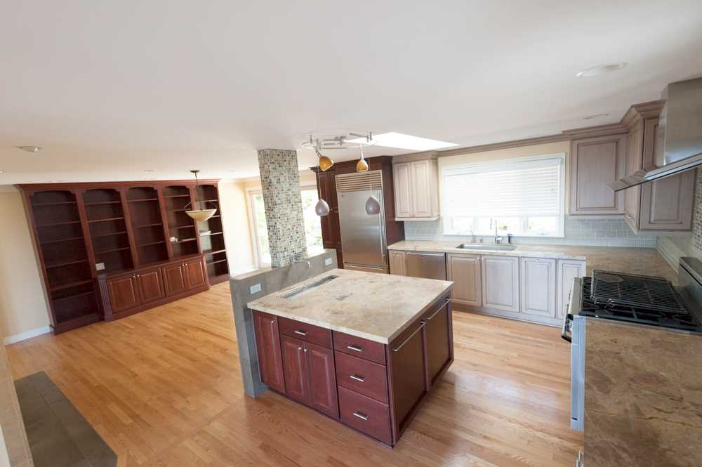
Before – The Dining Room and Kitchen
The original dining and kitchen area had a combination of dark and light wood cabinets.
Photography provided by Floisand Studio Architects
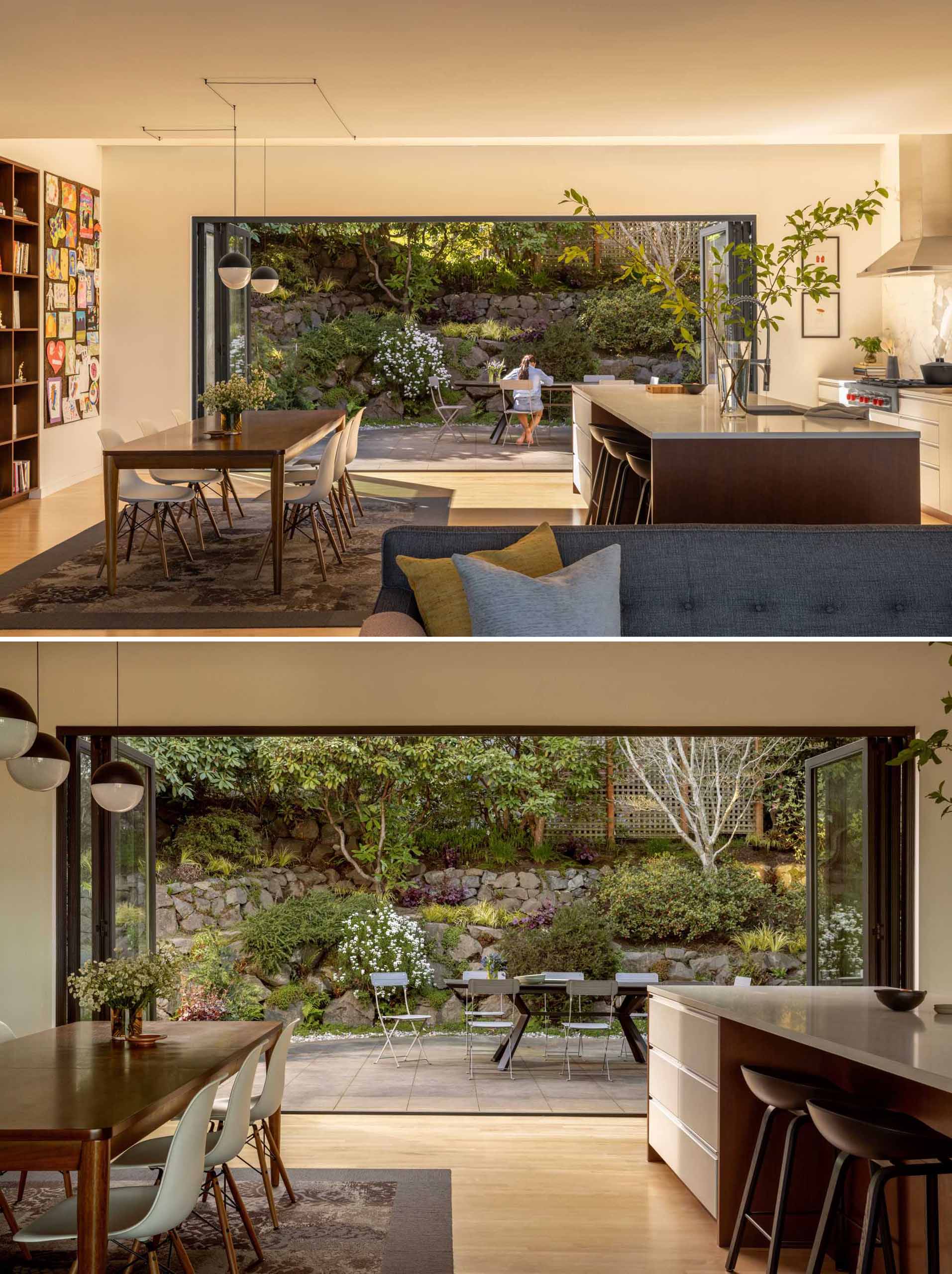
After – The Outdoor Space
This open area at the other end of the social space is dedicated to the dining area and kitchen. The area is framed on one end by a vaulted ceiling, which leads to a protected patio accessible via large glass sliders, and on the other end by a wall of windows offering water views.
Photography by Rafael Soldi
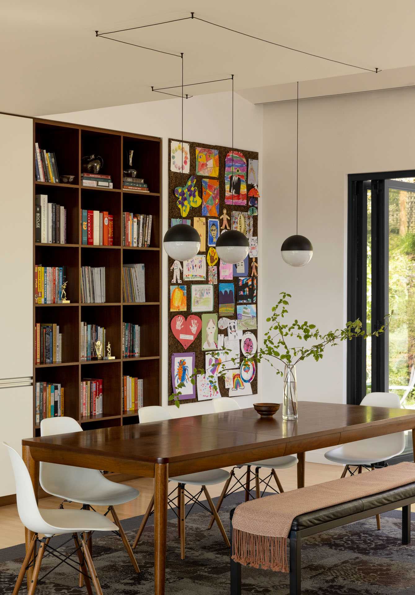
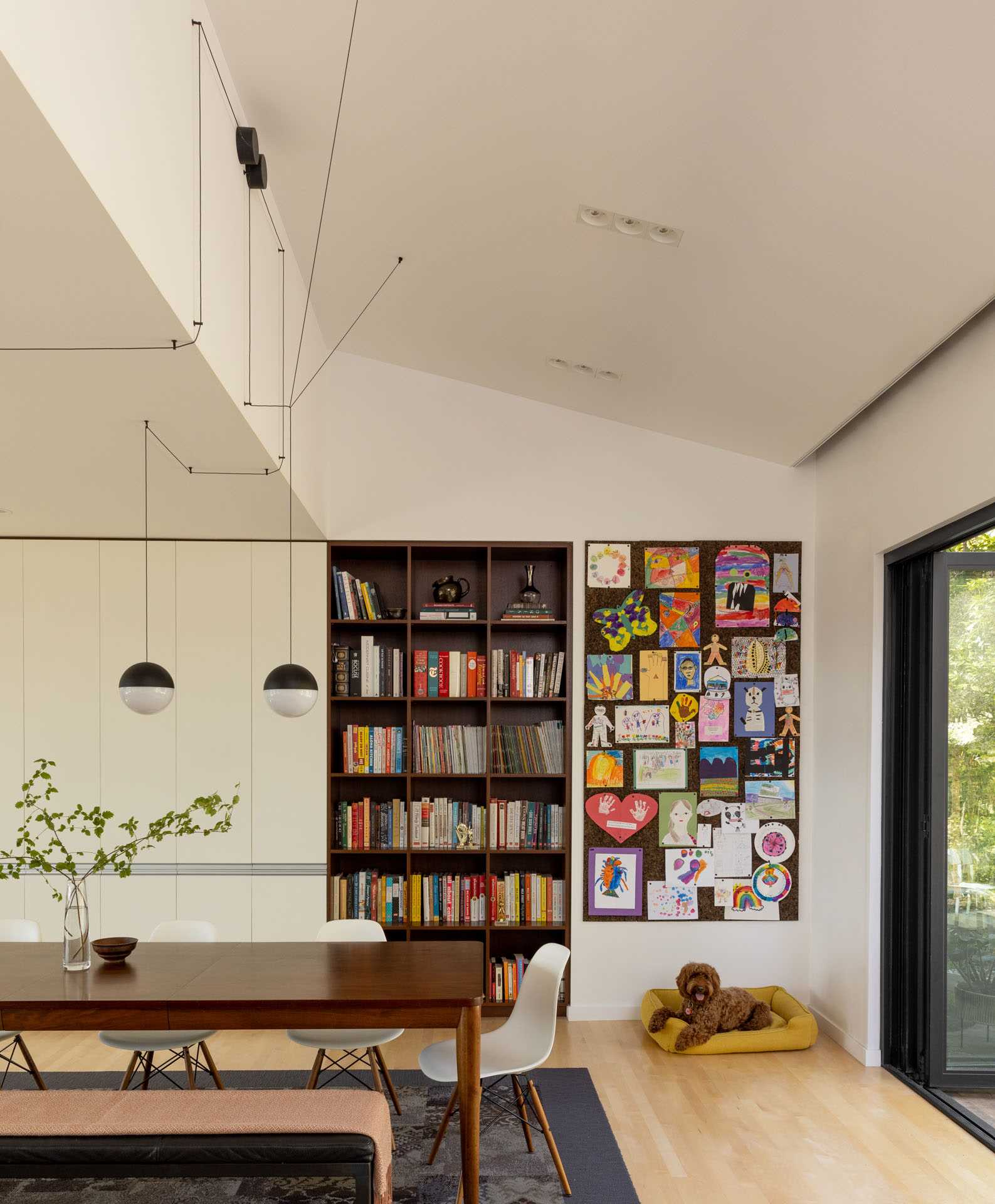
After – The Dining Room
The dining room has a large wood dining table with bench and chair seating, as well as a wood bookshelf and art wall.
Photography by Rafael Soldi
Photography by Rafael Soldi
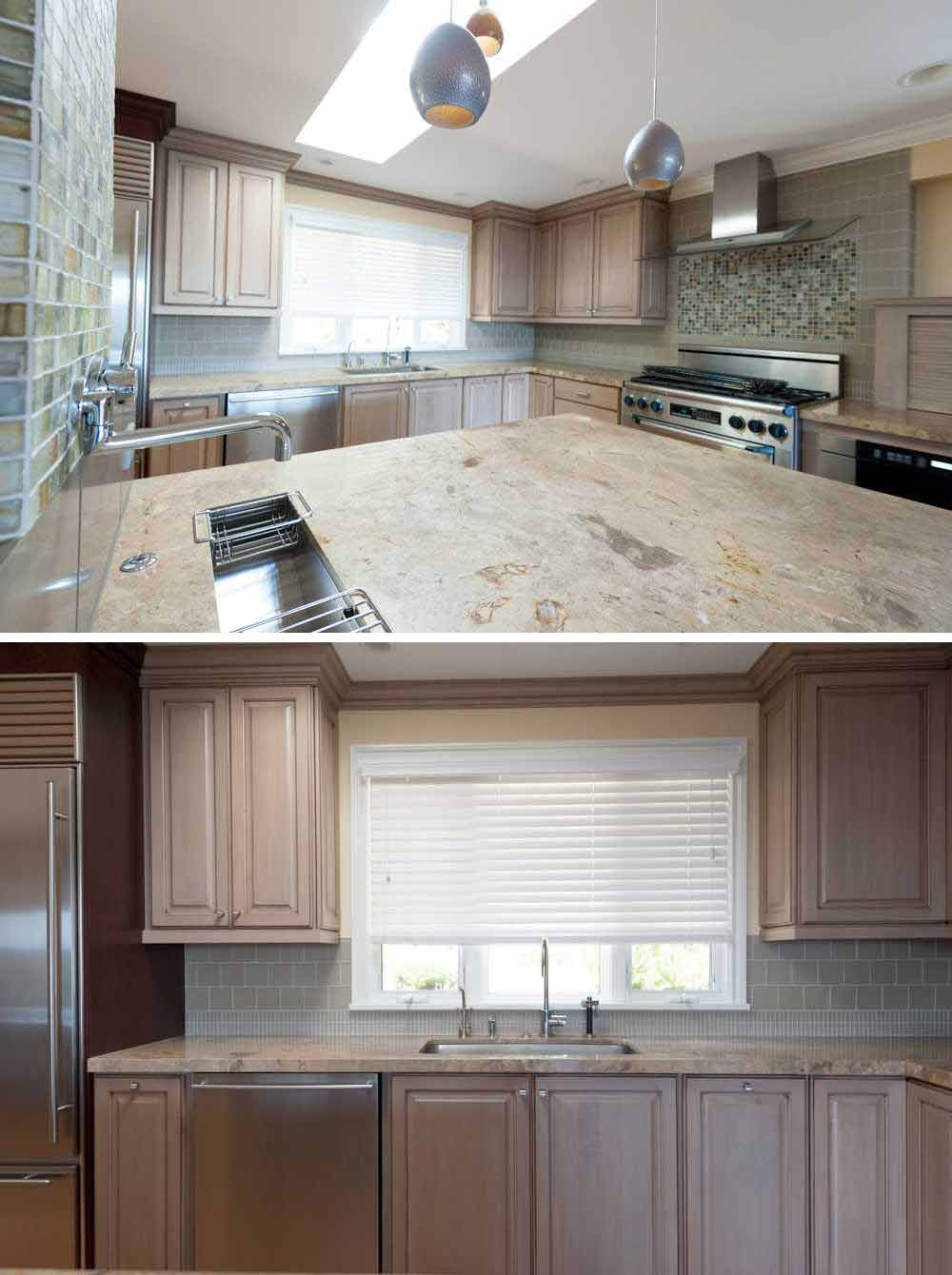
Before – The Kitchen
The original kitchen had wood cabinets and multiple different tile designs.
Photography provided by Floisand Studio Architects
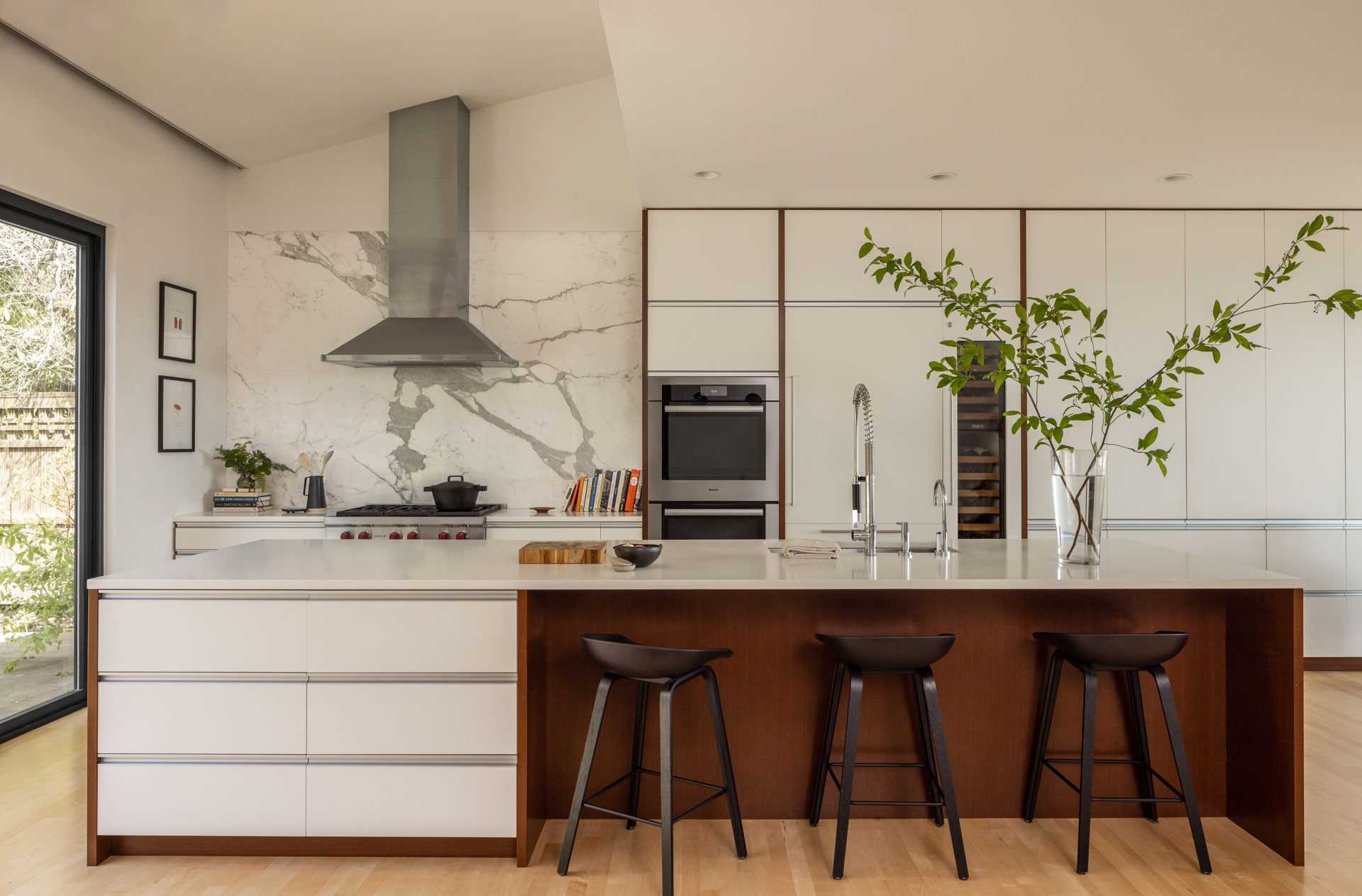
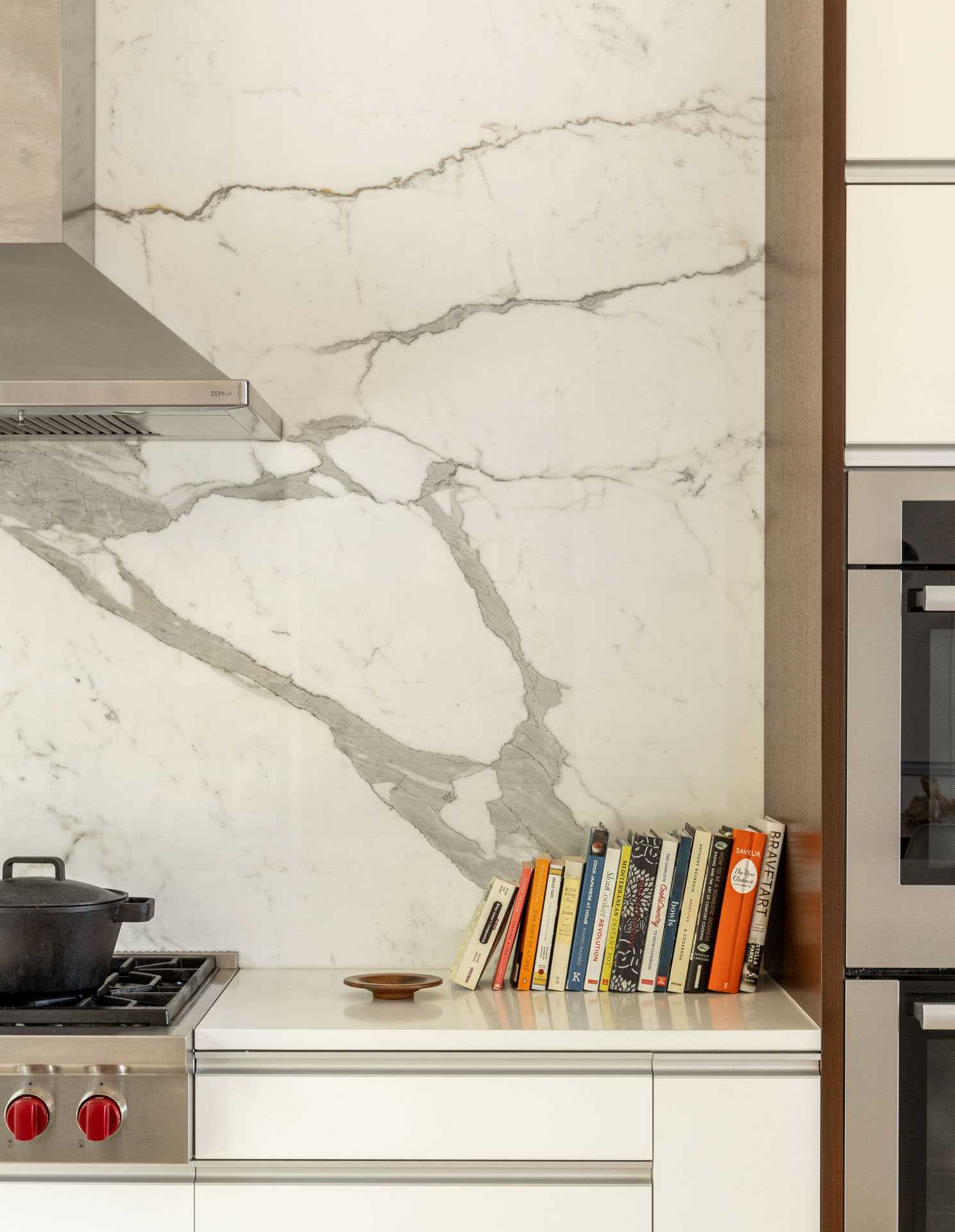
After – The Kitchen
The new bright and open kitchen includes minimalist white cabinets with wood accents.
Photography by Rafael Soldi
Photography by Rafael Soldi
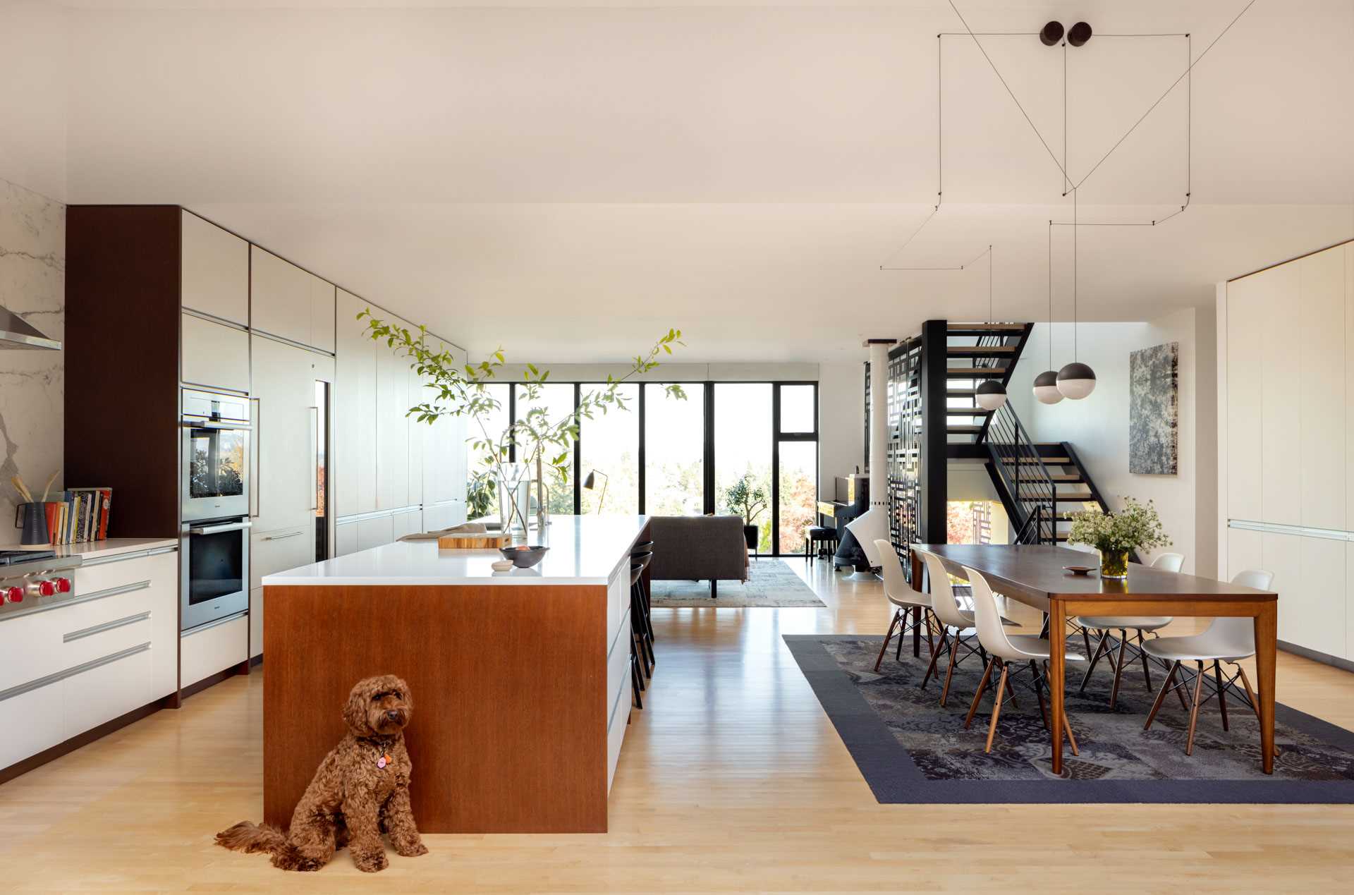
After – The Stairs
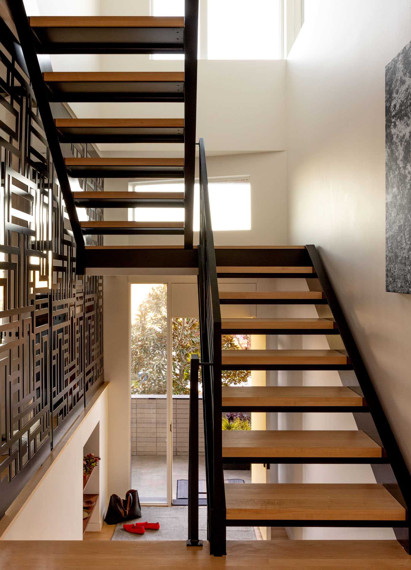
To enhance the aesthetics and functionality of the home, the original closed stairway was replaced with a steel and wood open riser stairwell.
Photography by Rafael Soldi
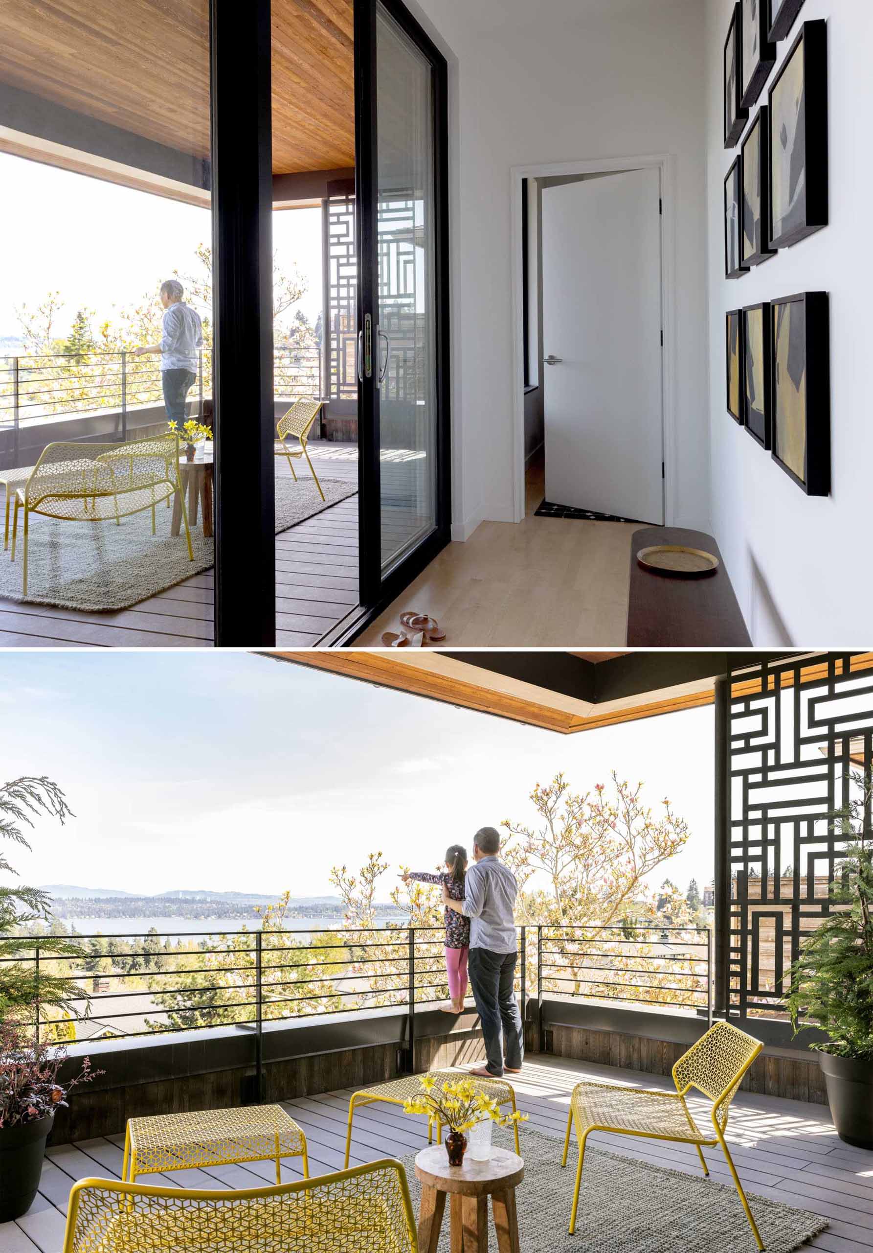
Fall protection was integrated into the design through a patterned steel screen, which serves as a barrier at the new entry porch, main stair, and upper deck. This screen not only ensures safety but also allows filtered light to permeate the adjacent spaces, creating an inviting atmosphere.
Photography by Rafael Soldi
After – The Deck
Due to an additional floor being added to the home, a new space was created for an additional outdoor area.
Photography by Rafael Soldi
Before – A Bedroom
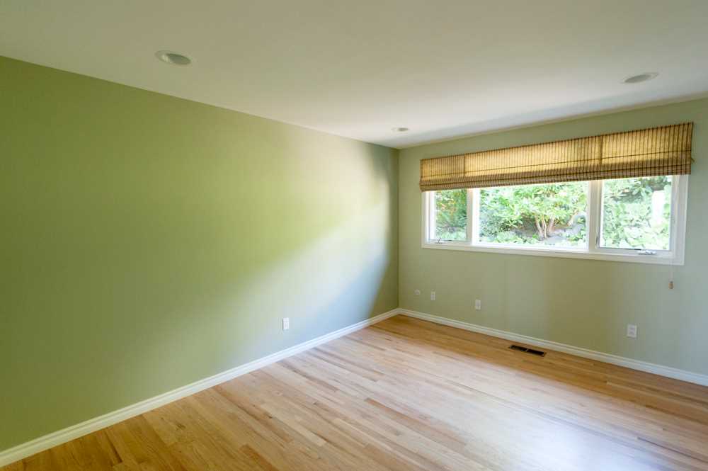
Here’s one of the original bedrooms that includes green walls, wood floors, and white window frames.
Photography provided by Floisand Studio Architects
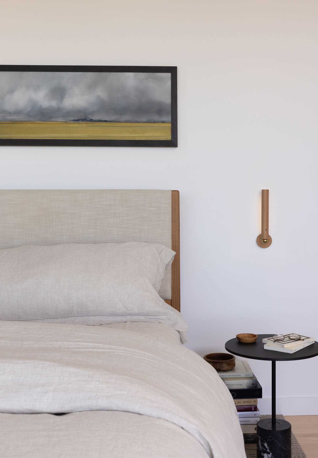
After – The Primary Bedroom
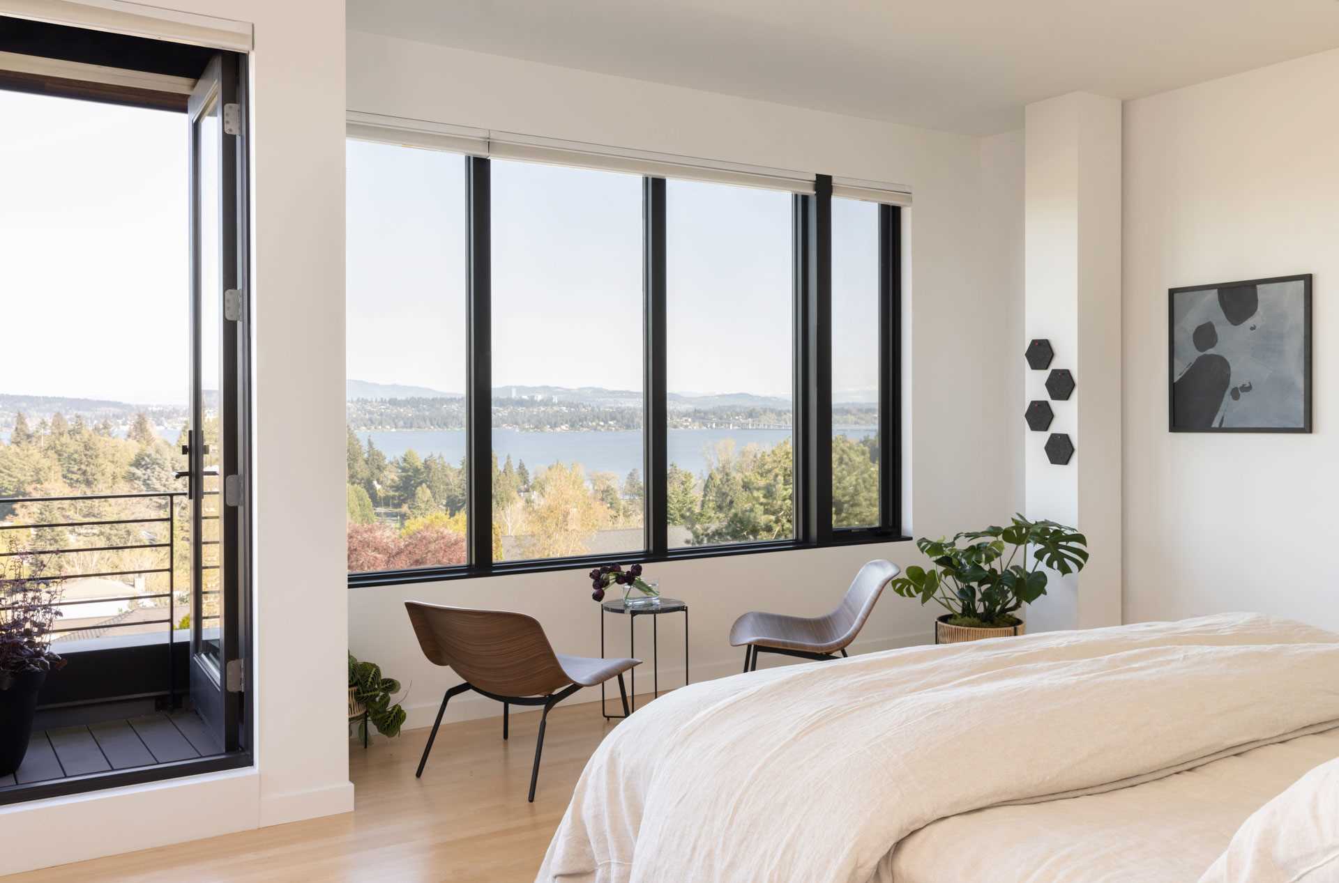
The primary bedroom was relocated from the basement to the newly added third story. Black-framed windows allow for a picturesque view.
Photography by Rafael Soldi
Photography by Rafael Soldi
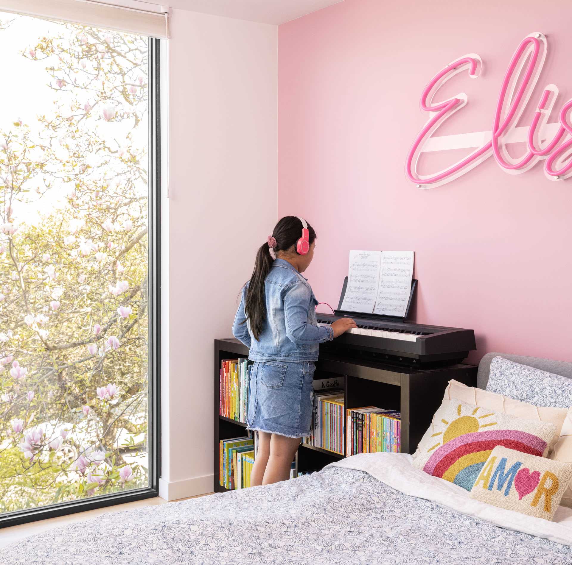
After – A Kid’s Bedroom
In one of the kid’s bedrooms, a pink accent wall with a neon sign creates a fun and colorful environment.
Photography by Rafael Soldi
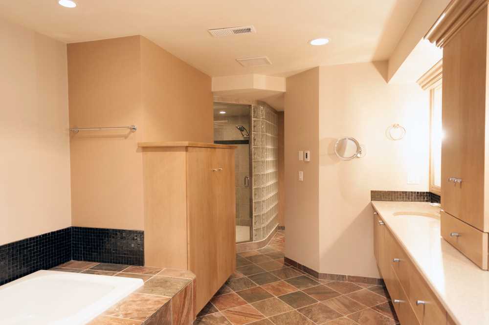
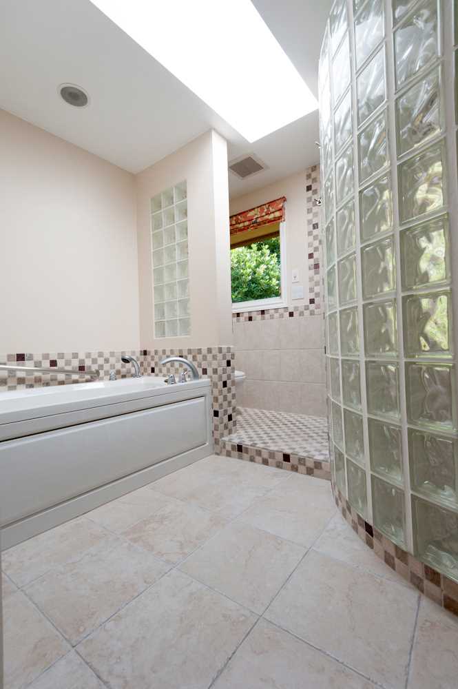
Before – The Bathrooms
The original bathrooms both include glass blocks, as well as tiled bathtub surrounds.
Photography provided by Floisand Studio Architects
Photography provided by Floisand Studio Architects
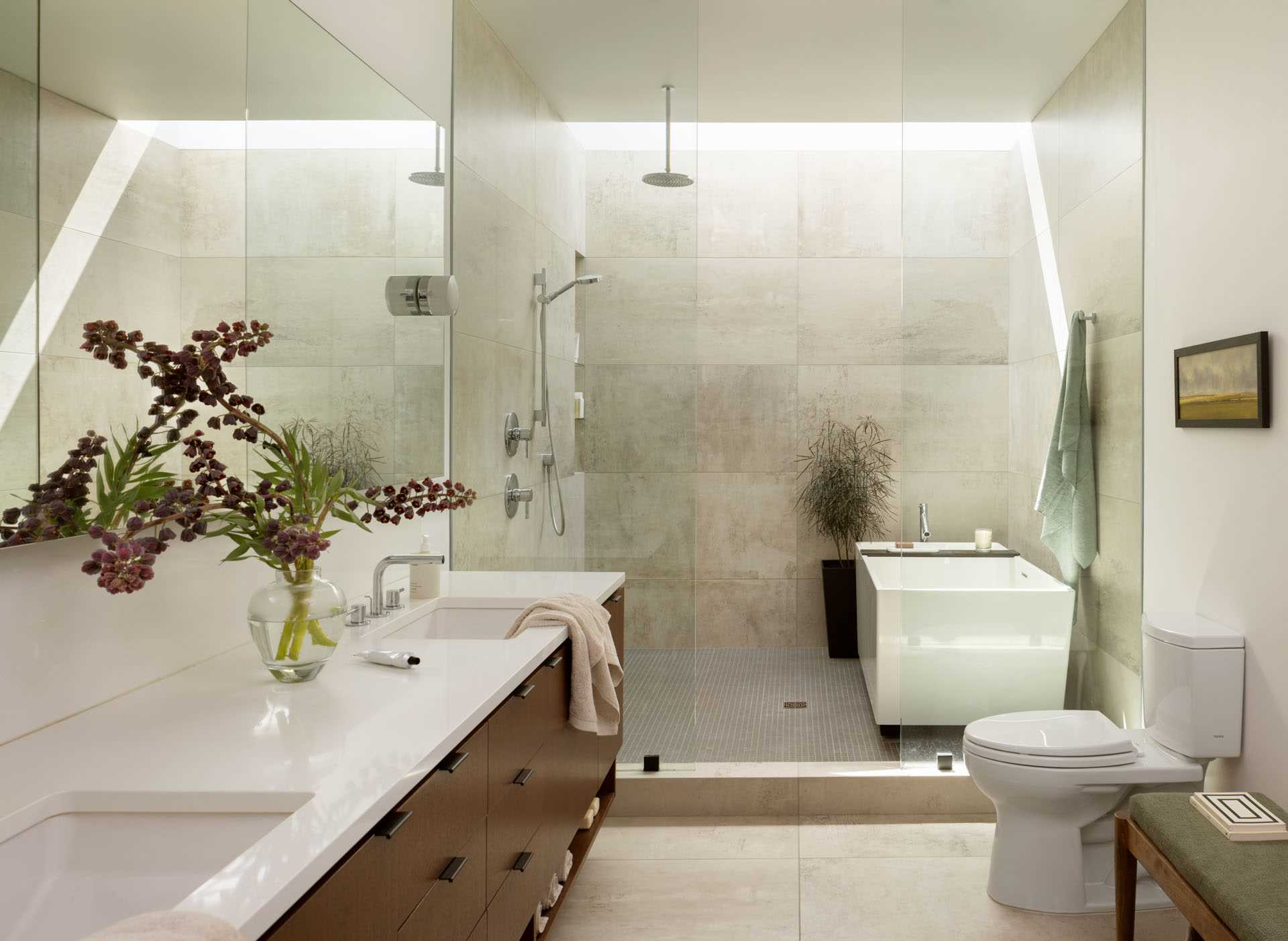
After – The Bathroom
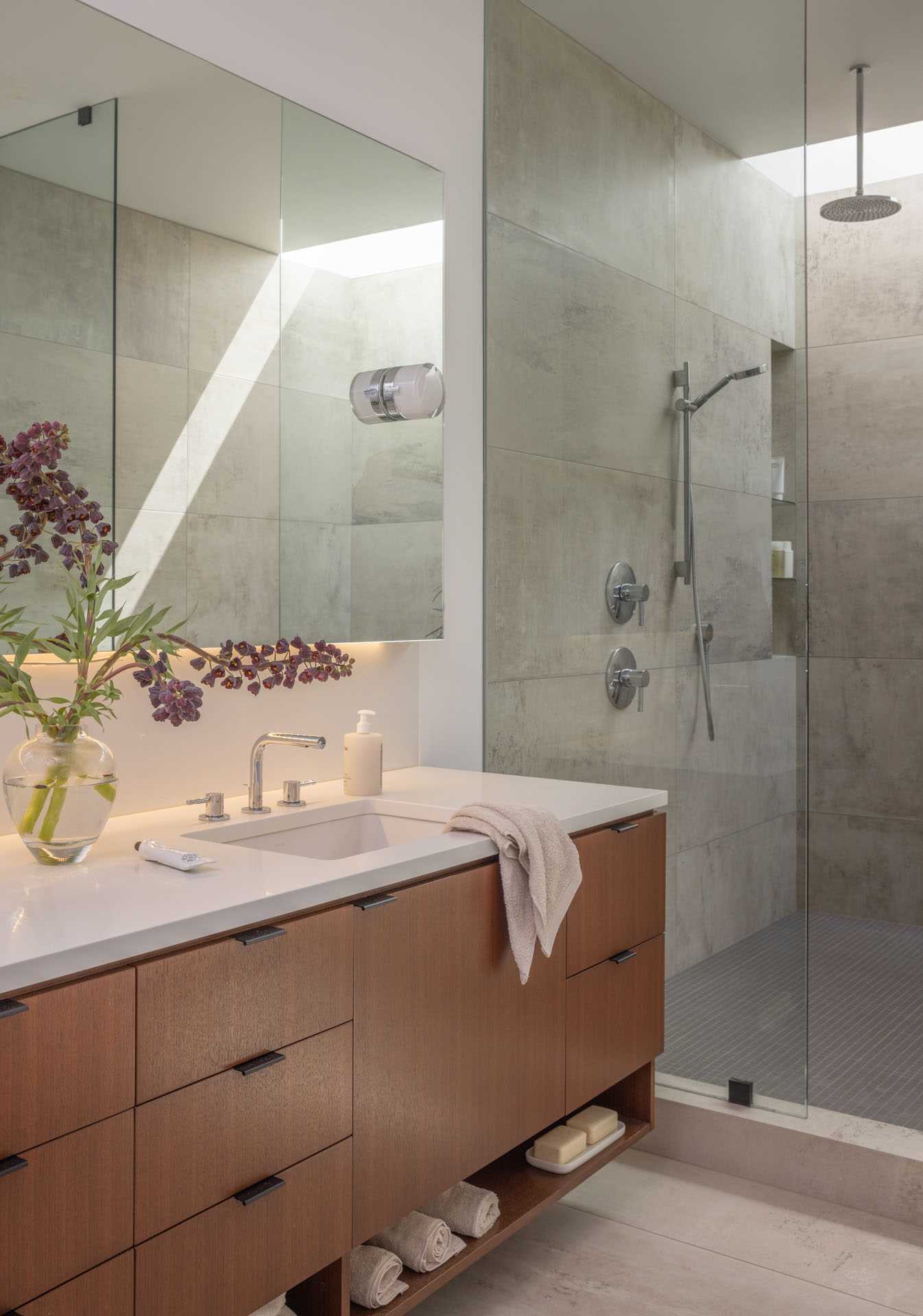
The back side of the home, where the bathroom is situated, faces the windows of neighboring homes on the hillside above. To address this, a wide skylight was incorporated, spanning the length of the wet room. This skylight serves the dual purpose of bringing in natural light while ensuring privacy.
Photography by Rafael Soldi
In addition, a custom mirror was strategically placed above the vanity, creating the illusion of depth in an otherwise relatively narrow primary bathroom. This design element adds a sense of spaciousness to the area.
