Beans and Beams: 17 Projects that Explore the Design Elements of Coffee Shops
Beans and Beams: 17 Projects that Explore the Design Elements of Coffee Shops

Coffee shops have always been popular gathering spaces among coffee lovers, but with the rise of remote working, especially post-pandemic, they have become a hotspot for remote workers and students as well. One of the many reasons why they are such a popular hangout spot, other than the fact that they serve one of the most globally-adored drinks, is because of their well-designed interior spaces that promote comfort, relaxation, and productivity simultaneously. After all, it’s always been said that architects and coffee go hand in hand. In this interior focus, we explore how different design elements shape the user experience of a coffee shop, and look at how architects have employed them through 17 examples.
Along with the quality of drinks being served, design plays a major in the success of the coffee business. Designing a café demonstrates knowing how each and every space caters to its users; what it takes for customers to sit and move organically, the dimensions of the space and designated zones, how to utilize the space in a cost-effective and efficient way, how customers on wheelchairs move around the space, and how to comply with and ensure health and sanitary regulations.

While planning a café, architects often dedicate 60% of the floor plan for the seating area, and the other 40% for service, storage, etc. Within the two main zones, a typical coffee shop is divided into sub-units based on the activity being performed there: back kitchen & storage, drink/food prep, order, service, main circulation, high table seating area, lounge area, coworking space, and sanitary facilities, with each being designed individually. Although the amount of different units differs based on the scale of the interior space, almost every coffee shop takes into account the following keywords: accessibility, practicality, efficiency, and comfort. A properly organized plan makes it easier for employees to move around and multi-task, going back and forth between the drink preparation and serving area, as well as effortless for customers to understand how they will move around the space.

Read on to learn more about the main design features of a coffee shop and how they’ve been employed by architects through 17 projects from our database.
Coffee Bar & Service Area
Many architects prefer beginning their design process from the “back of the house”, where the storage and employee-related facilities are allocated, and design forwards, ending with the seating area. This strategy ensures that the main functions have been given enough space for an optimized workflow, and that the equipment (refrigerators, coffee machines, etc.) can be installed without any spatial compromises or obstacles. These operational spaces, which take up the 40% of the general plan, are handled differently since it involves storing and preparing alimentary products. Therefore, while designing this part of the café, architects choose material and finishes that are safer and easier to clean, and install independent HVAC units that ensure complying with sanitary regulations.


Blue Bottle Coffee Kanda Manseibashi Cafe / Schemata Architects

Storage
Coffee shops require an abundance of storage space, especially around the service area and back kitchen. In projects with limited space, employees need to move around comfortably, so efficiency is key. Therefore, the optimized way to integrate storage is through vertical shelving units that go all the way up towards the ceiling, as well as the more common storage units such as beneath the counter.
Store and Bistro Erva Santa / Moca Arquitetura

Kettl Tea Flagship / Michael Tower Architecture

Employee Circulation
When it comes to the employee zones, the emptier and more organized the space is, the more comfortable, productive, and safe they will be. Ideally, employees should not be crossing paths frequently, and should not be walking back and forth multiple times to serve customers, as it could delay the preparation and serving process, and tire the baristas. To avoid that, organizing the workspace into stations gives them the ability to reach all the tools and products they need by rotating 360 degrees from where they stand, making it less possible for them to cross paths with each other, and more efficient to work. Although having a preset menu helps predetermine what equipment is needed and how much space they’ll take up from the service area, allocating each machine across the bar in order of usage helps employees define where each task is performed and creates an easier workflow.
YAMA Coffee Shop / KSOUL Studio
_20210527_-_Ksoul_-_Yama_13.jpg?1649838480)

PAGA Microroastery / Taste Space

Customer Circulation
As soon as customers enter the space, they should have a defined sense of direction as to how their journey is going to take place, which can only be dictated by the floor plan. The plan determines how and where customers line up, gives them an overview of the available food selection, where they will sit, and how long they’ll be sitting there, etc. In addition to the customer journey, the way the layout is planned can also define the length of the cue line during rush hour, and how obstructing it is to other customers at the shop, which can be very influential on the overall customer experience. Therefore, architects often designate the cue line to be on the side and away from the seating area, and in a very sequential manner; laying out the step-by-step process of purchasing a drink throughout the space, taking into account that some customers will choose to stay, and others will just take their drink and leave. Architects also prefer to have a circular customer flow rather than linear, to make room for a larger capacity, and avoid combining those who are waiting to pick up their drink with the same area where others are ordering.
NOC Coffee Co. / Studio Adjective

FabCafe Nagoya / Suppose Design Office

Interior Aesthetics & Ambience
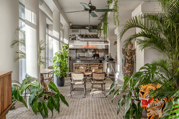
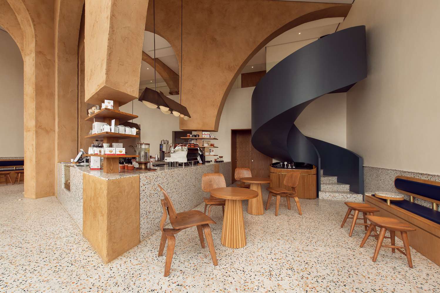
Most coffee shops design their space with a focus on “comfort” and “coziness”. With that in mind, architects often opt for features such as ambient lighting, muted colors, warm color palette, natural materials, and greenery. In some projects, architects and interior designers use design elements that really reflect their particular design concept, whether it being a reference to an architecture movement, or a specific context / mise-en-scene they are trying to convey.
Mustapan Coffee Shop / Estudio Chávarro

Thailand Hi Cafe / balbek bureau


Furniture Selection
While choosing the furniture, it is important to take into consideration functionality, comfort, and ergonomics. Unless the cafe’s business model is very specific in regards to the customer capacity and experience, the space should be able to accommodate different types of customers simultaneously: visitors who came to just enjoy a cup of coffee, the on-the-go coffee lover, study groups, couples, remote workers, etc. Each type of customer requires a unique furniture selection. For instance, study groups will not feel comfortable working on sofas, they would much rather work on a large table with mobile chairs, whereas the lone visitor won’t feel comfortable sitting on a table and chair, he/she would rather sit on a comfortable sofa away from busy communal zones. The type of furniture also determines the amount of customers occupying the space, large comfortable sofas take up a lot of space and entice users to stay longer, limiting the amount of customer turnover. On the other hand, it is important to consider the materials used and how difficult it would be to clean or maintain them frequently.
BASAO Tea Lounge / NORM Architects


Facade
Just as influential as the interior is in shaping the user’s experience, the facade is also crucial in determining the appeal of the coffee shop and how customers perceive the space. After all, first impressions are very powerful, especially to new customers who happen to stumble upon the coffee shop while passing by. The facade and entrance should reflect the space inside and express notions of being welcoming, approachable, and comfortable, whether it being through similar design features or see-through facades that display the interior space. Another approach would be to have a very vibrant and appealing facade that serves as a focal point to get pedestrians’ attention.
September Cafe / Red5studio + Ben Decor

Colchetes Café / Estúdio Brasileiro de Arquitetura

Today is Long Cafe / Absence from Island

Find more coffee shop projects in this My ArchDaily folder created by the author.
This article is part of an ArchDaily series that explores features of interior architecture, from our own database of projects. Every month, we will highlight how architects and designers are utilizing new elements, new characteristics and new signatures in interior spaces around the world. As always, at ArchDaily, we highly appreciate the input of our readers. If you think we should mention specific ideas, please submit your suggestions.


