architensions builds pink tile-clad extension on top of old ranch house in the US
house on house by architensions
New York-based studio Architensions introduces House on House, the transformation of a little suburban home in Babylon, New York. The project includes the addition of a second-floor volume that looks as if a new dwelling has been placed on top of the existing structure. The exterior of the first story preserves the original light gray vinyl siding, while the second floor addition is covered in thick stucco to highlight the solid, heavy massing. In some places, a skin of smooth, light pink rectangular ceramic tile emerges and descends onto the exterior walls of the original home in inverted arcs, arches, and swoops, as if the new is slowly overtaking the old. Both aesthetically and functionally, this design juxtaposes the past and the present.
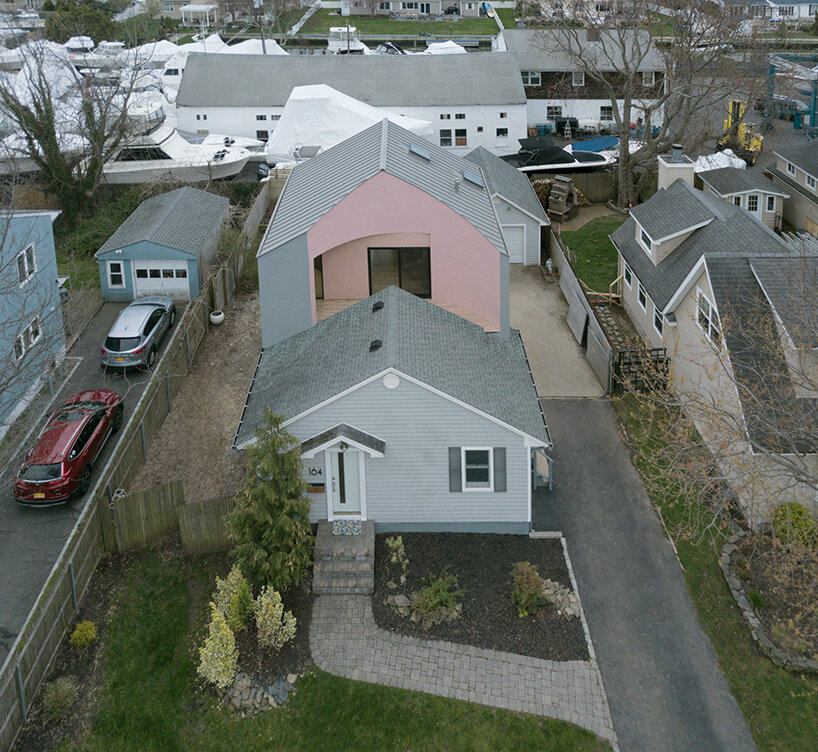
the transformation looks as if another dwelling has been placed on top of the original ranch house
all images by Michael Vahrenwald/ESTO
research of cultural heritage and architectural classification
The transformation started in 2018 after the homeowner asked Architensions to take on a task that mirrored his daring design aspirations and desire to grow. The previous layout of the residence was an introverted enclosure, and the homeowner was interested in changing it into a room where functions were open and conventional ideas of propriety or seclusion were questioned. In addition to making the entire house more open to the neighborhood and permeable to the backyard, he intended to connect the existing ground floor to the expansion above.
This prompt served as the starting point for an intensive investigation into the cultural heritage and architectural classification of the nearby suburban neighborhoods. The design team was particularly interested in the house’s proximity to Levittown, New York, a suburban community whose formation was characterized by segregation due to exclusionary contracts and redlining. Architectural details and plans that promoted the nuclear family’s seclusion and introversion rather than community were also inherent to the typology.
‘In order to subvert the typology, we needed to become intimately familiar with it—then remix and subvert it,’ explains Architensions co-founder Nick Roseboro. ‘We wanted to discover a new spatial paradigm that would link the architecture of the house to its social narrative.’ adds co-founder Alessandro Orsini.
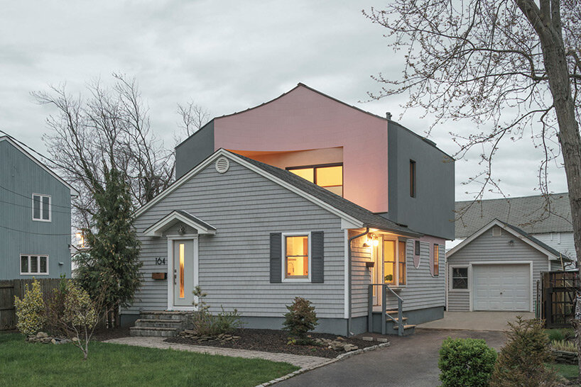
a skin of smooth, light pink rectangular ceramic tile emerges on the upper volume
‘hacking’ the original architectural elements
The investigation of the existing structure, which revealed it to be a ranch house comparable to those featured in Sears House Catalogs between 1908 and 1942, served as the starting point for the design process. These houses were constructed without the aid of an architect and their design was based on the vernacular tectonics of the balloon frame, with an added element of standardization. The timber profiles were constructed using industrial methods and measurements that do not allow for design freedom, and the only difference was found in the decorative facade design, which was frequently inspired by neo-classical or Victorian design elements.
Orsini and Roseboro conducted research and created a taxonomy of architectural features (windows, porches, roofs, and additions) typical of these suburban homes, which they would later ‘hack’ and remix on the new volume, simultaneously referencing and subverting the architectural history of the neighborhood.
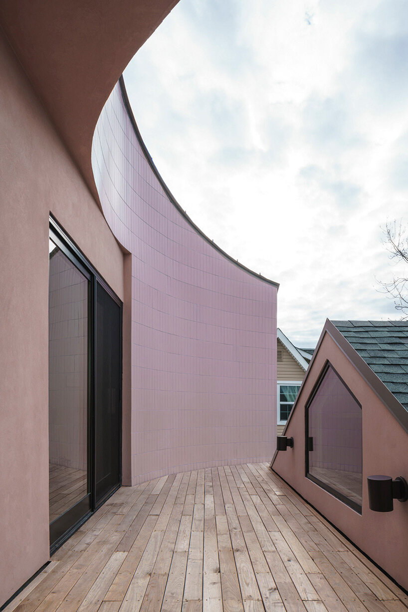
a street-facing, semi-circular outdoor patio is created from the second-floor bedroom
new program and use of color
The new, second-floor volume is defined by a large massing sitting on top of the existing house. It was necessary to compact the stair that connected the first floor and the new addition in order to conserve space, but it also had to be included in the layout as a wall-free feature of separation. Architensions decided to adopt a distinct cylinder, which aided in the design’s internal development. A street-facing, semi-circular outdoor patio is created from the second-floor bedroom and provides a singular connection to activities on the street by subtracting the distinctive geometry of the cylinder from the square volume on the outside.
In addition to reconfiguring the service core, which included the closet, laundry room, and bathroom, Architensions also added a study area and a guest room to the ground floor and opened up the kitchen and living room considerably. The primary bedroom on the new second floor is an open area with a volumetric cylinder acting as an inner wall separating it from the front terrace. The interior was originally painted white, which conveyed a numbness, or fear of color. Therefore, the Architensions team used yellow throughout the project to highlight transitions, bring light inside, and define spaces.
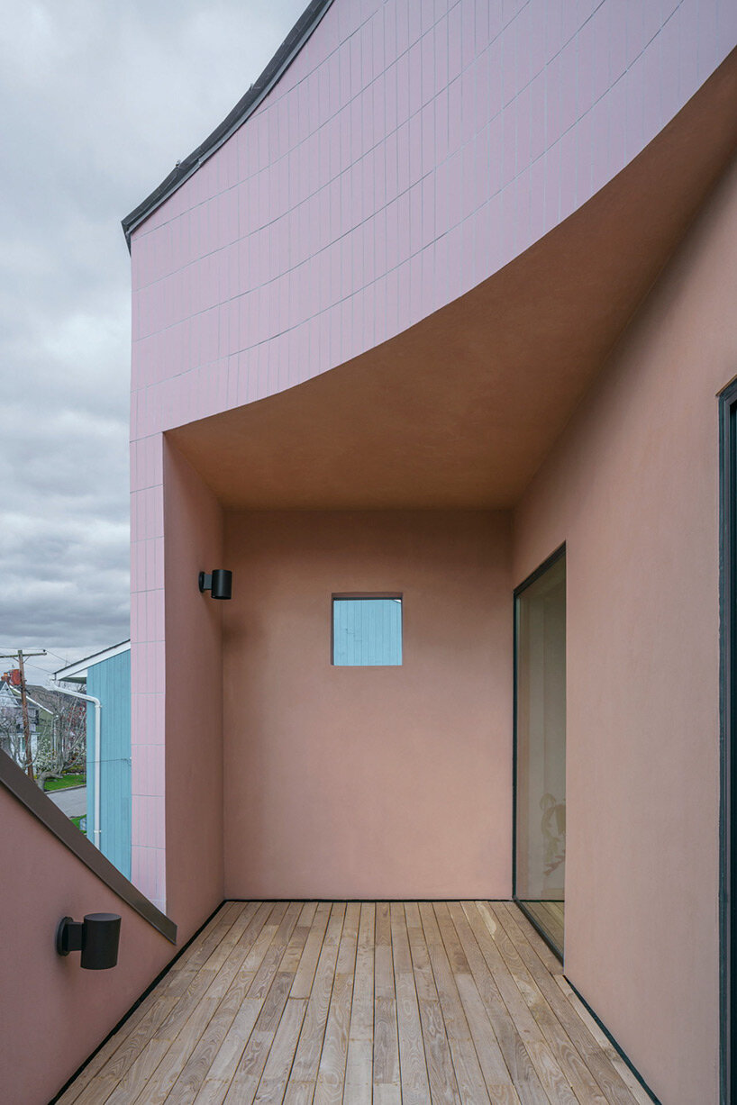
the pink ceramic tile skin adds to the liveliness of the transformation
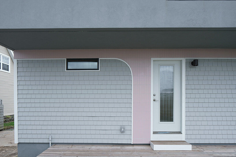
the pink tile descends onto the exterior walls of the original home in inverted arcs, arches, and swoops
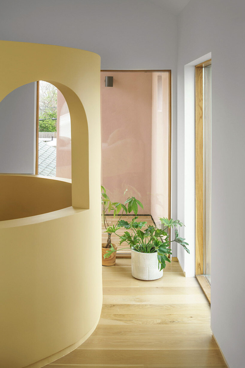
the Architensions team used yellow throughout the project to highlight transitions, bring light inside, and define spaces
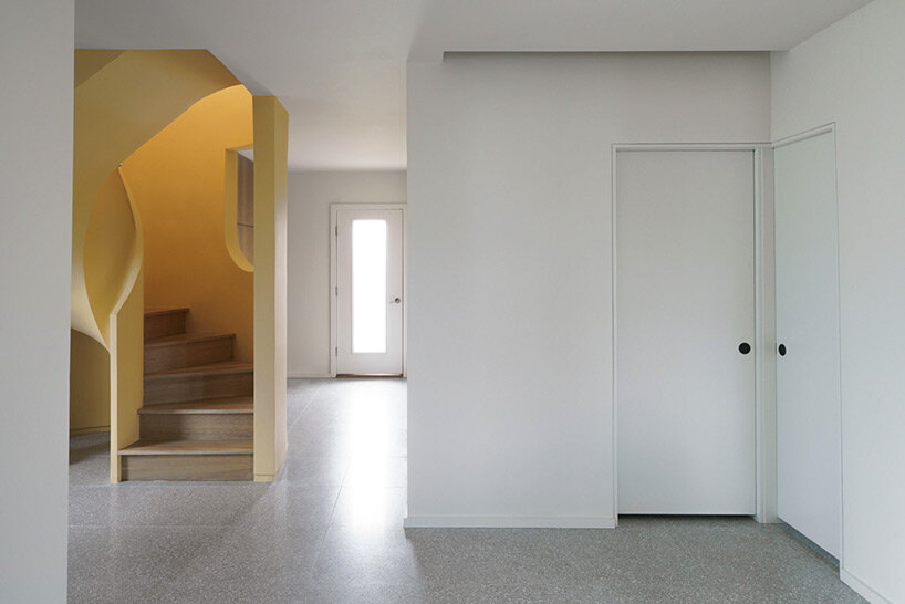
a distinct yellow cylinder aids in the design’s internal development
