Sherwin-Williams Says This Is the Home Color Palette of 2024 (and Beyond)
When it comes to articulating the design zeitgeist, there’s nothing today’s paint brands—Sherwin-Williams included—love more than a good color story. Each year trend forecasters take stock of the pigments percolating on runways, at trade shows, and online, organizing colors into palettes that attempt to distill and define a specific movement within the world of interiors or popular culture at large.
But with how adept today’s trend forecasters are at distilling disparate inputs into an aesthetic narrative, there’s been an increasing tendency for different brands to publish annual color stories that can start to feel like different chapters of the same book, Sue Wadden, the director of color marketing at Sherwin-Williams, tells AD PRO. “The storytelling was kind of blending. Everyone was talking about a nature palette, or a brights palette. I was interested in cutting through the noise.”
That interest led Wadden and Sherwin-Williams to shift gears with the introduction of Anthology: Volume One. The 48 hues found in the brand’s Colormix Forecast for 2024 aren’t grouped into abstract, mood-based categories but four immediately intelligible chromatic families: blues and greens, reds and purples, deeps and darks, and delicate tints.
For Sherwin-Williams, this remixed approach isn’t just about reorganizing how it presents the colors that will define the year ahead. By analyzing trending colors from 2020 to today, the brand seeks to celebrate the defining shades of the decade thus far, while looking for the inflection points and surprising new trends we might look back on in 2030.
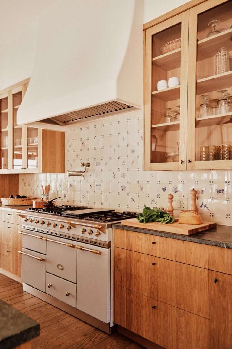
The incorporation of both present and future is evidenced right away in the composition of the blues and greens collection. “We’ve talked about how important green has been for the first part of this decade, [but] blue is going to sort of take over for green in the second half,” Wadden says of this versatile palette that runs from statement-making Aquastone to the quasi-neutrality of Stardew. “From layered textures to tiles to painting your kitchen cabinets or the vanity in your bathroom, the chromaticity of blues and greens fit the bill.”


