Christopher John Rogers’s Debut Farrow & Ball Line Is Made for Playful Interiors
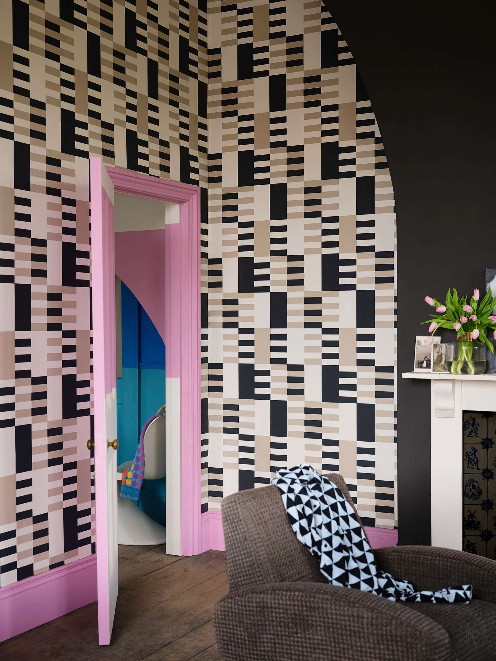
When the venerable paint company Farrow & Ball was looking for a designer with whom to collaborate on a capsule collection, one name immediately stood out: Christopher John Rogers. Celebrated for garments bursting with color and pattern, the fashion designer has dressed the likes of Michelle Obama, Viola Davis, and Tessa Thompson. His hope for his line of colors, as with any of his clothes, was to “give people the tools to express themselves—however they wish.”
Sorting through his own library of swatches with Charlotte Cosby, Farrow & Ball’s creative director, Rogers narrowed down his spectrum to 12 unapologetically joyful hues, among them bold statements like Hog Plum yellow, Romesco crimson, and Shallot pink. “I don’t have just one avenue of inspiration,” reflects the designer, who drew upon memories from his childhood in Baton Rouge. As an example he cites Raw Tomatillo green, a nod to his grandmother’s fried green tomatoes. (He calls the shade “intense but also not overwhelming.”) Lobster blue, meanwhile, is based on a little-known crustacean. “A lot of people would expect a red or a pink,” he notes of the name. Three wallpapers round out the mix with textured stripes, glitchy checks, and dotted motifs.


