5 Pamela Shamshiri–Approved Secrets to Creating Photos With Staying Power
Designers’ work is best experienced in person—but short of that, it lives and dies by how it’s been captured in photos. Whether you’re planning on pitching a project to AD or simply looking to record it for your digital portfolio, it pays to get photography right.
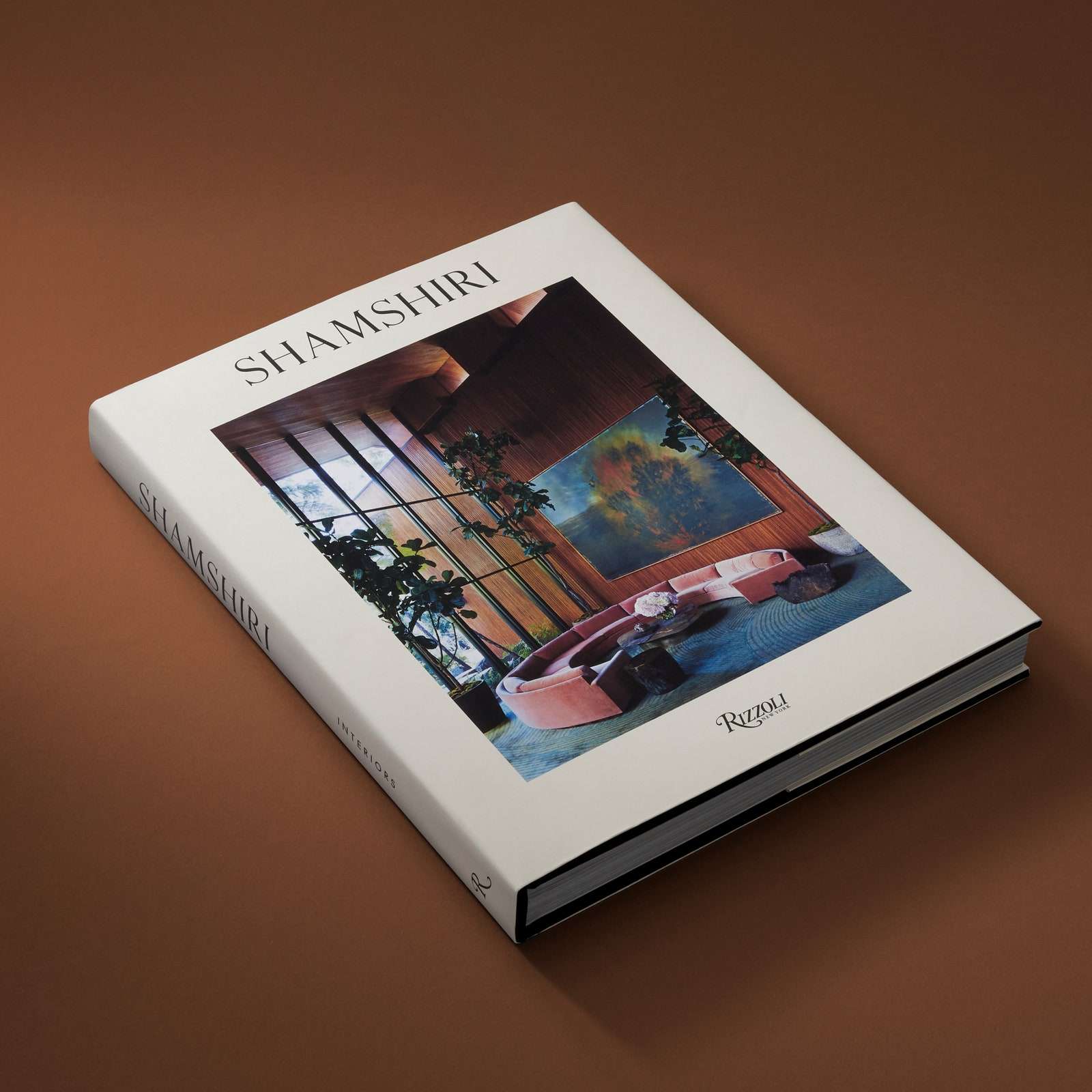
“It’s like they say in [entertainment]: You’re only as good as your last film. [In design], you’re only as good as your last image,” shared interior designer Pamela Shamshiri. The founder of AD100 firm Studio Shamshiri attended the AD PRO member-exclusive workshop this week, hosted by AD West Coast Editor Mayer Rus (coauthor of the new book Shamshiri: Interiors). Titled “Creating Images With Staying Power,” the conversation addressed the importance of documenting design work, collaborating with stylists and photographers, navigating photography contracts, and more.
Missed the live segment? Take note of five standout tips from the informative—and enjoyably candid—discussion. Then watch the full hour-long workshop below.
1. Make the investment
“[The images] are your portfolio, your next book, your Instagram,” shares Shamshiri. “It’s the best investment we make.” Acknowledging that budgets won’t always allow for flying in a top interiors photographer or stylist, Rus suggests finding regional talent or “sympathetic collaborators” who might be willing to work within the project constraints. The bottom line: “Spend what needs to be spent to document your work,” says Rus.
2. Let natural light lead
With only a day or two for an average photoshoot, there can be a pressure to enforce an agenda with time constraints per room. But don’t be too regimented about it, says Shamshiri. “Following the [natural] light has to be the priority in a shoot. Give the photographer an open schedule to move with it.” One way to speed up the process? Try to have the photographer visit the property in advance so they’re well informed of how light travels through the residence.
3. Consider every angle
Variety is key when it comes to getting the right shots. Whether shooting for an editorial spread or an Instagram feed, it’s best to have a mix of vertical and horizontal options. You’ll also want to play with scale, capturing the interior from full-room, mid-room, and close-up angles. The latter, says Shamshiri, “captures the spirit of the room with its patterns and textures.”
4. Wait for the right season
Few things can damper a stunning interior as quick as bare, lifeless trees beyond the window. In general, you want to photograph with green, verdant landscapes—making early spring and summer preferred scheduling slots. Of course, there are exceptions. “Each house has its best season,” says Shamshiri. “Be willing to wait for when you can shoot it at its best.” Need proof of her patience? The designer delayed the photoshoot of a recent project by nine months in order to wait for the property’s garden to flourish. “Gardens are such a huge part of the story, especially if [the home] has an indoor-outdoor element.”
5. Know your audience
“It’s all about knowing your audience,” says Rus. If shooting with a specific publication in mind, consider catering the styling or angles to their sensibilities. “There are certain shots we take specifically with the magazine in mind,” says Shamshiri, offering AD as an example: “[The title] loves color and pattern and a sense of life—and Instagram loves that too.” For portfolio stills, for example, the styling and photography should best represent your work—even if it means making some styling edits. Hiding the TV with art or swapping out a client’s heirloom chair are fair game. “If you’re paying for the shoot, you reserve the right to take the images that you think best represent your work,” says Rus. “Take the consideration of the client, but you get the final say.”


