Announcing the winners of AN’s 2022 Best of Design Awards
AN’s Best of Design Awards celebrates outstanding built and unbuilt architectural projects in a range of categories, from cultural destinations to temporary installations.
2022 was a bumper crop year: AN received more than double the number of submissions than in typical previous iterations of this program. As a result, our jury found it extra challenging to select only one winner and one honorable mention from each category, leading us to make good use of our honorable mentions and editors’ picks as a repository of strong contenders. As such, those commendations are recognized in separate listings.
Considering the sheer breadth of the work represented here, it’s also difficult to draw a common theme, although it’s clear that formal invention matters as much as the desire to do environmental and social good. This is especially apparent in this year’s Project of the Year: the Reggio School in Madrid, Spain, by Office for Political Innovation, a practice led by Columbia GSAPP Dean Andrés Jaque.
Don’t miss AN’s 2022 Best of Design Awards winners, honorable mentions, editors’ picks, and project of the year.
Jury
James Burnett
President
OJB Landscape Architecture
Tei Carpenter
Founder
Agency—Agency
Sekou Cooke
Director
Master of Urban Design, UNC Charlotte
Felecia Davis
Associate Professor
Stuckeman Center for Design and Computation
Gabriela Etchegaray
Cofounder
AMBROSI | ETCHEGARAY
Ron Stelmarski
Principal and Design Director
Perkins&Will
Civic

Churchill Hill Meadows Community Centre and Mattamy Sports Park
“The jury found this project to be a compelling and straightforward set of indoor and outdoor spaces for active everyday use. Large skylights illuminate the interior, and while mass timber used, it’s lightened at the perimeter to create a sheltered porch with exposed framing veiled in expanded metal mesh. Simple and lovely. ”
Cultural
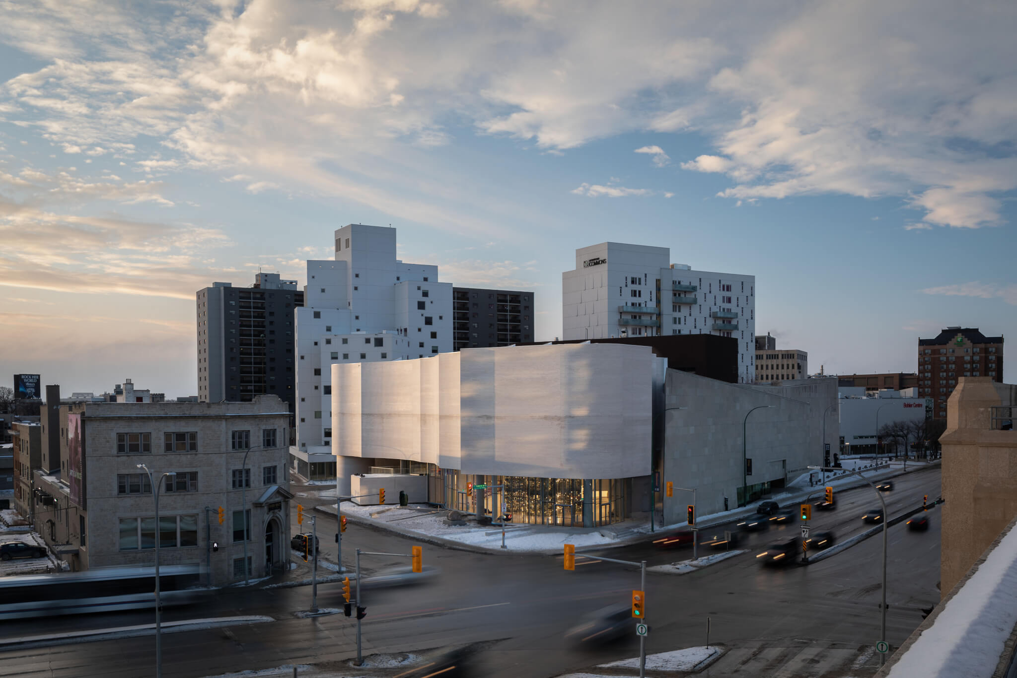
“There’s some complexity in plan here, and how they dealt with the form making of the facade is beautiful. I think it’s significant that the overall arts complex is making this Inuit Art Centre the centerpiece of the institution. And, I liked the visible storage on the inside; it’s a facade experience from the street, which is a nice gesture.”
Education—Higher Education

Tsai Center for Innovative Thinking at Yale University
“The oval is a good shape for softening the hard edges of the modernist glass box, and it’s hard to imagine a softer modernism than this—even the glass walls are curvy. I love all the daylight; the big, open collaboration space; and the yellow walls and curtains. Very nice.”
Education—Kindergarten, Primary, High School

Marygrove Early Education Center
“This project excels in all dimensions. The mat building strategy produces a low-slung, child-scaled building that forms a hinge between the existing built environment and the natural context. The porosity and subtle shaping of the broad form were defining characteristics that stood out to the jury. Pocket-park courtyards dropped into the mass appear very effective in providing safe and sheltered exposure to nature while allowing daylight to modify the quality of interior spaces.”
Infrastructure
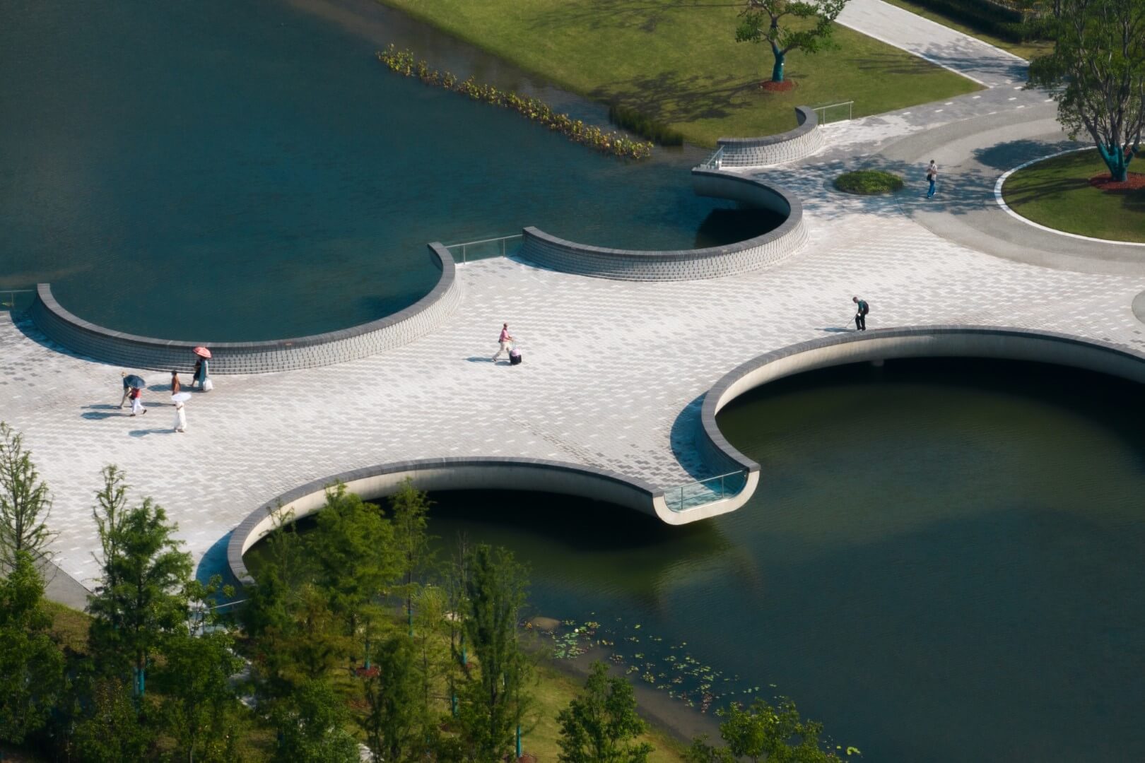
“The impeccable materiality of the project allows it to succeed both as an historical reference and as a modern place of both gathering and reflection. The moon-shaped circles sweep outward into branches that overlook the water, creating wonderful destinations in their own right. The bridge serves as inviting and magical entrance to the park, and visitors immediately experience the transition into the natural realm.”
Library

The Hong Kong Polytechnic University— Library Extension and Revitalization for Pao Yue Kong Library
“This rooftop addition creates a landscape of floor finishes, desks, chairs, and lighting to support studying in groups of varying sizes. I like how the space lends agency to its users, and I wonder what it would be like in the busy days leading up to final exams.”
Adaptive Reuse
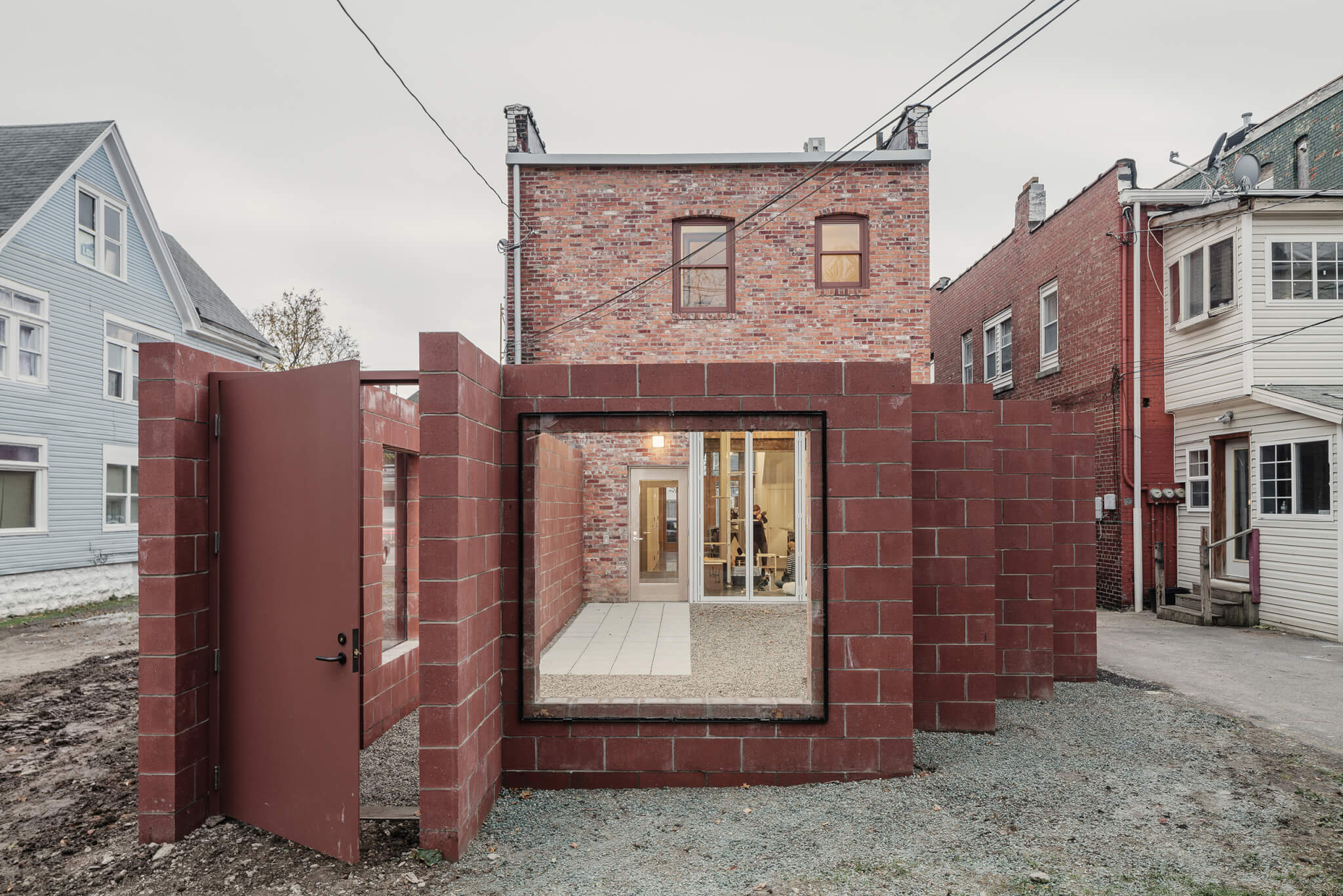
“A thoughtful, modest project that stimulated a lively discussion within the jury. An intentional work in progress, the project situates architeture as a living entity that can continually adapt and change over time as budget allows and as needs change. A contemporary approach to architecture’s contingencies that prioritizes process over singular image.”
Restoration & Preservation

“That this effort was able to strip these three buildings down to their concrete frames and add a new energy efficient facade is a testament to the value of Mies’s ideas. This repurposing—which also improves the interiors for student use—feels in line with current thinking about the importance of reusing old buildings instead of building new ones.”
Building Renovation

“A new take on 1960s-era buildings. This project is a wonderful example of breathing new life into non-descript structures with simple materials that shine with new purpose. The outdoor courtyard that knits the two existing buildings together refocuses the heart of the ensemble into a place of gathering and celebration.”
Facades

“Wow—what is it? Very unexpected. This project garnered a lot of attention and promoted a rich conversation among the jury, probably in the same way it generates curiosity, discovery, and discussion among students. The envelope offers a delightful array of material contrasts and apertures. Children deserve this type of school—a place where their imaginations are challenged, and the building works like a living laboratory.”
Digital Fabrication

“This simple but thoughtful pavilion creates a space by following a methodology that adapts non-standard material stock. It is an efficient approach that advances digital fabrication technics and customization.”
Commercial—Office

“This project really stood out through its balance of craft and engagement with the site ecology. Natural and artificial lighting reinforces the dynamic, angular forms that cut a complimentary silhouette to the distant mountains. Horizon lines shift across the modest plan, making occupants acutely aware of the environment and forming a celebration of living with the land.”
Commercial—Hospitality
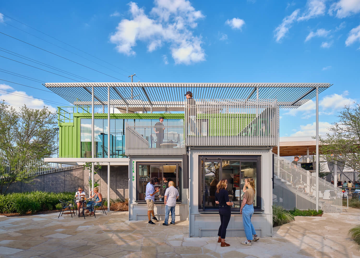
“With just a few strong gestures, this outdoor space is defined by a sequence of movement and connection. The shipping container vocabulary is married with glass and color that brings the outdoor space to the foreground and encourages people to share experiences in small moments across the site.”
Commercial—Sports & Entertainment

Centre de glaces Intact Assurance
“This rink is elegant and simple. It seems appropriate for an ice-skating rink, as the interior and exterior are cohesive. The reveal of the wood on the exterior is a subtle gesture that’s beautiful. It reinforces the actual act of speed skating and speaks to the sport itself.”
Commercial—Retail

“I appreciate the Webster because it creates a series of individual little moments and experiences for the shopper, so they’re going to very different spaces. It feels like it was designed around the shopping experience.”
Architectural Lighting

“This project racked up points for its impressive daylighting strategy, which keeps workers connected to the diurnal cycle within a large-footprint building. Where electric lighting is used, it is warm and indirect, washing the architectural surfaces in ways that are bespoke and intriguing.”
Healthcare

“On the inside, the project neatly accommodates its essential program of social and medical services for the LGBTQ+ community. But it also shines on the outside, where the tall, long block is faced in a varied field of brick textures. The gesture allows for many expressions of difference that stack together to become an overall unified facade, much like how society is thought to operate.”
Religious
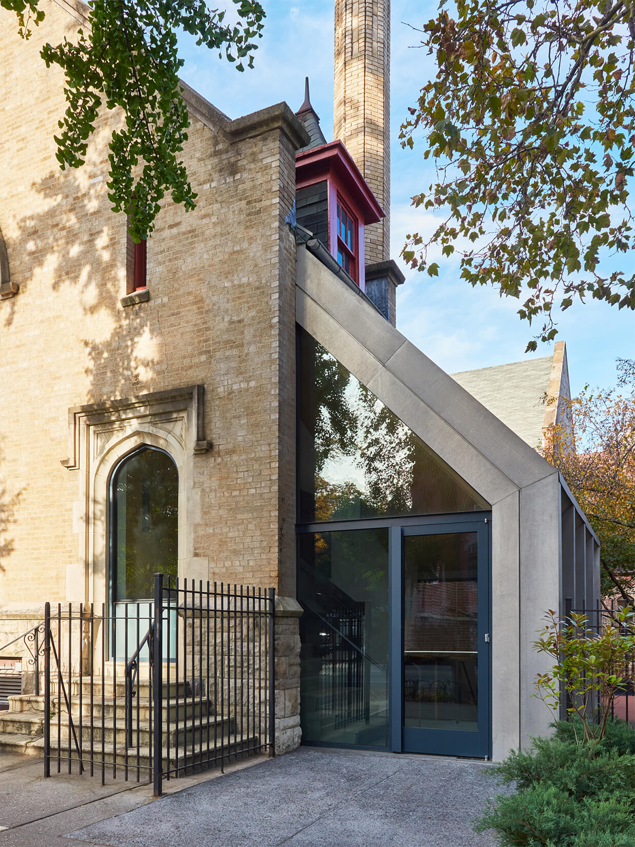
“This modest intervention creates a new entrance that relies on openness and accessibility. Attached to an existing church, it elegantly prioritizes the relationship to an adjacent garden, connecting the interior and exterior spaces as well as to the upper levels.”
Residential—Mixed Use

“The designers of this project gave a lot of attention to humanizing and enriching this city block from bottom to top. The ground floor is inviting and generous with recessed storefront, protected walkways, and intermediate gardens. Articulation of the mass and material selection creates a shadow play that artfully animates and enlivens the streetscape. The linking of the four blocks, particularly at the rooftop, form an exhilarating vertical experience that is often lacking in this project type.”
Residential—Multi-unit

“This condominium stacks 18 units around a central atrium enclosed with netting, eliminating any corridors. The scheme, combined with its inventive material resolutions, is a welcome take on how high-end housing can advance conceptual goals beyond mere luxury. It’s like a student project come to life, in a good way.”
Residential—Single-unit

Rain Harvest Home (La Casa que Cosecha Lluvia)
“This project has great simplicity and hierarchy of materials that made it feel very comfortable in its environment. The forms of each pavilion permit light and water into the spaces in very striking and poetic ways. The design appears to provide a rejuvenating mix of playful and transcendent experiences without compromising functionality.”
Social Impact

Church Hill North Community Hybrid
“I know this took a huge amount of work to get off the ground and that the building exists signals a long-term commitment to a community. This award also recognizes all the unseen work and persistence that happens to get a project like this going. The project is a good model for other communities that may have a similar situation across the U.S. Starting with the program or activities woven into this building and grounds it seems like this project, that is supported by the building but certainly goes beyond it in its activities, would have great impact in a food desert and in an underserved community provides a way to learn about foods as a career.”
Urban Design & Master Plan

Financial District-Seaport Climate Resilience Master Plan
“An important effort in readying Manhattan for a future of higher seas and stronger storms.”
Landscape
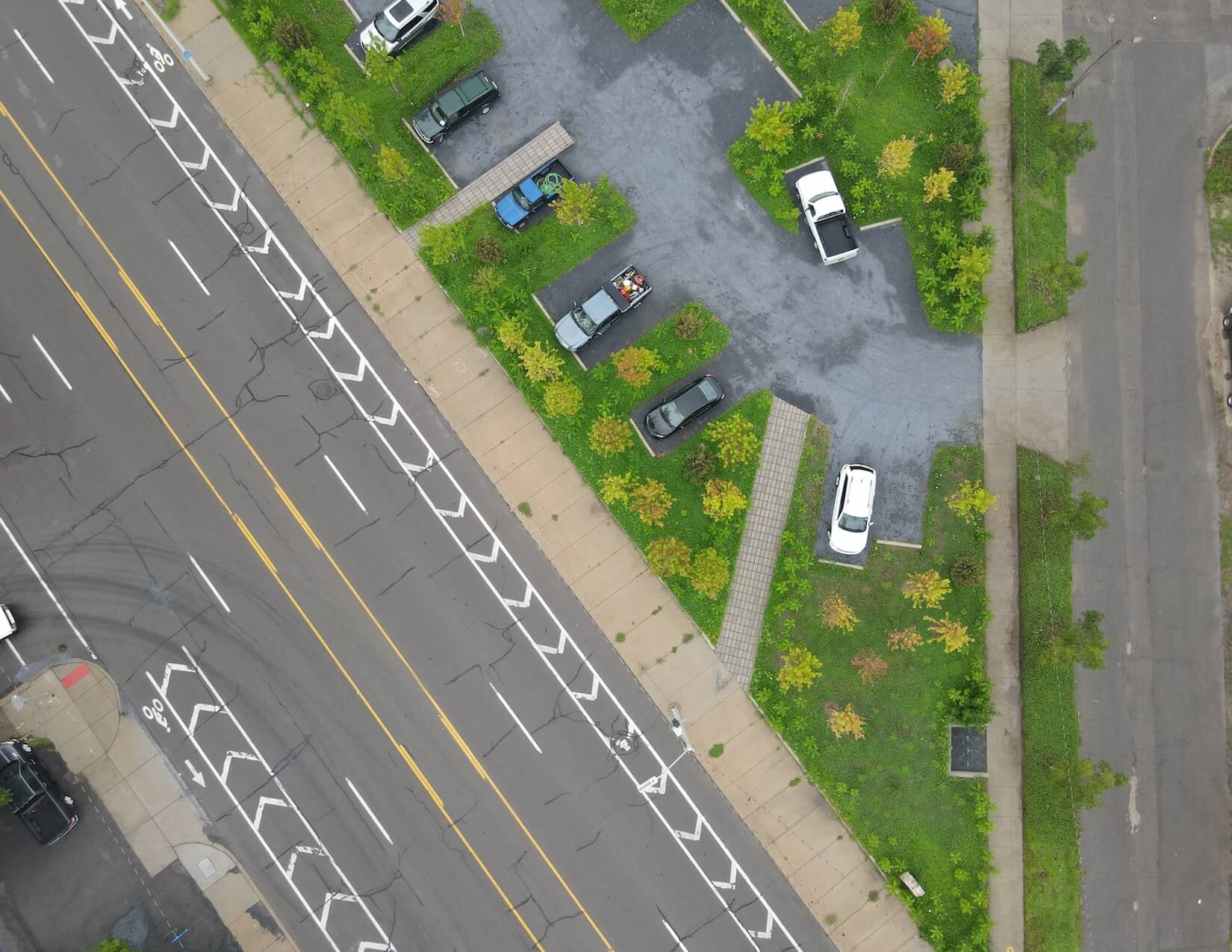
“This is an excellent project that could be replicated in many cities: the idea that cars can co-exist with lushly landscaped space. A brilliant proof of concept that turns the tables on traditional thinking about parking. We often see wide expanses of asphalt or even permeable paving punctuated with small dots of landscape. This model upends that thinking and allocates small dots of paving to the parking within a sea of planting.”
Interior—Institutional
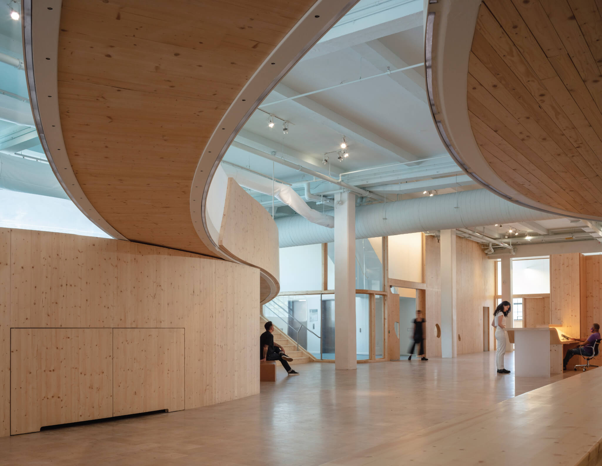
Bronx Children’s Museum
“The materials are simple, but curving CLT can be challenging. The blending and meeting of the different materials with the organic CLT curves is done very well here.”
Interior—Healthcare

Brooklyn Biomedical Office and Lab
“Biomedical facilities aren’t frequently darlings of the design award circuit, but this one is a real stunner. Large windows and interior apertures admit daylight deep into the facility, and the color palette is exceedingly tasteful.”
Interior—Retail

“A well-accomplished interior design project where subtle details are thoughtful along with the embedded domestic atmosphere. It brings into the present the warm aspects of Victorian elements that are set along the walls and comprise the furniture.”
Interior—Residential

“The elegant and clever figural void strategy integrates circulation and light and is literally a breath of fresh air into the otherwise dark townhouse typology. Soft geometric transformations of the void across the vertical spaces creates moments of domestic wonder.”
Interior—Hospitality

“A pleasure to see this simple selection of material, shape, color and lighting in this small space. The use of wood, in two colors, is primary, and the linear shape of this wood is repeated in the lighting. It was great to see how the designers achieved the mysterious appearance of light from what looks like—but are not—sticks of wood. Elegant and restrained.”
Interior—Workplace

“I like how the interior intervention sympathizes with the existing concrete structure—those big, round, mushroom columns are rad! The workspaces look soft and cool, just what we all need for the return to the office after the pandemic years of going goblin mode.”
Exhibition Design
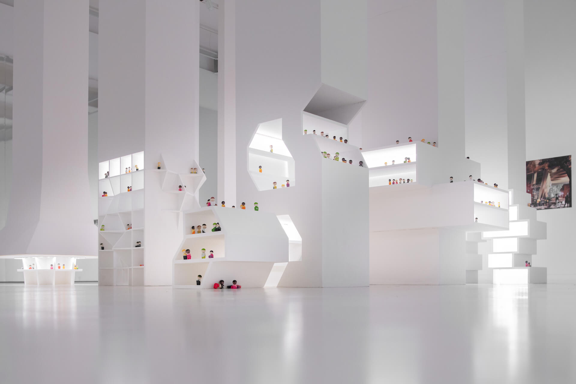
“At Shape Tomorrow, people bending over or squeezing down to look at the stuff that’s close to the ground are part of the exhibit. That’s part of an understanding of how we might shape tomorrow, to make it comfortable for more bodies.”
Temporary Installation

“It’s a protest and a clear roadmap for improvement. What more could you ask for?”
Young Architects Award

CloudHouse Shade Pavilion
“I appreciated the fact that this pavilion was made with a couple of different units flipped to their concave or convex sides to make an engaging shape. It looks like it can expand to be a bigger shelter as well and is, in fact, a building system for a material that is shapable like plastic. Perhaps this works for many kinds of recycled plastics one might find in a material stream in a community.”
Student Work
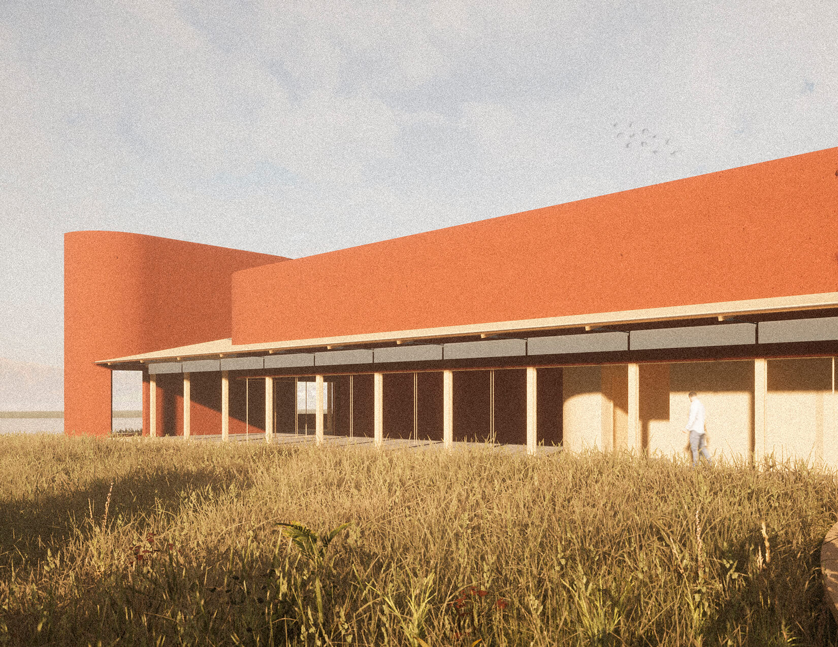
“This campus of three buildings establishes a community center clearly identified through red figures extended by wood framing. The scheme is imaged in serene, landscape- heavy views that showcase how the structures open up to the wider environment.”
Unbuilt—Commercial, Cultural, Civic, Education

Folly Tree
East Hampton, New York
“Strangeness abounds in this proposal to add on to an existing barn. The design, with its lofted shingle roof, is a hybrid cultivated from architectural references like New England barns, Gwathmey modernism, and contemporary formalisms. The resulting spaces, expertly rendered, are weird and compelling.”
Unbuilt—Conceptual

“California is electrifying rapidly. This proposal could actually prove useful in achieving that goal.”
Unbuilt—Residential—Multi-unit

“In this proposal, the weaving of spaces and the linking of private-but-connected outdoor terraces are an effective strategy.”
Unbuilt—Residential—Single-unit

House, Some of This, Some of That
“The nine-square-grid–like experiment of these CMU T-shapes (packed with bathrooms and storage) is inventive. With no hallways, the house is creatively imagined as a suite of related rooms nested under a big sloping circle roof. A weekend house with spatial provocation.”
Unbuilt—Landscape, Urban Design & Master Plan

The ARK: Rural Botanical Garden for Arkansas
“The idea of outdoor rooms that harken back to their ecological history and purpose is artfully imagined in this assemblage. The backdrop of dense forest is used to great effect here, especially as the rooms are imagined at great height with hanging gardens and a zipline.”
