An exhibition at Harvard GSD surveys the impressive career of Australian modernist John Andrews
John Andrews: Architect of Uncommon Sense
Curated by Paul Walker and Kevin Liu
Druker Design Gallery
48 Quincy Street
Cambridge, Massachusetts 02138
Open through December 22
John Andrews, who died last March, was an architect who didn’t make it into most architectural histories. You’ll find him in surveys about Australian and Canadian architecture, without doubt, but rather briefly, if at all, in others. He didn’t receive the attention that tended to flow with ease to architects based in the U.S. or Western Europe and, at the same time, Australia and Canada are not exactly where recent authors are looking to unearth overlooked talents. Andrews’s career was an elliptical one, spanning the fringes of the Commonwealth—from Australia to Canada and then back again—with a number of forays in the U.S. Andrews’s talent is now receiving its proper due in an excellent exhibit, John Andrews: Architect of Uncommon Sense, installed in his own Gund Hall, home of Harvard GSD. Curated by Paul Walker and Kevin Liu and drawing on all sorts of archival materials, plus recent photos by Chicago-based artist Noritaka Minami, it’s an impressive showing. Looking forward, a survey publication will follow early next year, to be published by Harvard Design Press.
Some architects worked largely with concrete yet denied the label of Brutalism—Andrews was one of those. He maintained that his work was “humanist,” which has traction. The span of his work reveals a relentless generative attention to plan and circulation and not to image. He was working in the golden age of concrete, and used it often, but he turned to whatever materials might be of use, frequently using those elements economically.
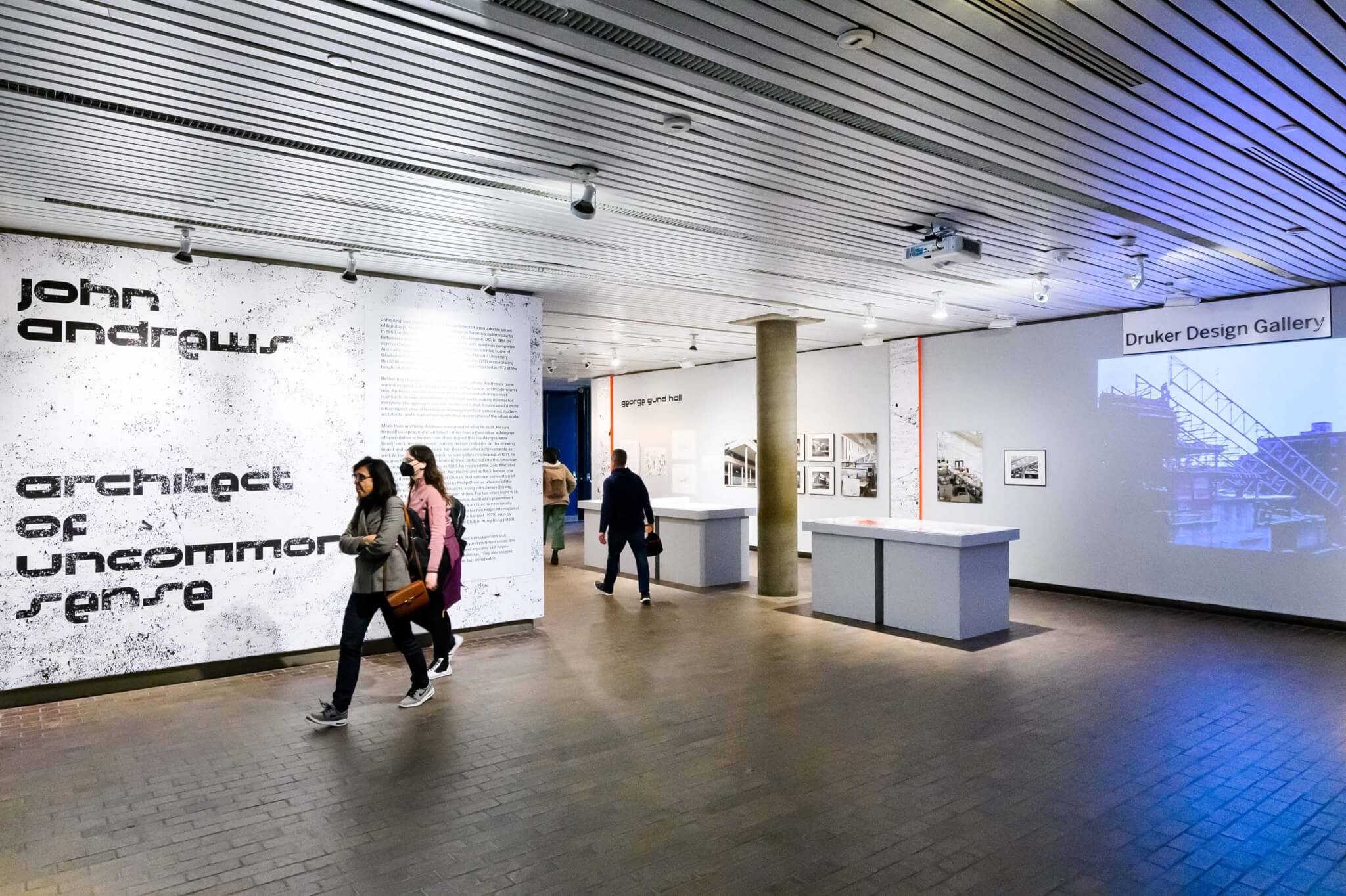
The wall text states that “he saw himself as a pragmatic architect rather than a theorist or a designer of speculative schemes–he often argued that his designs were based on ‘common sense,’ solving design problems on the drawing board and construction sites.” He was also a blunt and entertaining man (as you can see from this 1979 video made by Film Australia, which also appears in part in the exhibit) interested in getting things done.
Andrews has been compared to Aldo Van Eyck and Hertzberger for his mat-building tendency, but it seems like other greats—Le Corbusier, Kahn, Rudolph, and Sert—are clearer actual influences. He also paid keen attention to a wide variety of climatic circumstances: His designs responded to local circumstances, sprouted green roofs, and used thermal design and planning techniques that sought to situate works in “nature.”

It’s always welcome to see an exhibit on an architect in their own building. You don’t need to go far to gain a sense of what they’re about. This exhibit presents a strong overview of Andrews’s work, from greatest hits to lesser-known and unbuilt projects. It’s a fitting tribute, as Gund Hall turns 50 this year.
Born in Sydney in 1933, Andrews attended the University of Sydney, worked on the Opera House there, and attended Harvard GSD in its Sert years. He left for Canada, where he worked at Parkin and Associates, a large office, before, at the age of 25, coming in second place for the Toronto City Hall competition. Viljo Revell of Finland won the prize, apparently after a late-to-arrive Eero Saarinen fished the submission out of the rejects and convinced the jury of its merits.
His relocation to Canada was fortunate, amidst the halcyon decades of campus construction, and his work, along with Erickson and Massey and Ron Thom, constitutes the best of the era. Andrews’s academic complex at Scarborough College (1966) is likely his most famous project, receiving substantial attention in Banham’s Megastructure: Urban Futures of the Recent Past. A 1965 press release in the forthcoming publication points out that visitors have been reminded of “the stepped pyramids of Mexico, the sacred mounds of Babylon, a great power dam or the Maginot Line.” The project sought to create a sort of interior urbanism on the urban periphery, a topographical spine that respected nature around while providing a genuine core for life within.

His residences for Guelph University in Ontario (1968) display more febrile possibilities. Here he was cutting corners—literally—for windows and doors within long walls and then designing furniture and fixtures around them. Repetitive systems were frequently the start of his work, and especially in university systems a sense of the right scale for the room and the cluster was the first priority, and larger decisions followed.
The exhibit offers much evidence to its thesis that Andrews focused on plan and circulation, as it showcases numerous plans and circulation diagrams, along with sections, a variety of archival elements, older photos, and a suite of contemporary photos by Minami. You also don’t have to go far to encounter Andrews’s circular Corbusian columns, as they’re right there in the gallery.
His career (and this show) demonstrates how an architect can pivot to build similar buildings in different contexts. When he returned to Australia, his work continues its spatial logic but it’s transformed for the milder climate: Interior streets are out, and courtyards and covered pedestrian walks are in.
Toad Hall at the Australian National University in Canberra (1974) is a serrated sloping complex of brick dormitories. Other Australian university and educational projects display a trademark design ethos alongside a constant adaptability to location and materials.
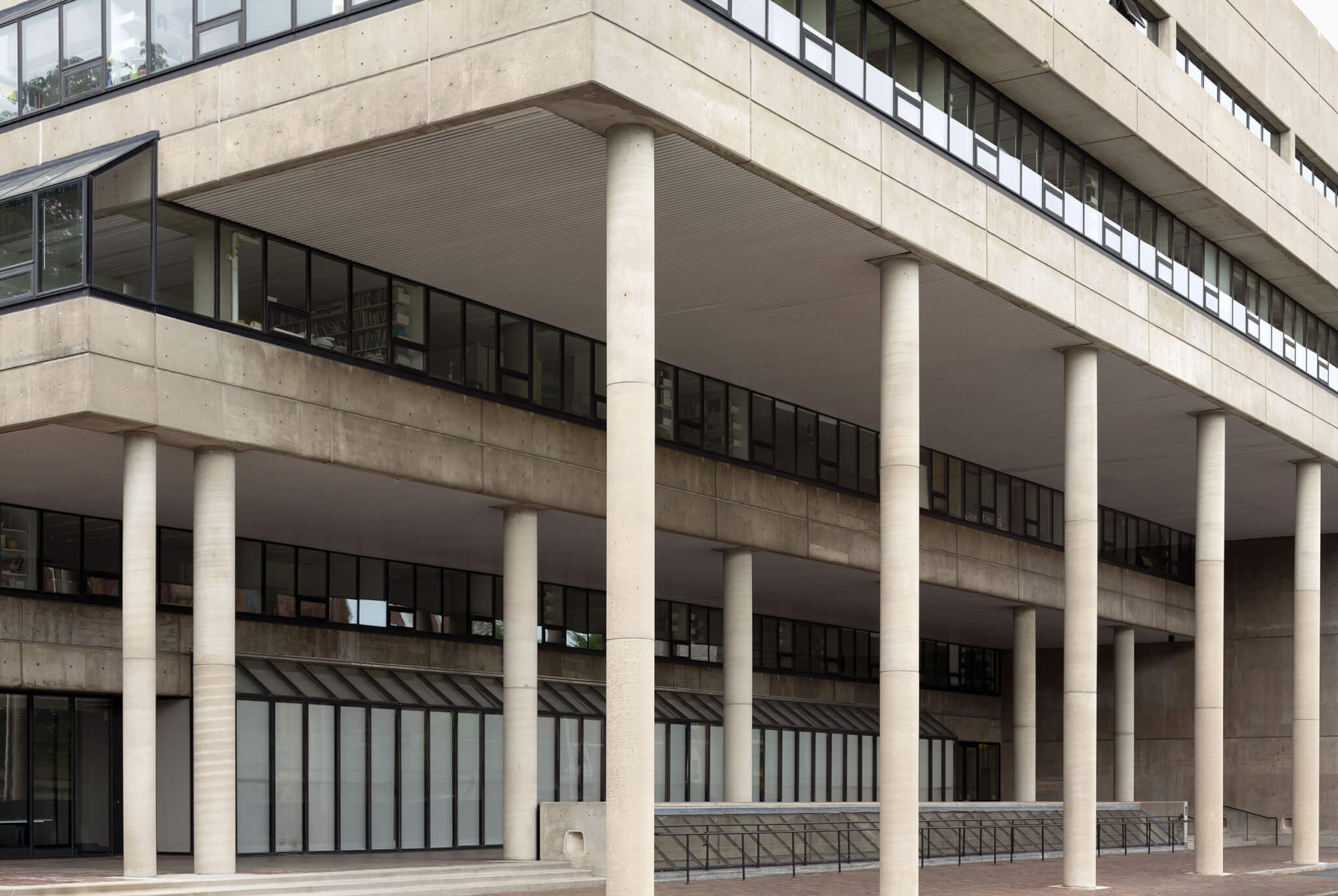
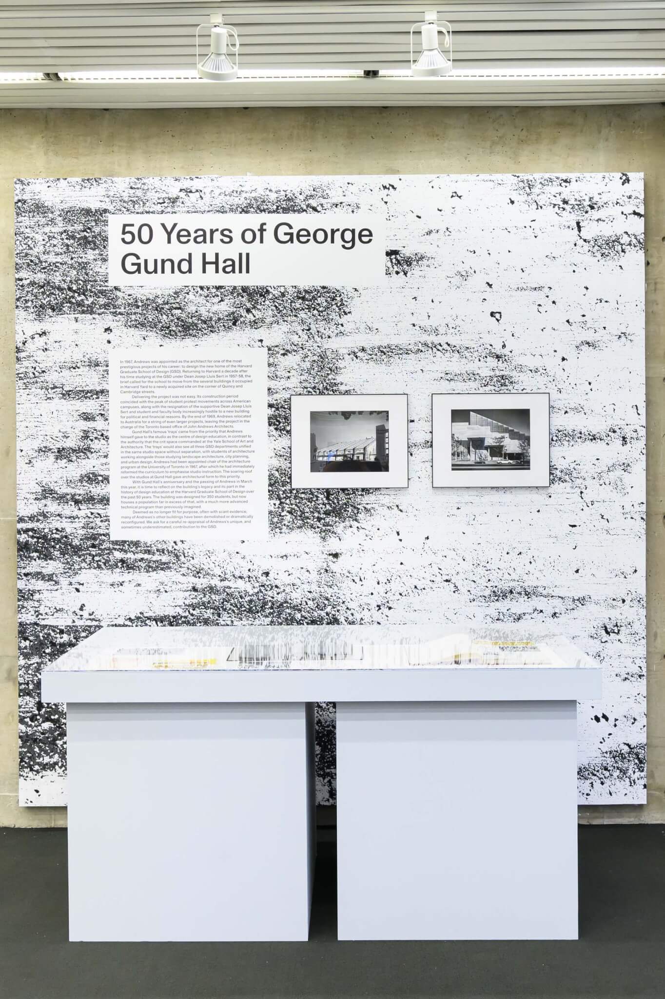
The trope of Andrews as a megastructural maniac isn’t really true; he broke most of his larger projects down into human-scaled elements and was very sensitive to context. This can be seen in his Gund Hall (1972). Here the form, derived from trays of terraced studio space, reflected his determination to put studio spaces at the center of the building. Other flourishes followed, including the grand colonnade facing Harvard’s Memorial Hall as a neighborly gesture.
Andrews did all sorts of things: His African Pavilion at Expo 67 in Montreal (1967) was something of an afterthought in the sequence of that event; major contractors and suppliers were thoroughly booked on other projects, so he turned to plywood. The result, an egg-crated, wood structure featuring roof tents inspired by North African wind scoops, was great.
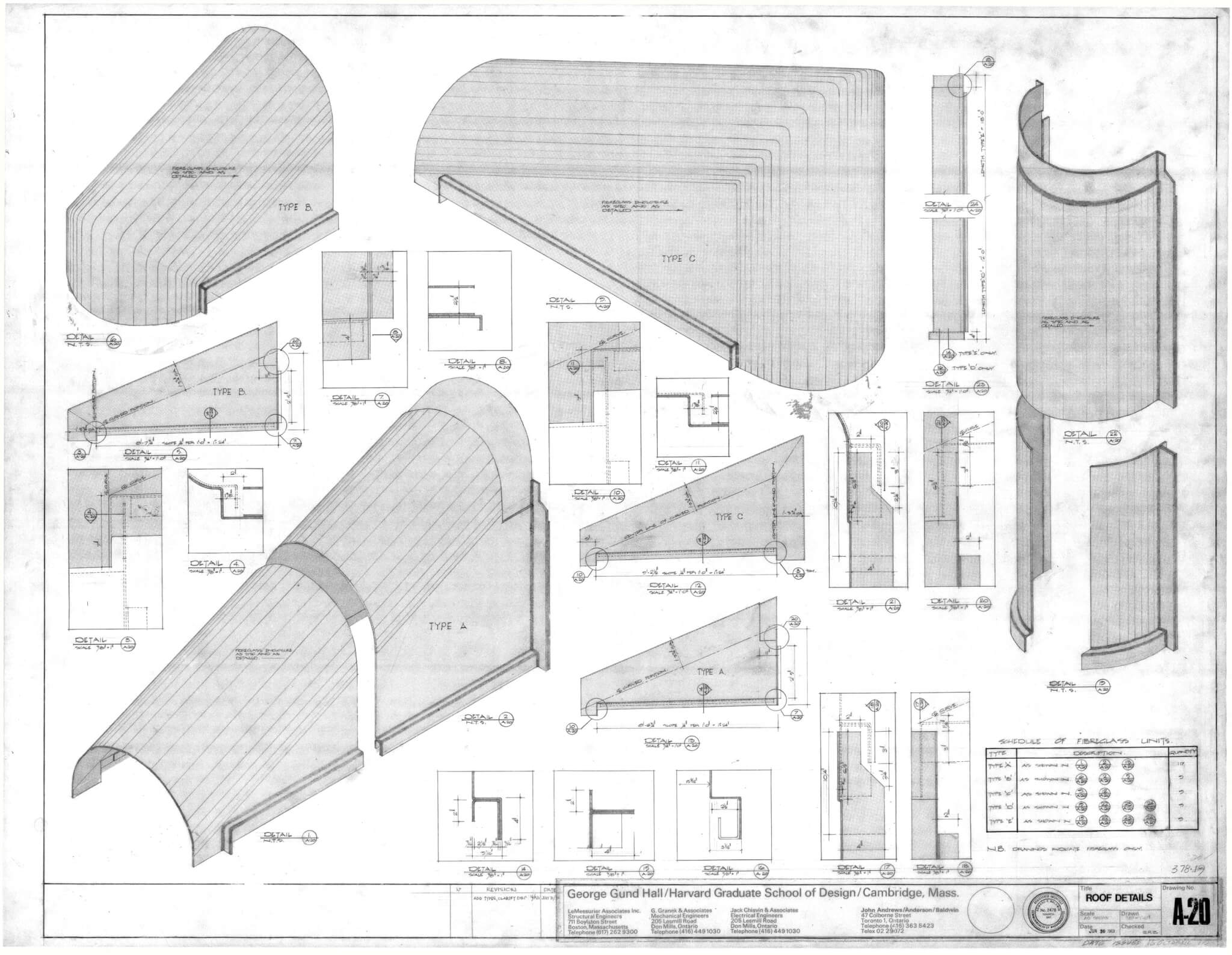
The Miami Cruise Terminal (1970), now gone, was exceptionally stylish, but it was designed to make the cruising passenger’s life simpler. He sent staff on a cruise, which revealed an hours-long wait in port to disembark (sans air conditioning) and drink service suspended, a harsh return to reality before they had even left the boat. He separated baggage and immigration facilities for each docking spot, reasoning that the staff could move from one to another, and designed a series of double-curved asymmetrical roofs to top off each of these. The structure reduced wait times to about 40 minutes.
Andrews designed office buildings like his university campuses, and they resemble some kind of “missing middle” offerings. Most aren’t that tall, and he spread buildings amidst courtyards and pedestrian routes. A precast structural system spans these courtyards in his amazing Cameron offices in Belconnen (1977), providing a sense of interiority belied by plenty of landscaping. Edmund Bacon, an architect in Philadelphia and father to Kevin, sent Andrews a letter, quoted in the book, calling it “one of the most interesting building complexes I have seen anywhere in the world because it relates to the larger city of which it is a part in a valid and original way.”
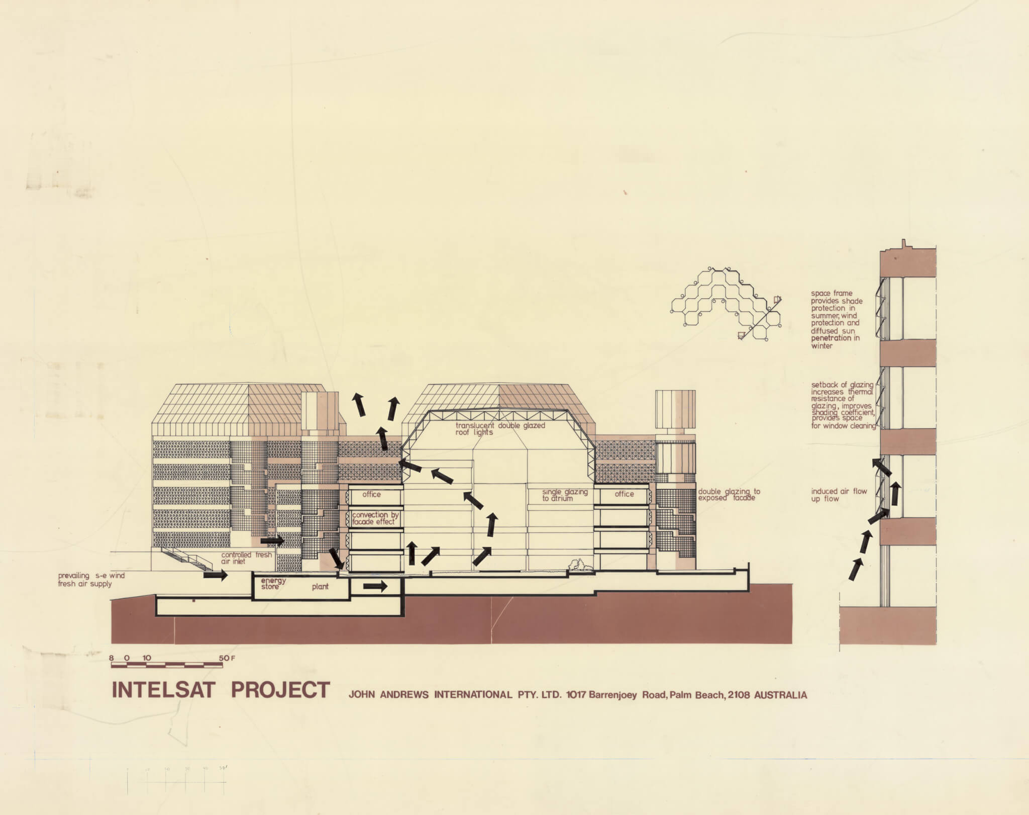
You can easily spot continuities throughout: The Octagon in Paramatta (1990) resembled the octagons at his Intelsat complex in Washington, D.C. (1988). It seems that chamfered corners and a dispersed plan surrounding open space and atria made for fine humanism at the time.
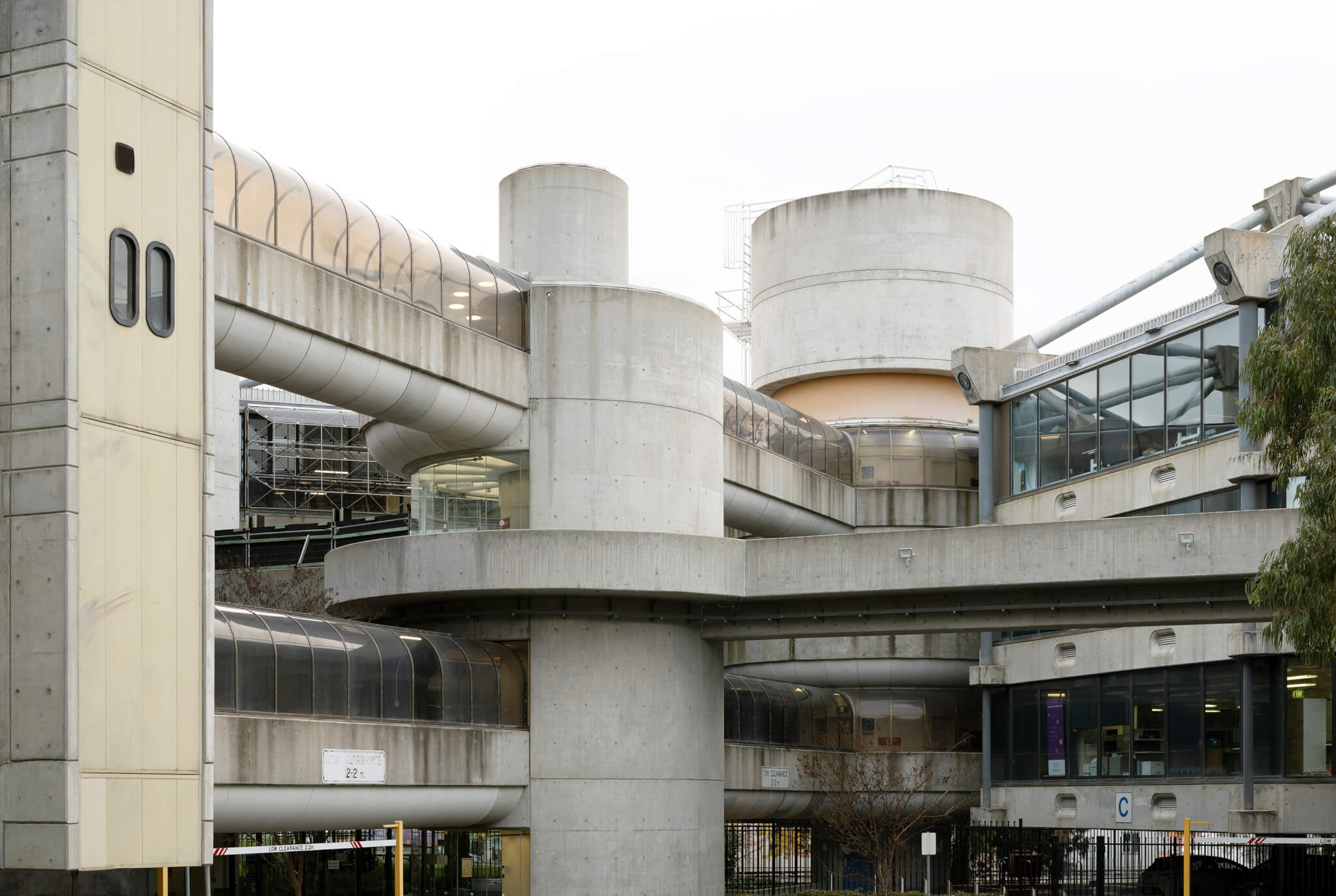
The Callam offices in Canberra (only partially built as proposed) are absolute futuristic joys, with circular forms and multiple overhead walkways knitting together a complex like a non-grotesque H.R. Giger scheme. Kenneth Frampton acclaimed the work in Modern Architecture: A Critical History, calling “the high tech hexagonal module on which this work is based […] surely more inspired in its inspiration than any of the phantasmagorical images inspired by Archigram.”
Andrews’s King George Tower in Sydney (1976) is another case of finding great expressive potential in just getting a practical task done. Expressive concrete towers, non-structural, line each corner of its triangle, containing stairways, ducts, an elevator core, and bathrooms, which Andrews dubbed “a loo with a view.” Stainless steel and polycarbonate sun shields were a nimble and light means to improve environmental performance and enliven the facade.
The list goes on. As it’s clear from the show and the nearly 500-page book, Andrews was prolific. In response, he was recognized as the first non-American architect inducted into the the American Academy of Arts and Letters in 1971, and in 1980 he received the Gold Medal of the Royal Australian Institute of Architects. His career slowed amidst a decline in institutional commissions and the rise of postmodernism. He was something of a Bunshaftian grump about this tide of meretricious ornament, and even if that’s your bag it’s easy to see his point. As Paul Walker’s book introduction explains, “his office remained resolutely committed to an essentially modernist approach that considered design capable of redeeming the built world, and of making it better for everyone.”
As it goes with too many tales of modernism, the effort is partially a necrology. The Miami Seaport Terminal and three of his Australian convention centers are gone, his Cameron offices were wrecked, and the King George Tower reclad idiotically. Minami’s skillful photographs capture these various mutilations, which are useful in assessing both what stands the test of time and what now looks like trash. It’s a welcome reminder of what the world does to many fine buildings without guardian angels. Here’s to hoping that changes soon.
Anthony Paletta is a writer living in Brooklyn.

