“A Three-Dimensional World of Connectivity”: Ole Scheeren Explains the Concepts Behind His Latest Cantilevered Skyscraper
Send us a photo. Tell us a story. Win $2,500! Architizer’s 3rd Annual One Photo Challenge launches on May 9th! Pre-register for architecture’s biggest photography competition here.
Büro Ole Scheeren has built a reputation for breaking conventions. The internationally acclaimed architecture firm, led by its founder Ole Scheeren, is continually rethinking urban typologies, seeking new ways to bring communities together and enhance the living experience of people living in metropolises around the globe. From the pixilated presence of MahaNakhon in Bangkok, Thailand, to the bold stacked forms of The Interlace in Singapore, the firm has pioneered striking new ways to imagine high-rise residential architecture.
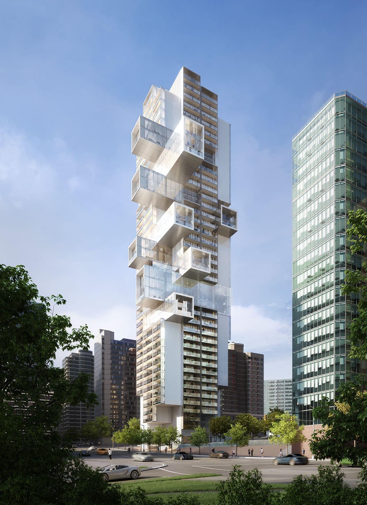
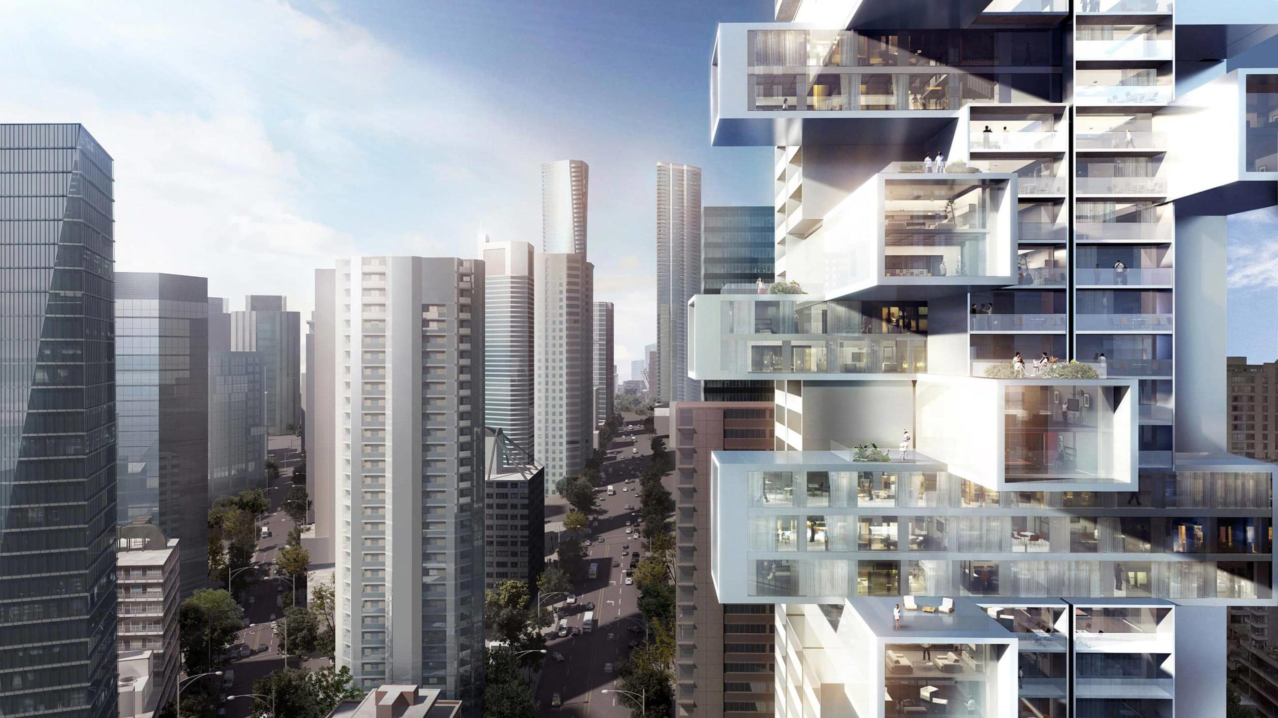
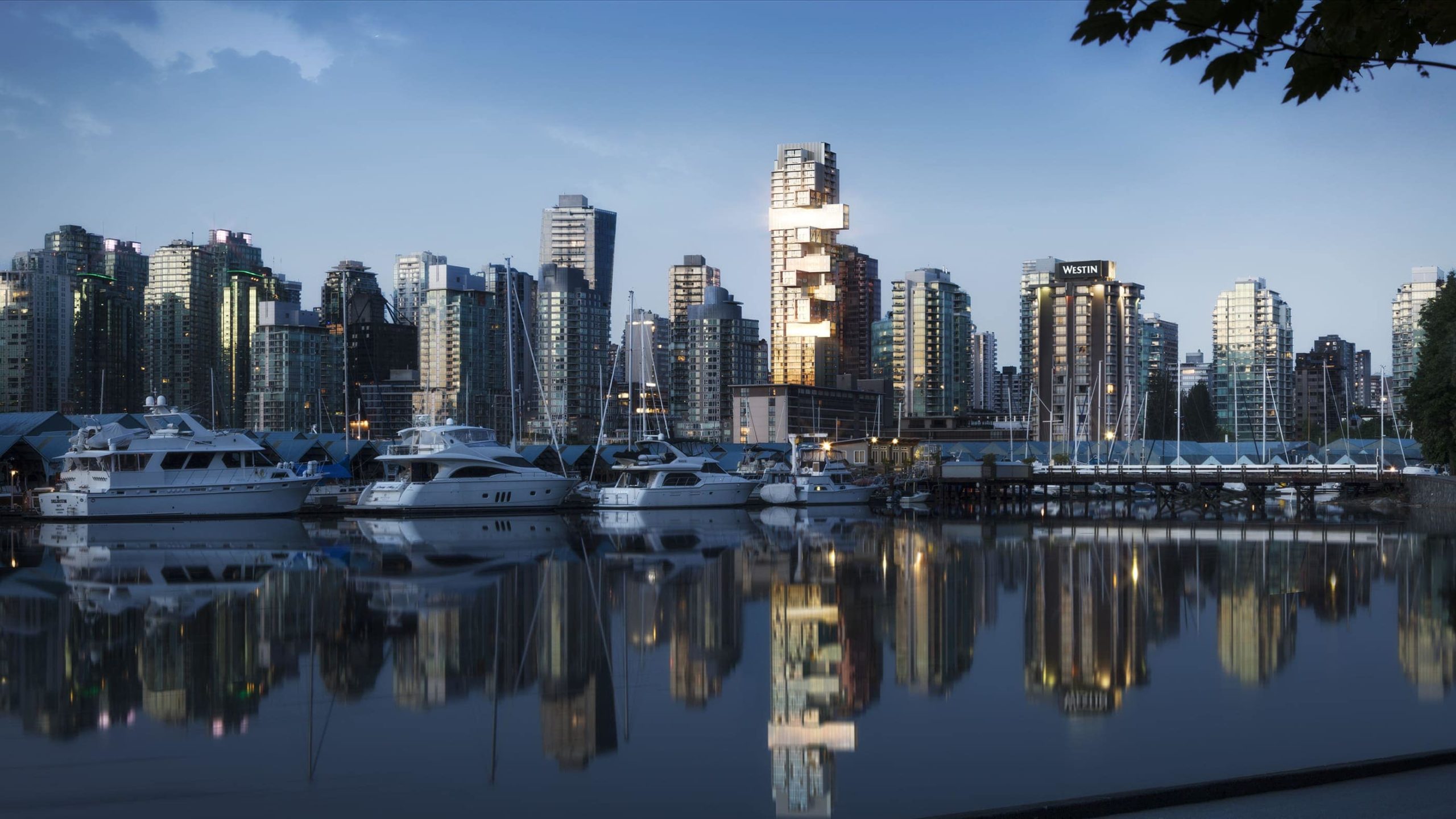
Continuing this trend, a new skyscraper by the firm is set to rise in Vancouver, Canada, in the coming months. Fifteen Fifteen is one of a number of high profile projects planned for construction at the top end of Alberni Street, with developments by Heatherwick Studio, Kengo Kuma and Associates and SOM also in the works. Büro Ole Scheeren’s addition to the district, recently dubbed “Architect’s Row”, is a 250,000-square-foot, 42-story residential tower with a highly distinctive form that will make it an instant landmark upon completion.
Architizer’s Editor in Chief Paul Keskeys chatted with Ole Scheeren about the concepts behind this major new project, its context and inspiration, and the precedent it sets for the future of residential skyscraper design.
Paul Keskeys: The first thing that strikes me about Fifteen Fifteen is its bold, cantilevered volumes, which break away from the conventional verticality of traditional skyscrapers. What inspired the design of this unusual form?
Ole Scheeren: The core idea of Fifteen Fifteen is to break the verticality of towers, to break the isolation created by vertical extrusions and instead create a three-dimensional building that would reach out to its context and three-dimensionally engage and incorporate its context into the very nature of the building.
 In terms of environmental and built context, what elements of Vancouver most influenced your design concept?
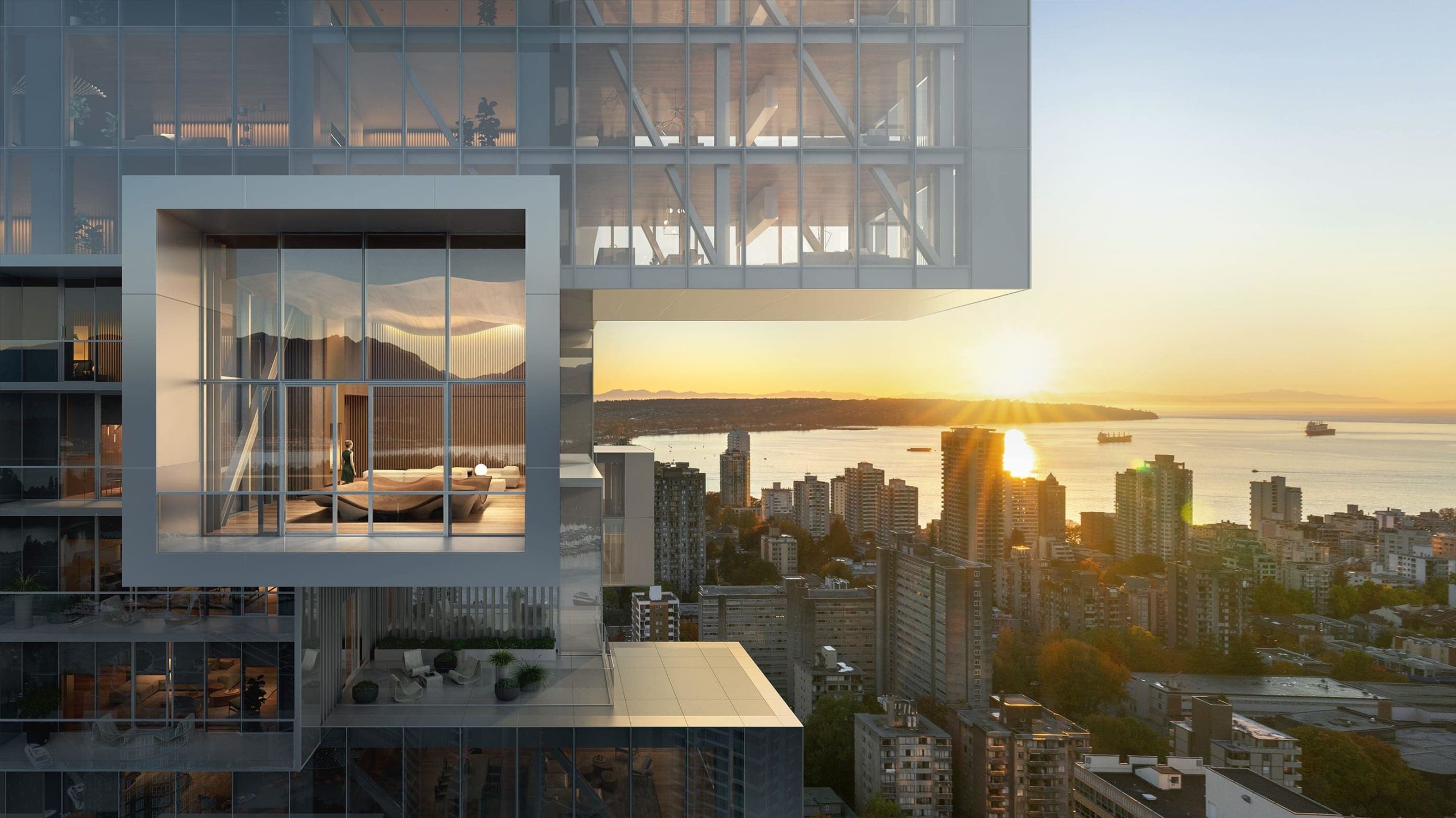
Vancouver is a uniquely positioned city between a dense urban grid and an incredible natural environment from the water, Stanley Park and the mountains behind. Fifteen Fifteen fully engages this context. It is a building that projects you out into the urban realm — that interacts with the Urban realm — but equally successfully engages the spectacular natural environment and connects the indoors with the outdoors.
It lets you float in dramatic cantilevers above city and nature and thereby creates a very special, active relationship between the surrounding context and the inhabitants.
 Residential skyscrapers are often accused of disconnecting inhabitants from the outdoors, but Fifteen Fifteen appears different. How did you seek to introduce exterior spaces into your design?
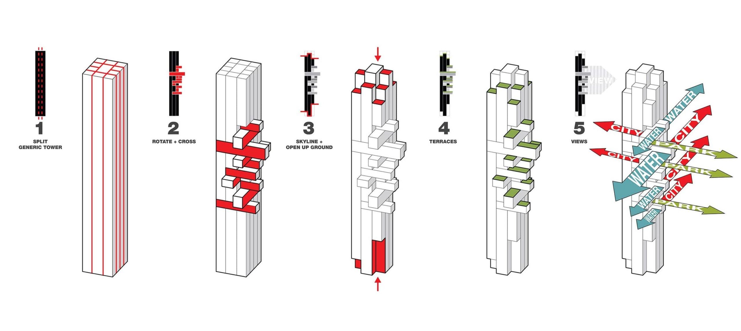
I’m interested in the idea of three-dimensional living, of defining an active position and place for the inhabitant and user of a building. Therefore, Fifteen Fifteen folds otherwise vertical elements into the horizontal and thereby creates this complex system of interlocking and cantilevering spaces.
By this, we not only create a direct relationship with the outdoors, but we of course also create a lot of continuity between the indoor of the residences, and very large-scale outdoor terraces that would not be possible in a conventional skyscraper. So, every apartment — even the smaller ones — has a balcony, which would still be something usual, but the three-dimensional cantilevers create external spaces of a scale that you would otherwise only have in landed housing conditions.
 What was the greatest challenge you came up against during the design process, and how did you navigate it?
The building inserts itself into a very special part of the city where Vancouver’s otherwise rectangular grid splices open at a point that you could say marks the entry to downtown. This opening up sort of created an extra space in the grid. Our design explores that space through its cantilevers and through the way in which it opens up towards this pivotal junction and thereby becomes a very precise insertion in the context of the city and urban plan of Vancouver.
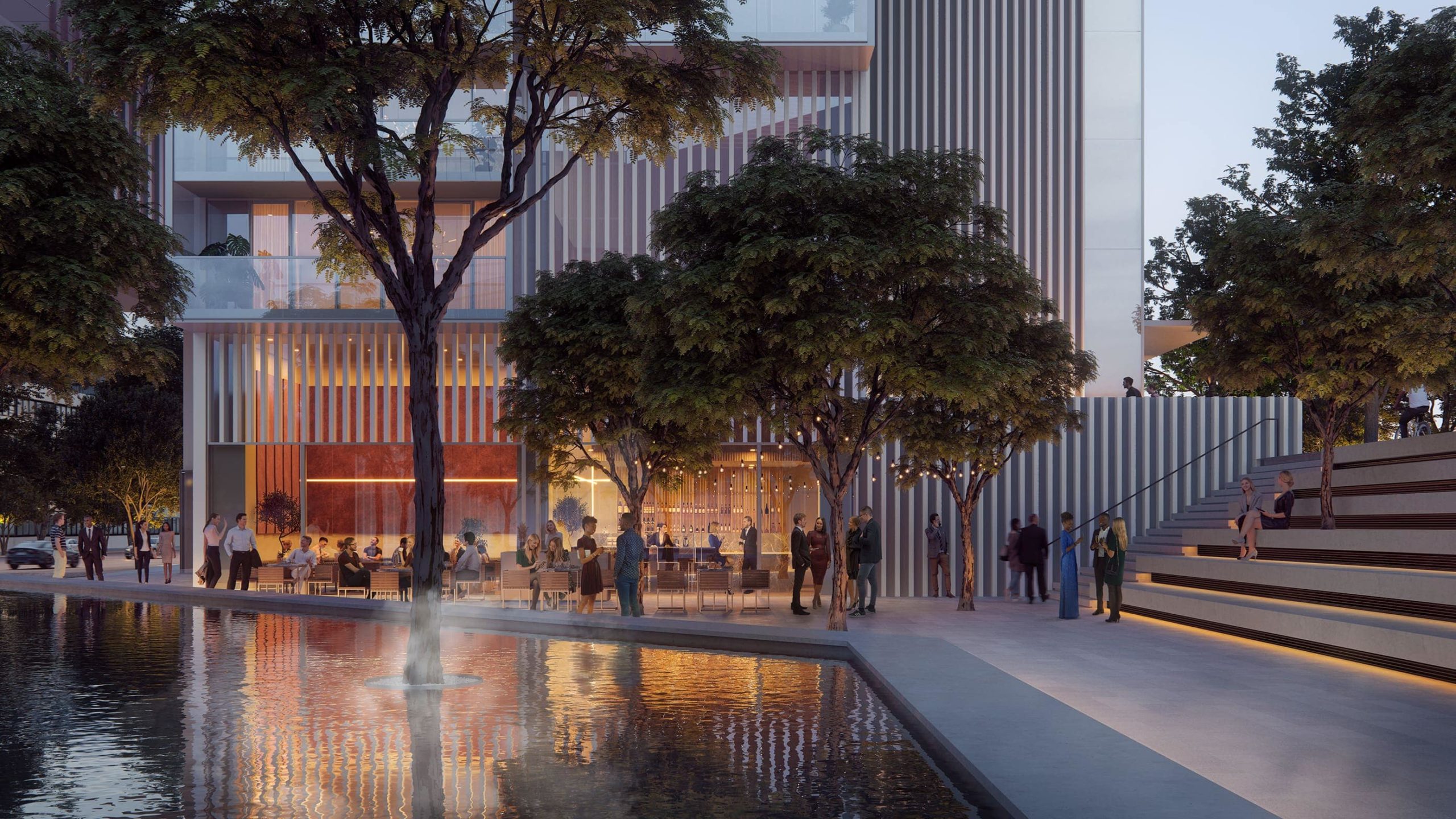
The design also minimizes its footprint through the cantilever volumes. We were able to liberate a large part of the site and turn it into public space – to give it back to the city, back to the local community — and create an outdoor plaza together with the historic water basin, a cafe and steps to the restaurant. It becomes a small public space ecosystem at the bottom of the building, that I think is a very important way to anchor the building in the city, but is also a way for a private residential development to give space back to the public domain.
 What influenced your selection of materials for the project?
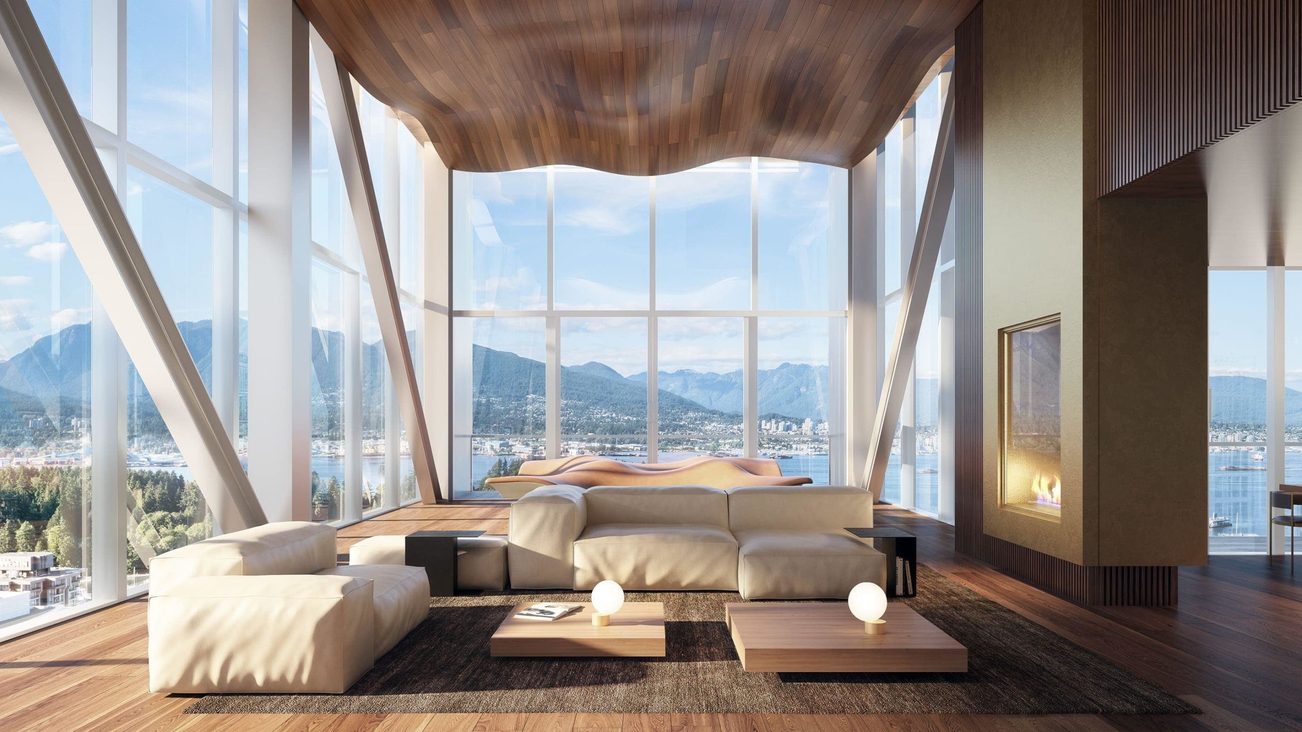
It’s a mixture between the idea of precision engineering — a great degree of precision — and working with a materiality palette that engages the landscape and the idea of an integrated living between city and nature. The interiors are characterized by wooden floors and wooden ceilings that create, sort of, horizontal sandwiches, emphasizing the panoramic views.
 What concepts brought to reality in Fifteen Fifteen do you hope will form a case study for the industry moving forward?
I think Fifteen Fifteen is really a prototype for how to break the monotony of the extruded skyscraper, for how to engage the context and environment actively and spatially, and for how to allow the inhabitants to participate in a three-dimensional world of space and connectivity. And in that way, how to understand the skyscraper much more as an active component of the city rather than a mute shaft and lifeless silhouette.
Send us a photo. Tell us a story. Win $2,500! Architizer’s 3rd Annual One Photo Challenge launches on May 9th! Pre-register for architecture’s biggest photography competition here.
All images courtesy Büro Ole Scheeren.
